An Equity Profile of. Jackson
|
|
|
- Edgar Chambers
- 5 years ago
- Views:
Transcription


1 An Equity Profile of Jackson
2 An Equity Profile of Jackson PolicyLink and PERE 2 Acknowledgments PolicyLink and the Program for Environmental and Regional Equity (PERE) at the University of Southern California are grateful to the W.K. Kellogg Foundation for their generous support of this project and our long-term organizational partnership. We also thank the city of Jackson, and particularly Primus Wheeler with Jackson Medical Mall, Matt Williams with the Mississippi Low-Income Child Care Initiative, and Charles Husband with the Department of Public Policy and Administration at Jackson State University for insightful guidance and feedback. Finally, we are grateful to our partners Dolores Acevedo-Garcia and Erin Hardy at The diversitydatakids.org Project for allowing us to include their unique data on child and family wellbeing in this series of profiles. This profile was written by James Crowder Jr. at PolicyLink; the data, charts, and maps were prepared by Sheila Xiao, Pamela Stephens, and Justin Scoggins at PERE; and Rosamaria Carrillo of PolicyLink assisted with formatting, editing, and design.
3 An Equity Profile of Jackson Table of contents PolicyLink and PERE Summary Introduction Demographics Economic vitality Readiness Connectedness Economic Benefits Implications Data and methods Equity Profiles are products of a partnership between PolicyLink and PERE, the Program for Environmental and Regional Equity at the University of Southern California. The views expressed in this document are those of PolicyLink and PERE.
4 An Equity Profile of Jackson PolicyLink and PERE 4 Summary While the nation is projected to become a people-of-color majority by 2044, Jackson reached that milestone in the 1980s. Since 1990, Jackson has experienced notable demographic growth and transformation driven mostly by an increase in the African American and Latino populations. Today, these demographic shifts including a decrease in the percentage of White residents persist. Equitable growth is the path to sustained economic prosperity in Jackson. The region s economy could have been more than $8 billion stronger in 2014 if its racial gaps in income had been closed: a 29 percent increase. By growing good jobs, connecting younger generations with older ones, integrating immigrants into the economy, building communities of opportunity, and ensuring educational and career pathways to good jobs for all, Jackson can put all residents on the path toward reaching their full potential, and secure a bright future for the city and region.
5 An Equity Profile of Jackson PolicyLink and PERE 5 Indicators Demographics 17 Race/Ethnicity and Nativity, Latino and Asian or Pacific Islander Populations by Ancestry, Racial/Ethnic Composition, 1980 to Composition of Net Population Growth by Decade, 1980 to Growth Rates of Major Racial/Ethnic Groups, 2000 to Share of Net Growth in Latino and Black Population by Nativity, 2000 to Percent Change in Population, 2000 to Percent Change in People of Color by Census Block Group, 2000 to Racial/Ethnic Composition by Census Block Group, 1990 and Racial/Ethnic Composition, 1980 to Percent People of Color (POC) by Age Group, 1980 to Median Age by Race/Ethnicity, The Racial Generation Gap in 2014: 100 Largest Cities, Ranked Economic vitality 28 Cumulative Job Growth, 1979 to Cumulative Growth in Real GRP, 1979 to Unemployment Rate, 1990 to Cumulative Growth in Jobs-to-Population Ratio, 1979 to Labor Force Participation Rate by Race/Ethnicity, 1990 and Unemployment Rate by Race/Ethnicity, 1990 and Unemployment Rate by Race/Ethnicity, Unemployment Rate by Census Tract, Gini Coefficient, 1979 to Real Earned Income Growth for Full-Time Wage and Salary Workers Ages 25-64, 1979 to Median Hourly Wage by Race/Ethnicity, 2000 and Households by Income Level, 1979 and Racial Composition of Middle-Class Households and All Households, 1979 and Poverty Rate, 1980 to Working Poverty Rate, 1980 to 2014
6 An Equity Profile of Jackson PolicyLink and PERE 6 Indicators Economic vitality (continued) 40 Poverty Rate by Race/Ethnicity, Working Poverty Rate by Race/Ethnicity, Percent of the Population Below 200 Percent of Poverty by Race/Ethnicity, Median Hourly Wage by Educational Attainment and Race/Ethnicity, Unemployment Rate by Educational Attainment, Race/Ethnicity, and Gender, Median Hourly Wage by Educational Attainment, Race/Ethnicity, and Gender, Growth in Jobs and Earnings by Industry Wage Level, 1990 to Industries by Wage Level Category in 1990 and Industry Employment Projections, Occupational Employment Projections, Industry Strength Index 50 Occupation Opportunity Index 52 Occupation Opportunity Index: Occupations by Opportunity Level for Workers with a High School Diploma or Less 53 Occupation Opportunity Index: Occupations by Opportunity Level for Workers with More Than a High School Diploma but Less Than a Bachelor s Degree 54 Occupation Opportunity Index: All Levels of Opportunity for Workers with a Bachelor s Degree or Higher 55 Opportunity Ranking of Occupations by Race/Ethnicity, All Workers 56 Opportunity Ranking of Occupations by Race/Ethnicity, Workers with Low Educational Attainment 57 Opportunity Ranking of Occupations by Race/Ethnicity, Workers with Middle Educational Attainment 58 Opportunity Ranking of Occupations by Race/Ethnicity, Workers with High Educational Attainment Readiness 61 Educational Attainment by Race/Ethnicity, Public or Private Pre-Kindergarten or Kindergarten Attendance, 2010 to Share of Students in Grades 3-8 (in public and charter schools) Achieving Proficiency on State Exams in Reading, Math, Science, and Social Studies (Combined),
7 An Equity Profile of Jackson PolicyLink and PERE 7 Indicators Readiness (continued) 62 Share of Elementary Children Attending At Least 90% of School Days, Share of Working-Age Population with an Associate s Degree or Higher by Race/Ethnicity and Nativity, 2014, and Projected Share of Jobs that Require an Associate s Degree or Higher, Percent of the Population with an Associate s Degree or Higher in 2014: 100 Largest Cities, Ranked 65 Percent of 16- to 24-Year-Olds Not Enrolled in School and Without a High School Diploma, 1990 to Disconnected Youth: 16- to 24-Year-Olds Not in Work or School, 1980 to Percent of Youth Disconnected in 2014: Largest 100 Cities Ranked 68 Low Birth-Weight Rate, Share of Babies Breastfed at Hospital Discharge, Infant Mortality Under Age 1 (per 1,000 live births), Adult Overweight and Obesity Rates by Race/Ethnicity, Adult Diabetes Rates by Race/Ethnicity, Adult Asthma Rates by Race/Ethnicity, Air Pollution: Exposure Index by Race/Ethnicity, Air Pollution: Exposure Index by Poverty Status, 2014 Connectedness 74 Residential Segregation, 1980 to Residential Segregation, 1990 and 2014, Measured by the Dissimilarity Index 76 Percent Population Below the Federal Poverty Level by Census Tract, Percent Using Public Transit by Annual Earnings and Race/Ethnicity and Nativity, Percent of Households Without a Vehicle by Race/Ethnicity, Means of Transportation to Work by Annual Earnings, 2014
8 An Equity Profile of Jackson PolicyLink and PERE 8 Indicators Connectedness (continued) 79 Percent of Households Without a Vehicle by Census Tract, Average Travel Time to Work by Census Tract, Share of Households that are Rent Burdened, 2014: 100 Largest Cities, Ranked 82 Renter Housing Burden by Race/Ethnicity, Homeowner Housing Burden by Race/Ethnicity, 2014 Economic benefits 85 Actual GDP and Estimated GDP without Racial Gaps in Income, Percentage Gain in Income with Racial Equity by Race/Ethnicity, Gain in Average Income with Racial Equity by Race/Ethnicity, Source of Gains in Income with Racial Equity by Race/Ethnicity, 2014


9 An Equity Profile of Jackson PolicyLink and PERE 9 Introduction
10 An Equity Profile of Jackson PolicyLink and PERE 10 Introduction Overview Across the country, community organizations and residents, local governments, business leaders, funders, and policymakers are striving to put plans, policies, and programs in place that build healthier, more equitable communities and foster inclusive growth. These efforts recognize that equity just and fair inclusion into a society in which all can participate, prosper, and reach their full potential is fundamental to a brighter future for their communities. Knowing how a community stands in terms of equity is a critical first step in planning for equitable growth. To assist with that process, PolicyLink and the Program for Environmental and Regional Equity (PERE) developed an equity indicators framework that communities can use to understand and track the state of equity and equitable growth locally. This document presents an equity analysis of the city of Jackson. It was developed with the support of the W.K. Kellogg Foundation to provide relevant data to community leaders build a stronger and more equitable city. The foundation is supporting the development of equity profiles in 10 of its priority communities across Louisiana, New Mexico, Michigan, and Mississippi. The data in this profile are drawn from a regional equity database that includes data for the largest 100 cities and 150 regions in the United States, as well as all 50 states. This database incorporates hundreds of data points from public and private data sources including the U.S. Census Bureau, the U.S. Bureau of Labor Statistics, the Behavioral Risk Factor Surveillance System, and Woods and Poole Economics. It also includes unique data on child and family well-being contributed by DiversityDataKids.org, based at the Institute for Child, Youth and Family Policy in the Heller School for Social Policy and Management at Brandeis University. See the "Data and methods" section of this profile for a detailed list of data sources. This profile uses a range of data sources to describe the state of equity in Jackson City as comprehensively as possible, but there are limitations. Not all data collected by public and private sources is disaggregated by race/ethnicity and other demographic characteristics. And in some cases, even when disaggregated data is available, the sample size for a given population is too small to report with confidence. Local data sources and the lived experiences of diverse residents should supplement the data provided in this profile to more fully represent the state of equity in Jackson.
11 An Equity Profile of Jackson PolicyLink and PERE 11 Introduction What is an equitable city? Cities are equitable when all residents regardless of their race/ethnicity, income, neighborhood of residence, or other characteristics are fully able to participate in the region s economic vitality, contribute to the region s readiness for the future, and connect to the region s assets and resources. Strong, equitable cities: Possess economic vitality, providing highquality jobs to their residents and producing new ideas, products, businesses, and economic activity so the city remains sustainable and competitive. Are ready for the future, with a skilled, ready workforce, and a healthy population. Are places of connection, where residents can access the essential ingredients to live healthy and productive lives in their own neighborhoods, reach opportunities located throughout the city (and beyond) via transportation or technology, participate in political processes, and interact with other diverse residents.
12 An Equity Profile of Jackson PolicyLink and PERE 12 Introduction Why equity matters now The face of America is changing. Our country s population is rapidly diversifying. Already, more than half of all babies born in the United States are people of color. By 2030, the majority of young workers will be people of color. And by 2044, the United States will be a majority people-ofcolor nation. Yet racial and income inequality is high and persistent. Over the past several decades, long-standing inequities in income, wealth, health, and opportunity have reached unprecedented levels. And while most have been affected by growing inequality, communities of color have felt the greatest pains as the economy has shifted and stagnated. Racial and economic equity is necessary for the nation s economic growth and prosperity. Equity is an economic and health imperative as well as a moral one. Research shows that equity and diversity are win-win propositions for nations, regions, communities, and firms. For example: More equitable regions experience stronger, more sustained growth. 1 Regions with less segregation (by race and income) and lower-income inequality have more upward mobility. 2 Researchers predict that health equity would lead to significant economic benefits from reductions in health-care spending and lost productivity. 3 Companies with a diverse workforce achieve a better bottom line. 4 A diverse population more easily connects to global markets. 5 Less income inequality results in better health outcomes for everyone. 6 The way forward is with an equity-driven growth model. To secure America s health and prosperity, the nation must implement a new economic model based on equity, fairness, and opportunity. Public and private policies and investments must support equitable economic growth strategies, healthy and opportunity-rich neighborhoods, and cradleto-career educational pathways. Cities play a critical role in building this new growth model. Local communities are where strategies are being incubated that foster equitable growth: growing good jobs and new businesses while ensuring that all including low-income people and people of color can fully participate and prosper. 1 Manuel Pastor, Cohesion and Competitiveness: Business Leadership for Regional Growth and Social Equity, OECD Territorial Reviews, Competitive Cities in the Global Economy, Organisation For Economic Co-Operation And Development (OECD), 2006; Manuel Pastor and Chris Benner, Been Down So Long: Weak-Market Cities and Regional Equity in Retooling for Growth: Building a 21 st Century Economy in America s Older Industrial Areas (New York: American Assembly and Columbia University, 2008); Randall Eberts, George Erickcek, and Jack Kleinhenz, Dashboard Indicators for the Northeast Ohio Economy: Prepared for the Fund for Our Economic Future (Federal Reserve Bank of Cleveland: April 2006), 2 Raj Chetty, Nathaniel Hendren, Patrick Kline, and Emmanuel Saez, Where is the Land of Economic Opportunity? The Geography of Intergenerational Mobility in the U.S. 20Summary%20and%20Memo%20January% pdf 3 Darrell Gaskin, Thomas LaVeist, and Patrick Richard, The State of Urban Health: Eliminating Health Disparities to Save Lives and Cut Costs. National Urban League Policy Institute, Cedric Herring. Does Diversity Pay?: Race, Gender, and the Business Case for Diversity. American Sociological Review, 74, no. 2 (2009): ; Slater, Weigand and Zwirlein. The Business Case for Commitment to Diversity. Business Horizons 51 (2008): U.S. Census Bureau. Ownership Characteristics of Classifiable U.S. Exporting Firms: 2007 Survey of Business Owners Special Report, June 2012, 6 Kate Pickett and Richard Wilkinson, Income Inequality and Health: A Causal Review. Social Science & Medicine, 128 (2015):

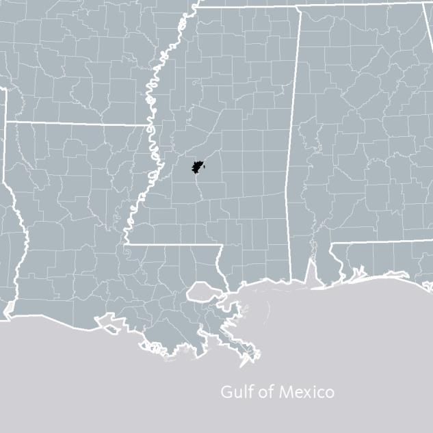
13 An Equity Profile of Jackson PolicyLink and PERE 13 Introduction Geography This profile describes demographic, economic, and health conditions in the city of Jackson, portrayed in black on the map to the right. Jackson City is situated in Hinds county, within the Jackson, MS Metropolitan Statistical Area located in the central portion of the state and composed of five counties: Copiah, Hinds, Madison, Rankin, and Simpson. Unless otherwise noted, all data follow the city geography, which is simply referred to as Jackson. Some exceptions due to lack of data availability are noted beneath the relevant figures. Information on data sources and methodology can be found in the Data and methods section beginning on page 93.
14 An Equity Profile of Jackson PolicyLink and PERE 14 Introduction Equity indicators framework The indicators in this profile are presented in four sections. The first section describes the region s demographics. The next three sections present indicators of the region s economic vitality, readiness, and connectedness. Below are the questions answered within each of the four sections. Demographics: Who lives in the city and how is this changing? Is the population growing? Which groups are driving growth? How diverse is the population? How does the racial composition vary by age? Economic vitality: How is the city doing on measures of economic growth and well-being? Is the region producing good jobs? Can all residents access good jobs? Is growth widely shared? Do all residents have enough income to sustain their families? Are race/ethnicity and nativity barriers to economic success? What are the strongest industries and occupations? Readiness: How prepared are the region s residents for the 21 st century economy? Does the workforce have the skills for the jobs of the future? Are all youth ready to enter the workforce? Are residents healthy? Are racial gaps in education and health decreasing? Connectedness: Are the region s residents and neighborhoods connected to one another and to the city s assets and opportunities? Do residents have transportation choices? Can residents access jobs and opportunities located throughout the city? Can all residents access affordable, quality, convenient housing? Do neighborhoods reflect the region s diversity? Is segregation decreasing? Can all residents access healthy food? Economic benefits: How would addressing racial inequities affect the regional economy? How would the region s gross domestic product be affected? How much would residents benefit from closing racial gaps in income and employment?


15 An Equity Profile of Jackson PolicyLink and PERE 15 Demographics
16 An Equity Profile of Jackson PolicyLink and PERE 16 Demographics Highlights Who lives in the region and how is it changing? By 2014, 80 percent of Jackson residents were African American up from 47 percent of residents in Of the 143,000 people of color in Jackson, 97 percent are Black. Decline in the White population since 1980: 71% The percentage of people of color is growing steadily, and Latinos are the fastest growing group (though they are growing from a small base). The median age of White residents in Jackson is 44, compared with 29 for Black Residents a 15 year difference. Growth rate of the Latino population between 2000 and 2014: 87% Racial generation gap: 29 percentage points
17 An Equity Profile of Jackson PolicyLink and PERE 17 Demographics A predominantly African American city Eighty-two percent of the city s residents are people of color. African Americans make up 80 percent of Jackson. While Latinos are the second largest racial/ethnic group among people of color, they make up less than 2 percent of the total city population. In fact, even though 82 percent of Jackson s residents are people of color, all other subgroups aside from African Americans make up less than 3 percent of the total city population combined. Nearly 80 percent of Jackson residents are Black Race, Ethnicity, and Nativity, 2014 White, U.S.-born White, Immigrant Black, U.S.-born Black, Immigrant Latino, U.S.-born Latino, Immigrant API, U.S.-born API, Immigrant Native American Mixed/other 0.7% 0.8% 0.3% 0.2% 0.1% 0.1% 0.6% 17.2% 0.3% 0.4% Mexicans are the largest subgroup of residents among those of Latino ancestry Latino and Asian or Pacific Islander Populations by Ancestry, 2014 Latino Population Mexican 1,193 Puerto Rican 690 All other Latinos 1,129 Total 3, % Asian or Pacific Islander (API) 0.1% Population Indian % 0.2% 0.6% Filipino % Vietnamese 43 All other 17.2% Asians 507 Total % 79% 79.4% Source: Integrated Public Use Microdata Series (IPUMS); U.S. Census Bureau. Note: Data represent a 2010 through 2014 average. The IPUMS American Community Survey (ACS) microdata was adjusted to match the ACS summary file percentages by race/ethnicity. Source: Integrated Public Use Microdata Series. Note: Data represent a 2010 through 2014 average
18 An Equity Profile of Jackson PolicyLink and PERE 18 Demographics Growth in the people-of-color population amid overall population decline The overall population of Jackson has steadily decreased since 1980, mostly due to a decline in the White population. In 1980, Jackson had almost 203,000, while only 173,600 residents lived in Jackson in The White population in 2014 was less than one third of what it was in The city s communities of color, on the other hand, have grown at a steady pace. The share of African Americans has increased steadily since 1980 Racial/Ethnic Composition, 1980 to 2014 Mixed/other Native American Asian or Pacific Islander Latino Black White 2% The people-of-color population has grown since 1980 while the White population has declined Composition of Net Population Growth by Decade, 1980 to 2014 White People of Color 14,232 22,211 Between 1980 and 2014, the White population decreased from roughly 105,800 to slightly more than 30,600. During the same time period the number of people of color grew from about 97,100 to about 143, % 9,440 1% 0% 56% 0% 1% 2% 0% 70% 80% 1980 to to to ,232 47% 56% 52% 43% -20,490 70% 80% -20, to % 18% 52% % -20,490-34,592 Source: U.S. Census Bureau. 28% Note: Data for 2014 represents a 2010 through 2014 average. Much of the 18% increase in the Mixed/other population between 1990 and 2000 is due to a Source: U.S. Census Bureau. change in the survey question on race. Shares by race/ethnicity in 2014 may Note: Data for 2014 represents a 2010 through 2014 average. differ slightly from those reported on page 17 due to rounding ,59
19 An Equity Profile of Jackson PolicyLink and PERE 19 Demographics Growth in the Latino population Latinos were the fastest growing racial/ethnic group in Jackson during the past decade. Even though the Latino population makes up a small share of the city s population (at close to 2 percent), the Latino population almost doubled increasing from 1,500 to 2,700. Decline in Asian or Pacific Islander, White and Mixed/other populations since 2000 Growth Rates of Major Racial/Ethnic Groups, 2000 to 2014 Mixed/other -13% Latino population growth is largely because of immigration, while Black population growth is driven exclusively by those born in the U.S. Share of Net Growth in Black and Latino Populations by Nativity, 2000 to 2014 Foreign-born Black U.S.-born Black Between 2000 to 2014, there was a decrease in the number of Asian or Pacific Islanders, Whites, and residents that identify as mixed race or other. Native American Asian or Pacific Islander -46% 13% Latino 87% 100% Black White 7% -40% Foreign-born Latino U.S.-born Latino 33% 100% 67% Source: U.S. Census Bureau. Note: Data for 2014 represents a 2010 through 2014 average. Source: Integrated Public Use Microdata Series. Note: Data for 2014 represents a 2010 through 2014 average. 0%
20 An Equity Profile of Jackson PolicyLink and PERE 20 Demographics People of color are growing in Hinds County despite overall population decline The same demographic trends occurring in Jackson city are also occurring in Hinds County. Since 2000, the county s overall population decreased by 2 percent, or approximately 4,440 people. However, the people-of-color population has grown by 14 percent since People of color now comprise approximately 179,800 of Hinds County s 246,400 residents. The People-of-color population is growing in Hinds County Percent Change in Population, 2000 to 2014 People-of-color growth Total population growth 14%. Hinds County -2% 14% Hinds County -2% Source: U.S. Census Bureau. Note: Data is for Hinds County, MS. Data for 2014 represents a 2010 through 2014 average.

21 An Equity Profile of Jackson PolicyLink and PERE 21 Demographics Declining numbers of people of color in the central city, growth in the suburbs Mapping the growth in people of color by census block group illustrates variation in growth and decline in communities of color throughout the city. The map highlights how the population of color has declined or experienced no growth in many neighborhoods in the core of downtown Jackson, and to the north and west of the city. Growth in people of color concentrated in the suburbs Percent Change in People of Color by Census Block Group, 2000 to 2014 Decline of 35% or more Decline of less than 35% or no growth Increase of less than 18% Increase of 18% to 100% Increase of 100% or more The largest increases in the people-of-color population are found in the southern part of the city in Leavell Woods and Elton, as well as in the far northeast portion of the city. Source: U.S. Census Bureau, GeoLytics, Inc.; TomTom, ESRI, HERE, DeLorme, MaymyIndia, OpenStreetMap contributors, and the GIS user community. Note: One should keep in mind when viewing this map and others that display a share or rate that while there is wide variation in the size (land area) of the census block groups in the region, each has a roughly similar number of people. Thus, care should be taken not to assign unwarranted attention to large block groups just because they are large. Data for 2014 represents a 2010 through 2014 average.

22 An Equity Profile of Jackson PolicyLink and PERE 22 Demographics Black population is dispersing while Latinos are growing in the northeastern part of the city Since 1990, the share of the population that is people-of-color has increased to 82 percent. This growth in the people-of-color population can be largely attributed to the growing Black population. Diversity is spreading outwards Racial/Ethnic Composition by Census Block Group, 1990 and 2014 Latinos have been the fastest-growing racial/ethnic group in the city overall, although they remain a relatively small share of the population. The northeast part of the city shows a small pocket of density for the Latino population. Source: U.S. Census Bureau, GeoLytics, Inc.; TomTom, ESRI, HERE, DeLorme, MaymyIndia, OpenStreetMap contributors, and the GIS user community. Note: Data for 2014 represent a 2010 through 2014 average.
23 An Equity Profile of Jackson PolicyLink and PERE 23 Demographics Communities of color will continue to grow in Hinds County Demographic change has been happening much faster in Hinds County than in the nation as a whole, and this shift will continue. In 1980, Hinds County was 54 percent White significantly less than the U.S. overall (80 percent). In fact, the county became majority people of color by By 2000, 63 percent of the population was people of color. Based on current projections, the nation will become majority people of color in Nationally, the Latino population will continue to increase, projected at 26 percent in 2050 compared with only six percent in However, in Hinds County, the share of the Latino population will increase much more slowly from one percent in 1980 to four percent in The Black population, on the other hand, is projected to increase to 81 percent of the population in Hinds County by 2050, while the share nationally is only projected to increase to 13 percent in 2050 (it was 12 percent in 1980). 45% The share of White residents is projected to steadily decline through 2050 Racial/Ethnic U.S. % White Composition, 1980 to 2050 Mixed/other U.S. % White Native American Other Asian or Pacific Islander Native American Latino Asian/Pacific Islander Black Latino White Black White 1% 0% 1% 1% 2% 1% 2% 1% 1% 2% 3% 1% 2% 4% 45% 51% 51% 61% 69% 61% 73% 69% 1% 76% 2% 2% 2% 2% 3% 4% 73% 1% 2% 3% 1% 2% 2% 5% 14% 6% 7% 21% 8% 54% 54% 29% 35% 48% 41% 48% 47% 37% 37% 28% 18% 23% 28% 19% 17% 23% 15% 19% 12% 15% 12% % % % % Projected 48% 16% Projected 15% Source: U.S. Census Bureau; Woods & Poole Economics, Inc. 40% Note: Data is for Hinds County, MS. Much of the increase in the Mixed/other population between 1990 and 2000 is due to a change in the survey question on race. Figures may not sum to total due to rounding 34% 79% 76% 81% 79% 81% 28%
24 An Equity Profile of Jackson PolicyLink and PERE 24 Demographics The racial generation gap has grown since 1980 Young people are leading the demographic shift in Jackson. In 2014, 90 percent of Jackson s youth (under age 18) were people of color, compared with 61 percent of the city s seniors (65 and older) who are people of color. This 29 percentage point difference between the share of people of color among young and old can be measured as the racial generation gap. The racial generation gap may negatively affect the city if policymakers do not invest in the educational systems and community infrastructure needed to support a youth population that is more racially diverse. There is a large racial generation gap in Jackson Percent People of Color (POC) by Age Group, 1980 to 2014 Percent of seniors who are POC Percent of youth who are POC 61% 34% 26 percentage point gap 90% 29 percentage point gap 61% Blacks in the city are more youthful than its White population Median Age by Race/Ethnicity, 2014 Black White % Jackson s Black population is also more youthful than its White population. Black residents have a median age of 29, while the median age of Whites is 44, a 15-year difference. 61% 34% percentage point gap All percentage point 61% Source: U.S. Census Bureau. Note: Data for 2014 represents a 2010 through 2014 average. Source: Integrated Public Use Microdata Series. Note: Data represent a 2010 through 2014 average. Data for some racial/ethnic groups are excluded due to small sample size.
25 An Equity Profile of Jackson PolicyLink and PERE 25 Demographics A shrinking racial generation gap (continued) Jackson s 29 percentage-point racial generation gap is ranked 54 th among the 100 largest U.S. cities. Compared with major cities in neighboring states, Jackson has a smaller racial generation gap. Memphis, TN ranks 47 th with a 30 percentage point gap, and Baton Rouge, LA ranks 33 rd with a 33 percentage point gap. Jackson has a moderate generation gap The Racial Generation Gap in 2014: 100 Largest Cities, Ranked Irving City, TX: #1 (54) Jackson: #54 (29) Hialeah City, FL: #100 (-2) Source: U.S. Census Bureau. Note: Data represent a 2010 through 2014 average.


26 An Equity Profile of Jackson PolicyLink and PERE 26 Economic vitality
27 An Equity Profile of Jackson Economic vitality Highlights How is the city doing on measures of economic growth and well-being? Hind County s gross regional product (GRP) has only grown by 33 percent since 1979, which is far below the national average of 106 percent. All workers, even the highest paid workers, have seen a decline in real wages since The poverty rate for African Americans is more than triple the rate for Whites, while the rate of working poverty is more than four times as high. The gap in wages between White and Black full-time workers rose from $6/hour to $8/hour between 2000 and PolicyLink and PERE Wage growth (since 1979) for workers at the 10 th percentile: -27% Share of African Americans living in poverty: 35% 27 Wage gap between Whites and African Americans: $8/hour
28 An Equity Profile of Jackson PolicyLink and PERE 28 Economic vitality Declining economic growth Measures of economic growth include increases in jobs and increases in gross regional product (GRP), the value of all goods and services produced within the county. The number of jobs in Hinds County has fallen since the late 1990s Cumulative Job Growth, 1979 to 2014 Hinds County United States Gross Regional Product (GRP) growth is far below the national average Cumulative Growth in Real GRP, 1979 to 2014 Hinds County United States By these measures, economic growth in Hinds County has declined in the past several decades. Cumulative job growth since 1979 is 58 percentage points behind the national average, while cumulative GRP growth is 73 percentage points below the national average. 100% 100% 106% 75% 180% 64% 75% 180% 50% 140% 140% 50% 33% 25% 100% 100% 25% 93% 6% 60% 0% % -25% 60% 0% % 20% -25% % -20% Source: U.S. Bureau of Economic Analysis. Source: U.S. Bureau of Economic Analysis.
29 An Equity Profile of Jackson PolicyLink and PERE 29 Economic vitality Slow but steady economic resilience in the labor force after the downturn The regional economy struggled during the economic downturn, but unemployment has decreased steadily since Despite the decline, the unemployment rate in the Hinds County exceeded the national average in The unemployment rate in Hinds County was 6.1 percent and 5.3 percent in the nation overall. Unemployment began to fall consistently in 2011, but at a slower pace than the national average Unemployment Rate, 1990 to 2015 Hinds County United States 12% Downturn According to the most recent data from the Bureau of Labor Statistics, however, unemployment in the county was 4.3 percent compared with 4.6 percent nationwide as of March While the 4.3 percent rate for Hinds County is a preliminary estimate, the most recent data suggests that the labor market has improved significantly since % 180% 140% 100% 4% % % % 60% % % 0% % Source: U.S. Bureau of Labor Statistics. Universe includes the civilian noninstitutional population ages 16 and older.
30 An Equity Profile of Jackson PolicyLink and PERE 30 Economic vitality Job growth is keeping up with population growth While overall job growth is essential, it s important to consider whether jobs are growing at a fast enough pace to keep up with population growth. Hinds County job growth per person caught up to the national average in 1998, but has fallen below the national average since then. In 2014, there was an 8 percentage point difference between the county and national rates. Job growth relative to population growth has been lower than the national average since 2000 Cumulative Growth in Jobs-to-Population Ratio, 1979 to 2014 Hinds County United States 20% 16% 10% 180% 140% 8% 100% 0% 60% % 93% 40% -10% % Source: U.S. Bureau of Economic Analysis.
31 An Equity Profile of Jackson PolicyLink and PERE 31 Economic vitality Unemployment higher for African Americans The unemployment gap between Blacks and Whites in Jackson has grown wider since Although the unemployment rates for both Whites and Blacks have increased since 2000, they increased more for the Black population. African Americans have a lower rate of labor force participation Labor Force Participation Rate by Race/Ethnicity, 2000 and Unemployment for African Americans increased since 2000 by 3 percentage points Unemployment Rate by Race/Ethnicity, 2000 and While Blacks had lower labor force participation than Whites in 2014, a slight drop among Whites alongside a slight rise among Blacks has lead to a narrowing of the gap since All 74.7% 74.3% All 6.6% 9.8% Black 74.0% 72.7% All Black All 7.9% 11.1% White Black 77.0% 78.1% White 4.1% Black 3.5% White Source: Integrated Public Use Microdata Series. Universe includes the civilian noninstitutional population ages 25 through 64. Note: Data represent a 2010 through 2014 average. Data for some racial/ethnic groups are excluded due to small sample size. White Source: Integrated Public Use Microdata Series. Universe includes the civilian noninstitutional population ages 25 through 64. Note: Data for 2014 represents a 2010 through 2014 average. Data for some racial/ethnic groups are excluded due to small sample size.
32 An Equity Profile of Jackson PolicyLink and PERE 32 Economic vitality Unemployment higher for African Americans Black residents of Jackson are more likely than White residents to be unemployed. About 11 percent of African American adults between ages 25 to 64 are unemployed, compared with only four percent of the White population. It is important to note that actual unemployment is likely even higher because only those who are actively searching for work are counted as unemployed, not those who have given up the search. African Americans have the highest unemployment rates in the city Unemployment Rate by Race/Ethnicity, 2014 All White 4.1% 9.8% Black 11.1% Source: Integrated Public Use Microdata Series. Universe includes the civilian noninstitutionalized population ages 25 through 64. Note: Data represent a 2010 through 2014 average. Data for some racial/ethnic groups are excluded due to small sample size.

33 An Equity Profile of Jackson PolicyLink and PERE 33 Economic vitality Many neighborhoods in Jackson have high unemployment Knowing where high-unemployment communities are located in the city can help the city s leaders develop targeted solutions. As the map to the right illustrates, concentrations of unemployment exist in pockets throughout the city, but are more prevalent in downtown Jackson and areas west of the urban core (specifically, to the northwest and southwest). Neighborhoods in the far northeast and southeast parts of the city have lower levels of unemployment. Clusters of high unemployment exist west of the urban core Unemployment Rate by Census Tract, 2014 Less than 6% 6% to 11% 11% to 15% 15% to 19% 19% or more 97% or more people of color Source: U.S. Census Bureau; TomTom, ESRI, HERE, DeLorme, MaymyIndia, OpenStreetMap contributors, and the GIS user community. Universe includes the civilian noninstitutional labor force age 16 and older. Note: Data represent a 2010 through 2014 average.
34 Level of Inequality Level of Inequality An Equity Profile of Jackson PolicyLink and PERE 34 Economic vitality Income inequality continues to exceed the nation Household income inequality has grown in the city over the past 30 years at a slightly faster rate than for the nation as a whole. Inequality in Jackson City has stabilized since 1999, but remains higher than the nation. Household income inequality has increased since 1979 Gini Coefficient, 1979 to 2014 Jackson United States Inequality here is measured by the Gini coefficient, which is the most commonly used measure of inequality. The Gini coefficient measures the extent to which the income distribution deviates from perfect equality, meaning that every household has the same income. The value of the Gini coefficient ranges from zero (perfect equality) to one (complete inequality; one household has all of the income) Gini Coefficent measures income equality on a 0 to 1 scale. 0 (Perfectly equal) > 1 (Perfectly unequal) Gini Coefficent measures income equality on a 0 to 1 scale. 0 (Perfectly equal) > 1 (Perfectly unequal) Source: Integrated Public Use Microdata Series. Universe includes all households (no group quarters) Note: Data for 2014 represents a 2010 through 2014 average.
35 An Equity Profile of Jackson PolicyLink and PERE 35 Economic vitality Declining wages for all workers After adjusting for inflation, wages have declined or stagnated for the bottom half of workers nationwide over the past three decades. However, in Jackson City, wages have declined for all workers. Wages have decreased for all full-time workers in Jackson Real Earned Income Growth for Full-Time Wage and Salary Workers Ages 25-64, 1979 to 2014 Jackson United States Wage decline has been more severe in the city than it has been nationwide, and has been steepest for the lowest-paid workers. One way to see this is to look at changes in wages at various percentiles of the wage distribution. Put simply, a worker at the 20 th percentile, for example, earns more than about 20 percent of all workers and less than 80 percent of all workers. 17% 6% 10th Percentile 20th Percentile 50th Percentile 80th Percentile 90th Percentile -7% -11% -10% 6% 17% In Jackson, wages fell by 27 percent and 20 percent for workers at the 10 th and 20 th percentiles. Even workers at the top saw their wages decline by 18 percent. -27% -20% -22% -23% -18% 10th Percentile 20th Percentile 50th Percentile 80th Percentile 90th Percentile -11% -10% -7% -20% -22% -23% -18% -27% Source: Integrated Public Use Microdata Series. Universe includes civilian noninstitutional full-time wage and salary workers ages 25 through 64. Note: Data for 2014 represents a 2010 through 2014 average.
36 An Equity Profile of Jackson PolicyLink and PERE 36 Economic vitality Larger wage declines for workers of color Since 2000, people of color in Jackson city have experienced wage declines. Wages for white workers more or less stayed the same. The gap in wages between White and Black full-time workers rose from $6/hour to $8/hour between 2000 and Median hourly wages for workers of color in Jackson have declined since 2000 Median Hourly Wage by Race/Ethnicity, 2000 and No racial/ethnic group in Jackson has a median wage high enough to be called a living wage for a family of one adult and two children (according to the MIT Living Wage Calculator). The living wage for a family of three with one adult in Hinds County is about $25/hour. $21.30 $21.10 $17.10 $14.20 $21.30 $21.10 $15.70 $13.10 $15.70 $15.70 $13.10 $13.10 All White Black People of Color $- $- $- $- $- $- White Black Latino Asian or Pacific Islander Mixed/other Source: Integrated Public Use Microdata Series. Universe includes civilian noninstitutional full-time wage and salary workers ages 25 through 64. Note: Data for 2014 represents a 2010 through 2014 average. Values are in 2014 dollars. Data for some racial/ethnic groups are excluded due to small sample size.
37 An Equity Profile of Jackson PolicyLink and PERE 37 Economic vitality A shrinking middle class The city s middle class is shrinking: Since 1979, the share of households with middleclass incomes decreased from 40 to 38 percent. The share of upper-income households also declined, from 30 to 25 percent, while the share of lower-income households grew from 30 to 38 percent. In this analysis, middle-income households are defined as having incomes in the middle 40 percent of household income distribution. In 1979, those household incomes ranged from $29,032 to $73,858. To assess change in the middle class and the other income ranges, we calculated what the income range would be today if incomes had increased at the same rate as average household income growth. Today s middle-class incomes would be $23,549 to $59,265, and 38 percent of households fall within that range. The share of middle-class households declined since 1979 Households by Income Level, 1979 and % $73,858 40% $29,347 30% Upper Middle Lower 25% 38% 38% $59,265 $23, Source: Integrated Public Use Microdata Series. Universe includes all households (no group quarters). Note: Data for 2014 represents a 2010 through 2014 average. Dollar values are in 2014 dollars.
38 An Equity Profile of Jackson PolicyLink and PERE 38 Economic vitality The share of African Americans in both middle-class and all households has increased since 1979 The demographics of the middle class reflect the city s changing demographics. While the share of households with middle-class incomes has declined since 1979, middleclass households have become more racially and ethnically diverse as the population has become more diverse. Black households make up 74 percent of all households and 77 percent of middle-class households. Though the middle class is reflective of the city s diversity, not everyone has similar employment and educational opportunities because of racial residential segregation. The middle class reflects the city s racial/ethnic composition Racial Composition of Middle-Class Households and All Households, 1979 and 2014 Latino, API, Native American, or Mixed/other Black White 11% 13% 37% 38% 62% 61% 4% 85% 3% 15% 3% 77% 74% 83% 16% 18% 69% 14% 68% 20% 23% Middle-Class Households All Households Middle-Class All Households Households Middle-Class All Households Middle-Class All Households 1979 Households 2014Households Source: Integrated Public Use Microdata Series. Universe includes all households (no group quarters). Note: Data for 2014 represents a 2010 through 2014 average. Figures may not sum to total due to rounding.
39 An Equity Profile of Jackson PolicyLink and PERE 39 Economic vitality Poverty rates are comparatively high and rising The poverty rate in Jackson has been consistently higher than the national average since However, since 2000 the percentage of residents in the city living in poverty has been about twice the national average. Today, more than 30 percent of Jackson residents live below the poverty line, which is $24,000 a year for a family of four. Poverty rate is nearly double the national average Poverty Rate, 1980 to 2014 Jackson United States 40% Working poverty has increased between 2000 to 2014 Working Poverty Rate, 1980 to 2014 Jackson United States 40% Working poverty, defined as working full-time with an income below 200 percent of the poverty level (roughly $48,000 for a family of four), has also risen significantly. By 2014, about 20 percent of the city s 25- to 64-yearolds were working poor. 30% 20% 35% 30% 10% 30.8% 31% 16% 30% 20% 35% 10% 30% 30.8% 20% 9% 25% 20% 0% % % 10% 5% 25% 20% 15% 10% 5% 0% % 0% Source: Integrated Public Use Microdata Series. Universe includes all persons not in group quarters. Note: Data for 2014 represents a 2010 through 2014 average. 0% Source: Integrated Public Use Microdata Series. Universe includes the civilian noninstitutional population ages 25 through 64 not in group quarters. Note: Data for 2014 represents a 2010 through 2014 average.
40 An Equity Profile of Jackson PolicyLink and PERE 40 Economic vitality Large racial inequities in poverty and working poverty African Americans in the city are more likely than Whites to be in poverty and working poverty. More than one in three Blacks live below the federal poverty level compared with about one in every 10 Whites. Poverty among African Americans is more than triple that of Whites Poverty Rate by Race/Ethnicity, 2014 All White Black Working poverty is highest for African Americans Working Poverty Rate by Race/Ethnicity, 2014 All White Black African Americans are also much more likely to be working poor compared with Whites. The working poverty rate for Blacks (25 percent) is 19 percentage points higher than Whites (6 percent). 40% 30% 20% 10% 0% 35% 31% 11% Source: Integrated Public Use Microdata Series. Universe includes all persons not in group quarters. Note: Data represent a 2010 through 2014 average. Data for some racial/ethnic groups are excluded due to small sample size. 28% 26% 24% 22% 20% 18% 16% 14% 12% 10% 8% 6% 4% 2% 0% 25% 20% 6% 40% 30% 20% 10% 0% 25% 20% 6% Source: Integrated Public Use Microdata Series. Universe includes the civilian noninstitutional population ages 25 through 64 not in group quarters. Note: Data represent a 2010 through 2014 average. Data for some racial/ethnic groups are excluded due to small sample size. 28% 26% 24% 22% 20% 18% 16% 14% 12% 10% 8% 6% 4% 2% 0% 2
41 An Equity Profile of Jackson PolicyLink and PERE 41 Economic vitality The racial gap in economic insecurity widens Because the federal poverty level is so low, it s helpful to look at the share of the population living below 200 percent of poverty. In 2014, double the poverty line was $48,000 a year for a family of four which is still well below a living wage. According to the MIT Living Wage Calculator, a living wage for a family of four with two adults and two children living in Hinds County would be about $58,000 a year. In 2014, 64 percent of Black residents in Jackson lived below 200 percent of poverty, more than double the rate for Whites. Economic insecurity has increased since 2000 Percent of the Population Below 200 Percent of Poverty, % 56% 56% 64% 64% 47% 23% 25% 23% 25% White Black All White Black Source: Integrated Public Use Microdata Series. Universe includes all persons not in group quarters. Note: Data for 2014 represent a 2010 through 2014 average. Data for some racial/ethnic groups are excluded due to small sample size.
42 An Equity Profile of Jackson PolicyLink and PERE 42 Economic vitality At the highest level of education, African American wages are far below White wages While wages tend to increase with higher educational attainment, the returns to education do not seem to be very substantial in Jackson until a worker earns a BA degree or higher. Relatively small gains in wages are made between those with a high school diploma and those with an AA degree Median Wages by Educational Attainment and Race/Ethnicity, 2014 All White Black While the sample size of White workers with less than a BA degree is not large enough to report data on median wages, a comparison of median wages for Black workers to the median wages for all workers combined suggests that wage gaps by race are small or nonexistent at least among those with less than a BA degree. Among workers with a BA degree or higher, however, the gap is stark: Black workers earn nearly $8/hour less than their white counterparts. $30 $20 $30 $10 $10.30 $11.60 $11.60 $13.00 $12.60 $13.80 $13.80 $19.70 $24.70 $16.90 $20 $10 $0 Less than a HS Diploma HS Diploma, no College Some College, no Degree AA Degree, no BA BA Degree or higher $0 Less than a HS Diploma, Some College, AA Degree, BA Degree HS Diploma no College no Degree no BA or higher Source: Integrated Public Use Microdata Series. Universe includes the civilian noninstitutional population ages 25 through 64. Note: Data represent a 2010 through 2014 average. Values are in 2014 dollars. The White sample size is only large enough to show data for those with a BA degree or higher.
43 An Equity Profile of Jackson PolicyLink and PERE 43 Economic vitality Women of color earn less compared with their male counterparts In Jackson, women of color earn less than men of color, regardless of education level. Women of color also have similar or higher unemployment rates compared with their male counterparts. Women of color with a high school diploma but no college have an unemployment rate of 19 percent, compared with men of color at the same educational level at 12 percent. Women of color have comparable if not higher unemployment rates compared with men of color Unemployment Rate by Educational Attainment, Race/Ethnicity, and Gender, 2014 Women of color Men of color BA Degree or higher 5% 6% Women of color earn less than men of color Median Hourly Wage by Educational Attainment, Race/Ethnicity, and Gender, 2014 Women of color Men of color BA Degree or higher $16 More than HS Diploma, Less than BA 9% 7% BA Degree or higher More than 5.3% HS Diploma, Less than 6.4% BA BA Degree or higher $12 $14 HS Diploma, no College Less than a HS Diploma 19% 12% More than HS Diploma, Less than BA 21% 22% HS Diploma, no College 9.5% 7.3% HS Diploma, no College More than HS Diploma, Less than BA 11.6% $10 $13 HS Diploma, no College 18.7% Less than a HS Diploma Less than a HS Diploma 21 Source: Integrated Public Use Microdata Series. Universe includes the civilian noninstitutional population ages 25 through 64. Note: Data for some racial/ethnic groups are excluded due to small sample size. Data represent a 2010 through 2014 average. Source: Integrated Public Use Microdata Series. Universe includes civilian noninstitutional full-time wage and salary workers ages 25 through 64. Note: Data represent a 2010 through 2014 average. Data for some racial/ethnic groups are excluded because of small sample size.
44 An Equity Profile of Jackson PolicyLink and PERE 44 Economic vitality Low- and middle-wage industries have grown the most since 1990 Job growth in Hinds County has been primarily among low-wage and middle-wage jobs. Importantly, growth in low-wage jobs has been much higher (105 percent) than growth in high-wage jobs (36 percent). In many places around the country, both lowand high-wage jobs are increasing. In Hinds County, however, growth in low-wage jobs has been nearly three times the increase in highwage jobs. Low-wage jobs grew the most but had the smallest earnings growth Growth in Jobs and Earnings by Industry Wage Level, 1990 to 2015 Low wage Middle wage High wage 105% 102% Even though jobs in low-wage industries have grown by 105 percent since 1990, wages have only grown by 8 percent. Wages for jobs in high-wage industries grew by 18 percent. 52% 65% 36% 8% 18% 14% Jobs Earnings per worker 16% 24% 8% Source: U.S. Bureau of Labor Statistics; Woods & Poole Economics, Jobs Inc. Universe includes all private sector jobs covered by Earnings the federal per Unemployment worker Insurance (UI) program. Note: Data is for Hinds County, MS. 0.4%
45 An Equity Profile of Jackson PolicyLink and PERE 45 Economic vitality Uneven wage growth across industry sectors Wage growth in Hinds County has been uneven across industry sectors. High-wage industries like management and utilities had substantial increases in earnings. While low-wage industries tended to see the smallest wage growth, on average, the largest wage increases were actually seen in two low-wage industry sectors real estate and agriculture which saw earnings increases of 62 percent and 55 percent, respectively. Moderate wage growth for workers in many of the county s largest industries Industries by Wage Level Category in 1990 and 2015 Average Annual Earnings Average Annual Earnings Percent Change in Earnings Share of Jobs Wage Category Industry Utilities $68,865 $98,811 43% Mining $64,937 $82,234 27% Management of Companies and Enterprises $56,267 $85,681 52% High 16% Information $56,066 $56,753 1% Professional, Scientific, and Technical Services $49,733 $63,890 28% Wholesale Trade $47,495 $53,063 12% Finance and Insurance $47,282 $67,766 43% Transportation and Warehousing $43,502 $39,544-9% Health Care and Social Assistance $43,117 $41,560-4% Middle Manufacturing $40,009 $54,180 35% 50% Construction $37,746 $45,332 20% Education Services $33,297 $40,743 22% Other Services (except Public Administration) $27,477 $37,480 36% Retail Trade $26,647 $29,180 10% Real Estate and Rental and Leasing $25,825 $41,729 62% Agriculture, Forestry, Fishing and Hunting $21,621 $33,421 55% Low 34% Arts, Entertainment, and Recreation $21,361 $19,865-7% Administrative and Support and Waste Management $19,075 $25,219 32% Accommodation and Food Services $14,123 $14,736 4% Source: U.S. Bureau of Labor Statistics; Woods & Poole Economics, Inc. Universe includes all private sector jobs covered by the federal Unemployment Insurance (UI) program. Note: Data is for Hinds County, MS. Dollar values are in 2015 dollars.
46 An Equity Profile of Jackson PolicyLink and PERE 46 Economic vitality The healthcare and social assistance industry projected to provide the most jobs in 2022 In the coming years, the public administration, professional services, health care, and administrative and support services industries will see the most growth. Industry Employment Projections, Industry 2012 Estimated Employment 2022 Projected Employment Total Employment Change Annual Avg. Percent Change Total Percent Change Accommodation and Food Services 29,560 30, % 2.40% Administrative and Support and Waste Management and Remediation Services 18,120 20,260 2, % 11.80% Agriculture, Forestry, Fishing and Hunting 3,170 3, % 0.60% Arts, Entertainment, and Recreation 3,130 3, % 6.70% Construction 16,690 17, % 4.10% Educational Services 34,120 36,890 2, % 8.10% Finance and Insurance 14,210 14, % 1.60% Health Care and Social Assistance 58,030 64,850 6, % 11.80% Information 7,710 7, % 0.30% Management of Companies and Enterprises 4,530 4, % 1.30% Manufacturing 26,670 27, % 3.20% Mining, Quarrying, and Oil and Gas Extraction 1,980 1, % -1.50% Other Services (except Public Administration) 7,660 7, % 1.60% Professional, Scientific, and Technical Services 14,840 16,640 1, % 12.10% Public Administration 21,330 25,450 4, % 19.30% Real Estate and Rental and Leasing 4,690 4, % 3.80% Retail Trade 41,520 42, % 1.60% Transportation and Warehousing 14,760 15, % 4.60% Utilities 2,470 2, % 3.60% Wholesale Trade 15,610 15, % 1.20% Total, All Industries 340, ,280 24, % 7.20% Source: Mississippi Department of Employment Security, Industry and Employment Projections (Long Term). Note: Data is for the South Central Mississippi Works Workforce Investment Area, including Yazoo, Warren, Hinds, Madison, Rankin, Claiborne, Copiah, Simpson, Jefferson, Adams, Franklin, Lincoln, Lawrence, Wilkinson, Amite, Pike and Walthall Counties. Note: Figures may not sum to total due to rounding and/or issues relating to the projection methodology.
47 An Equity Profile of Jackson PolicyLink and PERE 47 Economic vitality Healthcare and education occupations will add the most jobs by 2022 Healthcare support and healthcare practitioner and technical jobs are projected to see the most growth in the coming years. Occupational Employment Projections, Occupation 2012 Estimated Employment 2022 Projected Employment Total Employment Change Annual Avg. Percent Change Total Percent Change Architecture and Engineering 5,310 5, % 5.10% Arts, Design, Entertainment, Sports, and Media 3,750 4, % 6.70% Building and Grounds Cleaning and Maintenance 9,620 10,640 1, % 10.60% Business and Financial Operations 11,000 12,040 1, % 9.50% Community and Social Services 5,770 6, % 12.30% Computer and Mathematical 4,620 5, % 11.70% Construction and Extraction 11,400 12, % 5.60% Education, Training, and Library 23,250 26,290 3, % 13.10% Farming, Fishing, and Forestry 1,240 1, % 4.00% Food Preparation and Serving Related 26,190 26, % 2.00% Healthcare Practitioners and Technical 26,420 31,020 4, % 17.40% Healthcare Support 16,870 20,390 3, % 20.90% Installation, Maintenance, and Repair 14,640 15, % 4.60% Legal 2,800 2, % -0.70% Life, Physical, and Social Science 2,760 2, % 8.00% Management 19,070 19, % 2.00% Office and Administrative Support 57,680 58, % 1.70% Personal Care and Service 6,790 7, % 14.00% Production 21,100 21, % 3.70% Protective Service 8,290 9,360 1, % 12.90% Sales and Related 36,650 38,440 1, % 4.90% Transportation and Material Moving 25,560 27,070 1, % 5.90% Total All 340, ,280 24, % 7.20% Source: Mississippi Department of Employment Security, Occupation and Employment Projections (Long Term). Note: Data is for the South Central Mississippi Works Workforce Investment Area, including Yazoo, Warren, Hinds, Madison, Rankin, Claiborne, Copiah, Simpson, Jefferson, Adams, Franklin, Lincoln, Lawrence, Wilkinson, Amite, Pike and Walthall Counties. Figures may not sum to total due to rounding and/or issues relating to the projection methodology.
48 An Equity Profile of Jackson PolicyLink and PERE 48 Economic vitality Identifying the region s strong industries Understanding which industries are strong and competitive in the region is critical for developing effective strategies to attract and grow businesses. To identify strong industries in the region, 19 industry sectors were categorized according to an industry strength index that measures four characteristics: size, concentration, job quality, and growth. Each characteristic was given an equal weight (25 percent each) in determining the index value. Growth was an average of three indicators of growth (change in the number of jobs, percent change in the number of jobs, and real wage growth). These characteristics were examined over the last decade to provide a current picture of how the region s economy is changing. Size + Concentration + Job quality + Growth (2015) (2012) (2015) (2012) (2015) (2012) ( ) ( ) Total Employment The total number of jobs in a particular industry. Industry strength index = Location Quotient A measure of employment concentration calculated by dividing the share of employment for a particular industry in the region by its share nationwide. A score >1 indicates higher-thanaverage concentration. Average Annual Wage The estimated total annual wages of an industry divided by its estimated total employment. Change in the number of jobs Percent change in the number of jobs Given that the region has experienced uneven employment growth across industries, it is important to note that this index is only meant to provide general guidance on the strength of various industries. Its interpretation should be informed by examining all four metrics of size, concentration, job quality, and growth. Real wage growth Note: This industry strength index is only meant to provide general guidance on the strength of various industries in the region, and its interpretation should be informed by an examination of individual metrics used in its calculation, which are presented in the table on the next page. Each indicator was normalized as a crossindustry z-score before taking a weighted average to derive the index.
49 An Equity Profile of Jackson PolicyLink and PERE 49 Economic vitality Management and health care among strongest industries According to the industry strength index, the strongest industries in Hinds County are health care and utilities. Health care ranks first due to its large number of jobs, high concentration, and 43 percent growth in employment since The utilities industry is strong due to its high concentration of jobs, high wages, and moderate wage growth. Health care is strong and expanding in the county Industry Strength Index Size Concentration Job Quality Total employment Location Quotient Average annual wage Change in employment % Change in employment Real wage growth Industry (2015) (2015) (2015) (2005 to 2015) (2005 to 2015) (2005 to 2015) Health Care and Social Assistance 22, $41,560 6,751 43% -15% Utilities $98, % 5% 78.4 Management of Companies and Enterprises 2, $85, % 3% 36.7 Finance and Insurance 4, $67,766-1,203-20% 5% 10.5 Education Services 2, $40, % 11% 3.7 Mining $82, % 26% -0.9 Real Estate and Rental and Leasing 1, $41, % 16% -9.6 Professional, Scientific, and Technical Services 4, $63,890-2,853-37% 17% Other Services (except Public Administration) 2, $37,480-1,032-26% 19% Administrative and Support and Waste Management and Remediation Services 6, $25, % 6% Information 1, $56,753-1,051-36% -1% Transportation and Warehousing 2, $39, % 2% Accommodation and Food Services 9, $14, % 2% Wholesale Trade 3, $53,063-1,278-28% -3% Construction 3, $45,332-1,278-28% 7% Retail Trade 10, $29,180-3,344-25% -4% Agriculture, Forestry, Fishing and Hunting $33, % 13% Manufacturing 3, $54,180-2,370-40% 3% Arts, Entertainment, and Recreation 1, $19, % 5% Growth Industry Strength Index Source: U.S. Bureau of Labor Statistics; Woods & Poole Economic, Inc. Universe includes all private sector jobs covered by the federal Unemployment Insurance (UI) program. Note: Universe includes all private sector jobs covered by the federal Unemployment Insurance (UI) program. Data is for Hinds County, MS. Dollar values are in 2015 dollars.
50 An Equity Profile of Jackson PolicyLink and PERE 50 Economic vitality Identifying high-opportunity occupations Understanding which occupations are strong and competitive in the region can help leaders develop strategies to connect and prepare workers for good jobs. To identify highopportunity occupations in the region, we developed an occupation opportunity index based on measures of job quality and growth, including median annual wage, real wage growth, job growth (in number and share), and the median age of workers. A high median age of workers indicates that there will be replacement job openings as older workers retire. Occupation opportunity index = Job quality + Growth Median annual wage Real wage growth Job quality, measured by the median annual wage, accounted for two-thirds of the occupation opportunity index, and growth accounted for the other one-third. Within the growth category, half was determined by wage growth and the other half was divided equally between the change in number of jobs, percent change in jobs, and median age of workers. Change in the number of jobs Percent change in the number of jobs Median age of workers Note: Each indicator was normalized as a cross-occupation z-score before taking a weighted average to derive the index.
51 An Equity Profile of Jackson PolicyLink and PERE 51 Economic vitality Identifying high-opportunity occupations (continued) Once the occupation opportunity index score was calculated for each occupation, occupations were sorted into three categories (high-, middle-, and low-opportunity). The average index score is zero, so an occupation with a positive value has an above-average score while a negative value represents a below-average score. Because education level plays such a large role in determining access to jobs, we present the occupational analysis for each of three educational attainment levels: workers with a high school degree or less, workers with more than a high-school degree but less than a BA, and workers with a BA or higher. Given that the regional economy has experienced widespread employment decline across many occupation groups, it is important to note that this index is only meant to provide general guidance on the strength of various occupations. All jobs (2011) High-opportunity (34 occupations) Middle-opportunity (18 occupations) Low-opportunity (22 occupations) Note: The occupation opportunity index and the three broad categories drawn from it are only meant to provide general guidance on the level of opportunity associated with various occupations in the region, and its interpretation should be informed by an examination of individual metrics used in its calculation, which are presented in the tables on the following pages.
52 An Equity Profile of Jackson PolicyLink and PERE 52 Economic vitality High-opportunity occupations for workers with a high school diploma or less Supervisors of construction and extraction workers and supervisors of transportation workers are high-opportunity jobs for workers without postsecondary education Occupation Opportunity Index: Occupations by Opportunity Level for Workers with a High School Diploma or Less High- Opportunity Middle- Opportunity Low- Opportunity Employment Job Quality Growth Occupation Median Annual Change in % Change in Opportunity Index Real Wage Growth Median Age Wage Employment Employment Occupation (2011) (2011) (2011) ( ) ( ) (2010) Supervisors of Construction and Extraction Workers 1,090 $49, % % Supervisors of Transportation and Material Moving Workers 830 $45, % % Supervisors of Production Workers 890 $44, % % Supervisors of Building and Grounds Cleaning and Maintenance Workers 420 $35, % % Assemblers and Fabricators 4,030 $36, % -1, % Metal Workers and Plastic Workers 1,280 $32, % % Supervisors of Food Preparation and Serving Workers 1,880 $28, % % Other Installation, Maintenance, and Repair Occupations 4,520 $32, % % Vehicle and Mobile Equipment Mechanics, Installers, and Repairers 2,320 $33, % % Other Protective Service Workers 3,130 $21, % % Material Recording, Scheduling, Dispatching, and Distributing Workers 7,800 $27, % % Motor Vehicle Operators 8,910 $30, % % Food Processing Workers 2,010 $21, % 1, % Construction Trades Workers 5,460 $30, % -1, % Other Construction and Related Workers 570 $25, % % Printing Workers 350 $28, % % Nursing, Psychiatric, and Home Health Aides 11,180 $18, % 4, % Personal Appearance Workers 360 $22, % % Helpers, Construction Trades 900 $24, % % Textile, Apparel, and Furnishings Workers 860 $19, % % Other Production Occupations 2,720 $24, % % Other Personal Care and Service Workers 2,410 $21, % % Material Moving Workers 6,840 $23, % % Food and Beverage Serving Workers 7,260 $17, % 1, % Grounds Maintenance Workers 930 $20, % % Building Cleaning and Pest Control Workers 5,360 $18, % % Cooks and Food Preparation Workers 8,830 $17, % % Woodworkers 250 $21, % % Other Transportation Workers 420 $22, % % Other Food Preparation and Serving Related Workers 1,180 $17, % % Retail Sales Workers 16,480 $19, % -1, % Source: U.S. Bureau of Labor Statistics; Integrated Public Use Microdata Series. Universe includes all nonfarm wage and salary jobs for which the typical worker is estimated to have a high school degree or less. Note: Analysis reflects the Jackson, MS Metropolitan Statistical Area as defined by the U.S. Office of Management and Budget. Dollar values are in 2011 dollars.
53 An Equity Profile of Jackson PolicyLink and PERE 53 Economic vitality High-opportunity occupations for workers with more than a high school diploma but less than a BA Supervisors of protective service workers and supervisors of installation workers are high-opportunity jobs for workers with more than a high school diploma but less than a BA Occupation Opportunity Index: Occupations by Opportunity Level for Workers with More Than a High School Diploma but Less Than a BA High- Opportunity Middle- Opportunity Low- Opportunity Employment Job Quality Median Annual Wage Real Wage Growth Change in Employment % Change in Employment Occupation (2011) (2011) (2011) ( ) ( ) (2010) Median Age Supervisors of Protective Service Workers 250 $47, % % Supervisors of Installation, Maintenance, and Repair Workers 900 $55, % 0 0.0% Electrical and Electronic Equipment Mechanics, Installers, and Repairers 830 $48, % % Supervisors of Office and Administrative Support Workers 3,070 $44, % % Supervisors of Sales Workers 3,180 $36, % % Law Enforcement Workers 1,910 $36, % % Drafters, Engineering Technicians, and Mapping Technicians 830 $40, % % Health Technologists and Technicians 7,120 $36, % % Legal Support Workers 1,050 $37, % % Secretaries and Administrative Assistants 9,190 $30, % % Financial Clerks 7,380 $30, % % Information and Record Clerks 9,540 $26, % 1, % Other Education, Training, and Library Occupations 2,490 $21, % % Other Healthcare Support Occupations 1,590 $26, % % Fire Fighting and Prevention Workers 440 $29, % % Communications Equipment Operators 370 $23, % % Other Office and Administrative Support Workers 5,150 $24, % % Entertainment Attendants and Related Workers 350 $18, % % Growth Occupation Opportunity Index Source: U.S. Bureau of Labor Statistics; Integrated Public Use Microdata Series. Universe includes all nonfarm wage and salary jobs for which the typical worker is estimated to have more than a high school diploma but less than a BA. Note: Analysis reflects the Jackson, MS Metropolitan Statistical Area as defined by the U.S. Office of Management and Budget. Dollar values are in 2011 dollars.
54 An Equity Profile of Jackson PolicyLink and PERE 54 Economic vitality High-opportunity occupations for workers with a BA degree or higher Lawyers and health practitioners are high-opportunity occupations for workers with a BA degree or higher Occupation Opportunity Index: All Levels of Opportunity for Workers with a BA Degree or Higher High- Opportunity Middle- Opportunity Job Quality Growth Employment Median Annual Change in % Change in Real Wage Growth Median Age Wage Employment Employment Occupation (2011) (2011) (2011) ( ) ( ) (2010) Occupation Opportunity Index Lawyers, Judges, and Related Workers 1,430 $96, % % Health Diagnosing and Treating Practitioners 12,930 $73, % 3, % Top Executives 5,750 $79, % % Advertising, Marketing, Promotions, Public Relations, and Sales Managers 1,150 $75, % % Engineers 1,200 $67, % % Operations Specialties Managers 3,130 $64, % % Other Management Occupations 3,800 $60, % % Architects, Surveyors, and Cartographers 360 $54, % % Sales Representatives, Services 1,830 $51, % % Physical Scientists 320 $54, % % Computer Occupations 3,380 $54, % % Business Operations Specialists 4,450 $49, % % Financial Specialists 3,970 $50, % % Postsecondary Teachers 2,050 $48, % % Sales Representatives, Wholesale and Manufacturing 3,470 $47, % % Social Scientists and Related Workers 270 $43, % % Life Scientists 550 $42, % % Librarians, Curators, and Archivists 540 $37, % % Entertainers and Performers, Sports and Related Workers 490 $38, % % Preschool, Primary, Secondary, and Special Education School Teachers 7,650 $38, % % Counselors, Social Workers, and Other Community and Social Service Specialists 3,010 $35, % 1, % Art and Design Workers 420 $36, % % Media and Communication Workers 1,340 $38, % % Other Teachers and Instructors 1,240 $31, % % Other Sales and Related Workers 470 $30, % % Source: U.S. Bureau of Labor Statistics; Integrated Public Use Microdata Series. Universe includes all nonfarm wage and salary jobs for which the typical worker is estimated to have a BA degree or higher. Note: Analysis reflects the Jackson, MS Metropolitan Statistical Area as defined by the U.S. Office of Management and Budget. Dollar values are in 2011 dollars.
55 An Equity Profile of Jackson PolicyLink and PERE 55 Economic vitality Latino workers concentrated in low-opportunity jobs Examining access to high-opportunity jobs by race/ethnicity, we find that Asian or Pacific Islanders (APIs) and Whites are most likely to be employed in high-opportunity occupations. Blacks and Latinos are the least likely to be in these occupations. Differences in education levels play a large role in determining access to highopportunity jobs (and this is examined next), but racial discrimination; work experience; social networks; and, for immigrants, legal status and English language ability are also contributing factors. Latinos and African Americans are least likely to access high-opportunity jobs Opportunity Ranking of Occupations by Race/Ethnicity, All Workers High Opportunity Middle Opportunity Low Opportunity 22% 59% 32% 47% 31% 73% 33% 47% 23% 17% 32% 11% 31% 58% 36% 22% 34% 44% 9% 18% 31% 36% 27% 26% 32% 30% 38% White Black Latino API People of Color All Source: U.S. Bureau of Labor Statistics; Integrated Public Use Microdata Series. Universe includes the employed civilian non-institutional population ages 25 through 64. Note: Analysis reflects the Jackson, MS Metropolitan Statistical Area as defined by the U.S. Office of Management and Budget. Data for some racial/ethnic groups are excluded due to small sample size. Figures may not sum to total due to rounding.
56 An Equity Profile of Jackson PolicyLink and PERE 56 Economic vitality White workers with a HS diploma or less are most likely to hold high-opportunity jobs Among workers with a high school degree or less, Whites are most likely to be in the highopportunity occupations. African Americans are less likely to be in these jobs, and far more likely to be in low-opportunity occupations. Of those with low education levels, African Americans are least likely to hold high-opportunity jobs Opportunity Ranking of Occupations by Race/Ethnicity, Workers with Low Educational Attainment High Opportunity Middle Opportunity Low Opportunity 30% 22% 47% 13% 13% 34% 20% 32% 36% 33% 32% 31% 44% 33% 30% 38% 34% 22% 54% 55% 47% White Black People of Color All Source: U.S. Bureau of Labor Statistics; Integrated Public Use Microdata Series. Universe includes the employed civilian noninstitutional population ages 25 through 64 with a high school diploma or less. Note: Analysis reflects the Jackson, MS Metropolitan Statistical Area as defined by the U.S. Office of Management and Budget. Data for some racial/ethnic groups are excluded due to small sample size.
57 An Equity Profile of Jackson PolicyLink and PERE 57 Economic vitality African American workers with some higher education among most likely to have low-opportunity jobs Differences in job opportunity are generally smaller for workers with middle education levels. Still, Whites are far more likely to be found in high-opportunity jobs, while African Americans are more likely to be in middleand low-opportunity jobs. Of those with middle education levels, White workers are more likely to have high-opportunity jobs Opportunity Ranking of Occupations by Race/Ethnicity, Workers with Middle Educational Attainment High Opportunity Middle Opportunity Low Opportunity 47% 31% 22% 48% 27% 27% 38% 33% 34% 41% 40% 44% 36% 32% 30% 38% 19% 22% 33% 33% 26% White Black People of Color All Source: U.S. Bureau of Labor Statistics; Integrated Public Use Microdata Series. Universe includes the employed civilian noninstitutional population ages 25 through 64 with more than a high school diploma but less than a BA. Note: Analysis reflects the Jackson, MS Metropolitan Statistical Area as defined by the U.S. Office of Management and Budget. Data for some racial/ethnic groups are excluded due to small sample size. Figures may not sum to total due to rounding.
58 An Equity Profile of Jackson PolicyLink and PERE 58 Economic vitality Black workers with a BA or higher least likely to have highopportunity jobs Differences in access to high-opportunity occupations tend to decrease even more for workers with college degrees, though gaps between White and Black workers remain. Smaller differences in occupational opportunity by race/ethnicity for college-educated workers Opportunity Ranking of Occupations by Race/Ethnicity, Workers with High Educational Attainment High Opportunity Middle Opportunity Low Opportunity Among the most educated workers, Whites are more likely to be in high-opportunity occupations. African Americans with college degrees have lower access to highopportunity jobs and greater representation in middle- and low-opportunity occupations. 82% 22% 47% 34% 69% 70% 31% 78% 32% 30% 44% 38% 22% 18% 17% 11% 13% 8% 13% 14% 10% White Black People of Color All Source: U.S. Bureau of Labor Statistics; Integrated Public Use Microdata Series. Universe includes the employed civilian noninstitutional population ages 25 through 64 with a BA degree or higher. Note: Analysis reflects the Jackson, MS Metropolitan Statistical Area as defined by the U.S. Office of Management and Budget. Data for some racial/ethnic groups are excluded due to small sample size.


59 An Equity Profile of Jackson PolicyLink and PERE 59 Readiness
60 An Equity Profile of Jackson Readiness Highlights How prepared are the city s residents for the 21 st century economy? PolicyLink and PERE 60 There is a looming skills and education gap for African Americans. In 2020, 34 percent of jobs in Mississippi will require at least an associate s degree. Only 26 percent of African American residents in Jackson have attained that level of education. Educational attainment for youth of color has improved over the past decade, but Black youth are more likely to be behind compared with their White counterparts. The number of disconnected youth who are not working or in school has declined, but the vast majority (93 percent) of disconnected youth are Black. Percent of Black residents with an associate s degree or higher: 26% Number of youth who are disconnected: 4,700 Obesity rate for Black adults in Hinds County: 38%
61 An Equity Profile of Jackson PolicyLink and PERE 61 Readiness White residents are three times as likely to have a Bachelor s degree as African Americans There are wide gaps in educational attainment between Whites and People of Color in Jackson. Forty-six percent of Black residents ages 25 to 64 have a high school diploma or less, compared with only 19 percent of Whites. Conversely, 57 percent of Whites in Jackson have obtained a Bachelor s degree or higher, while only 18 percent of Blacks have reached that level of education. There are wide gaps in educational attainment Educational Attainment by Race/Ethnicity, 2014 Bachelor's degree or higher Associate's degree Some college High school grad Less than high school diploma 18% 19% 57% 57% 18% 8% 8% 7% 28% 28% 28% 7% 17% 7% 17% 30% 29% 12% 16% 16% 0% 16% 0% 0% 7% 7% 0% 0% 0% White Black Latino Asian White Black People of Color Source: Integrated Public Use Microdata Series. Universe includes all persons ages 25 through 64. Note: Data represent a 2010 through 2014 average. Data for some racial/ethnic groups are excluded due to small sample size. 0%
62 An Equity Profile of Jackson PolicyLink and PERE 62 Readiness Racial inequities in the early years of learning Racial disparities in education appear early for children living in Jackson. Black children living in the city attend Pre-Kindergarten or Kindergarten at lower levels than other students. Only 62 percent of Black children access the critical formal early learning foundation provided by Pre-K and Kindergarten. There are stark racial disparities across indicators of early childhood learning Public or Private Pre-Kindergarten or Kindergarten Attendance, All 63% White Black 62% 68% Research by Robert Balfanz of Johns Hopkins University stresses the importance of key transitions and academic behaviors that predict whether or not students will be academically successful and graduating from high school on time. Among them are reading proficiency and attendance. Third grade reading proficiency levels are low for Black and Hispanic students in Jackson: only 34 percent of Hispanic students, and 42 percent of Black students read with sufficient proficiency at the end of third grade. School attendance rates for Kindergarten through 3rd grade are fairly high for all racial/ethnic groups in the city. Share Achieving 3rd Grade Reading Proficiency, 2014 All 42% White 66% Black 42% Latino 34% Asian or Pacific Islander Share of K-3 Children Attending At Least 90% of School Days, All White Black Latino Mixed race 95% 84% 82% 84% 88% 85% Source: diversitydatakids.org calculations of data from the American Community Survey, and the Mississippi Department Of Education. Note: Data for some racial/ethnic groups are excluded due to data availability. Estimates for pre-kindergarten and kindergarten attendance are derived from survey data and subject to sampling variability; please interpret accordingly. Estimates based on survey data are not reported if the margin of error at the 95 percent confidence interval is one-third of the estimate value or more.
63 An Equity Profile of Jackson PolicyLink and PERE 63 Readiness Black workers less prepared for future economy By 2020, 34 percent of Mississippi s jobs will require an Associate s degree or higher. While the majority of the Jackson s White workers currently have that level of education, only 26 percent of Black residents have attained that level of education. African Americans in Jackson will face a skills gap unless education levels increase Share of Working-Age Population with an Associate s Degree or Higher by Race/Ethnicity, 2014 and Projected Share of Jobs that Require an Associate s Degree or Higher, % 34% 26% Black White Jobs in 2020 Source: Georgetown Center for Education and the Workforce; Integrated Public Use Microdata Series. Universe for education levels of workers includes all persons ages 25 through 64. Note: Data for 2014 by race/ethnicity represent a 2010 through 2014 average for the city of Jackson; data on jobs in 2020 represent a statelevel projection for Mississippi. Some racial/ethnic groups are excluded due to small sample size.
64 An Equity Profile of Jackson PolicyLink and PERE 64 Readiness Relatively low education levels Jackson ranks 66 th of the largest 100 cities in the share of residents with an associate s degree or higher. Compared with major cities in neighboring states, Jackson s educational attainment is higher than Memphis, TN (ranked 82 nd, 31 percent) but lower than Baton Rouge, LA (ranked 47 th, 39 percent). Jackson is among the bottom half of the largest 100 cities for residents with an associate s degree or higher Percent of the Population with an Associate s Degree or Higher in 2014: Largest 100 Cities Ranked #1: Irvine City, CA (73%) #66: Jackson (34%) #100 San Bernardino City, CA (16%) Source: Integrated Public Use Microdata Series. Universe includes all persons ages 25 through 64. Note: Data represent a 2010 through 2014 average.
65 An Equity Profile of Jackson PolicyLink and PERE 65 Readiness More youth are getting high school diplomas, but Blacks are more likely to be behind The share of youth who do not have a high school education and are not pursuing one has declined considerably since 2000 for all racial/ethnic groups. Despite the overall improvement, People of Color are still less likely to finish high school than Whites. Blacks have a dropout rate or non-enrollment that is nearly five times higher than Whites. Slightly more than one in 10 African American youth are not in school and not pursuing a high school diploma. Educational attainment and enrollment among youth has improved for all groups since 2000 Percent of 16- to 24-Year-Olds Not Enrolled in School and Without a High School Diploma, 1990 to % 20.3% 11.3% 20.5% 11.8% 11.5% 11.3% 11.8% 2.4% 2.4% 0.0% 0.0% 0.0% 0 White Black People of Color White Black Latino API Source: Integrated Public Use Microdata Series. Note: Data for 2014 represents a 2010 through 2014 average. Data for some racial/ethnic groups are excluded due to small sample size.
66 An Equity Profile of Jackson PolicyLink and PERE 66 Readiness Black youth are more disconnected Trends in the pursuit of education have been improving for youth in Jackson. However, the number of disconnected youth who are neither in school nor working remains high for African Americans. Of the city s 4,700 disconnected youth in 2014, the vast majority (93 percent) are Black. There are almost 5,000 disconnected youth in the city Disconnected Youth: Year-Olds Not in Work or School, 2000 to 2014 Asian, Latino, Native American or Other Black White While the number of disconnected youth has declined, a large racial gap remains. In 2014, 19 percent of Black youth were disconnected. Compare this to White youth, with 9 percent disconnected. 6, ,000 3,000 4,709 4, ,867 4, ,315 1, Source: Integrated Public Use Microdata Series. Note: Data for 2014 represents a 2010 through 2014 average.
67 An Equity Profile of Jackson PolicyLink and PERE 67 Readiness Jackson ranks high in percentage of disconnected youth Jackson ranks 25 th of the largest 100 cities in the share of disconnected youth at 18 percent. Compared with cities in nearby states, Jackson is ranked higher than Baton Rouge, LA, which is ranked 77 th at 12 percent, and lower than Memphis, TN, ranked 5 th at 23 percent. The city is among the top 25 of the largest 100 cities for residents with disconnected youth Percent of youth that are disconnected in 2014: Largest 100 Cities Ranked Detroit City, MI: #1 (29%) Jackson: #25 (18%) Madison City, WI: #100 (04%) Source: Integrated Public Use Microdata Series. Note: Data represent a 2010 through 2014 average.
68 An Equity Profile of Jackson PolicyLink and PERE 68 Readiness Racial inequities in neonatal health While children born in the city tend to be born healthy and live past their first birthday, the majority of Black and Latino children are not breastfed the nutrition option for infants recommended most by health professionals. According to the National Institutes of Health, breastfeeding offers critical health benefits for both mother and child, including critical immunological and anti-inflammatory properties that protect both from illness and disease. Additionally, breastfeeding offers important economic benefits for a mother and her family: On average, a breastfeedingmother could save between $1,200 and $1,500 in formula expenses in the first year alone. On average, breastfeeding is an uncommon practice across racial groups in Jackson. Overall, only 43 percent of children are breastfed. Rates are better for Whites (71 percent), than for Latinos (51 percent). Only 38 percent of Black children are breastfed. Black children face some of the greatest health challenges Low Birth Weight Rate, All 14.0% White 7.2% Black 15.3% Latino 6.1% Share of Babies Breastfed at Hospital Discharge, All 43% White Black 38% Latino 51% Infant Mortality Under Age 1 (per 1,000 live births), All 10.4 White 4.7 Black 11.9 Latino % Asian or Pacific Islander 14.4 Source: diversitydatakids.org calculations of data from the National Center for Health Statistics. Note: Individuals reporting multiple or other races were recoded to one of four single races in the source data from the National Center for Health Statistics. Low birth weight is defined as weighing less than 2.5kg and plural births are excluded. Data for some racial/ethnic groups are excluded.
69 An Equity Profile of Jackson PolicyLink and PERE 69 Readiness Health challenges among the African American community Black adults have particularly high rates of obesity, diabetes, and asthma in Hinds County. Thirty-eight percent of Black adults are obese compared with only 26 percent of White adults. Black adults are also more likely than their White counterparts to have diabetes. Racial disparities in asthma are less pronounced but still apparent. Roughly six percent of White adults have asthma compared with eight percent of Black adults. The social determinants of health where people live, learn, work, and age are increasingly recognized as influencing growing rates of chronic diseases such as obesity, diabetes, and asthma. African Americans face above average obesity, diabetes, and asthma rates Adult Overweight and Obesity Rates by Race/Ethnicity, 2012 Adult Diabetes Rates by Race/Ethnicity, 2012 Adult Asthma Rates by Race/Ethnicity, 2012 Overweight Obese All 33% 34% All 12% All 7.5% All 33% 34% White White 35% 35% 26% 26% White 10% White 6.3% Black 32% 38% Black Latino 32% 0% 38% Black 13% Black 8.1% Asian or Pacific Islander Source: Centers for Disease Control and Prevention. Universe includes adults ages 18 and older. Note: Data is for Hinds County, MS. Data represent a 2008 through 2012 average. 0% 20% 40% 60% 80% Source: Centers for Disease Control and Prevention. Universe includes adults ages 18 and older. Note: Data is for Hinds County, MS. Data represent a 2008 through 2012 average. Source: Centers for Disease Control and Prevention. Universe includes adults ages 18 and older. Note: Data is for Hinds County, MS. Data represent a 2008 through 2012 average.
70 An Equity Profile of Jackson PolicyLink and PERE 70 Readiness Air pollution is a concern for all residents The average Jackson resident has higher exposure to air pollution than 82 percent of neighborhoods in the United States. Native American, Mixed/other, and Asian or Pacific Islander residents have the highest average exposures at 86.6, 84.5, and 83.5, respectively. The exposure index values range from 1 (lowest risk) to 100 (highest risk) on a national scale. The index value is based on percentile ranking each risk measure across all census tracts in the United States and taking the average ranking for each geography and demographic group. Native Americans in Jackson have the greatest exposure to air pollution Air Pollution: Exposure Index by Race/Ethnicity, 2014 All White Black Latino Asian or Pacific Islander Native American 86.6 Mixed/other 84.5 Source: U.S. EPA, 2011 National Air Toxics Assessment; U.S. Census Bureau. Note: Data on population by race/ethnicity represent a 2010 through 2014 average.
71 An Equity Profile of Jackson PolicyLink and PERE 71 Readiness Exposure to air pollution varies slightly by income as well as race Both race and socioeconomic status impact exposure to pollutants, though the differences are small. White residents below poverty have the highest average exposure at 85.7 followed by residents of color below poverty at In both socioeconomic groups, people of color rank lower on the exposure index. However, given the data presented on the previous page, it is clear that this is largely driven by lower exposure for the Black population and is not likely to reflect the experience of other groups particularly Native Americans, Asian or Pacific Islanders, and those of mixed or other race. The exposure index values range from 1 (lowest risk) to 100 (highest risk) on a national scale. The index value is based on percentile ranking each risk measure across all census tracts in the United States and taking the average ranking for each geography and demographic group. Exposure to air pollution is impacted by both race and income Air Pollution: Exposure Index by Poverty Status, 2014 White People of color Below poverty Below poverty Above poverty Above poverty Source: U.S. EPA, 2011 National Air Toxics Assessment; U.S. Census Bureau. Universe includes all persons not in group quarters. Note: Data on population by race/ethnicity represent a 2010 through 2014 average.


72 An Equity Profile of Jackson PolicyLink and PERE 72 Connectedness
73 An Equity Profile of Jackson PolicyLink and PERE 73 Connectedness Highlights Are the city s residents and neighborhoods connected to one another and to the city s assets and opportunities? In a city where people rely heavily on automobiles to get around, Black households are less likely to have access to a car. Jackson ranks 16 th of the largest 100 cities when it comes to high renter housing burdens. Sixty-one percent of Black renters pay too much for housing, a 13 percentage point difference from White renters, at 48 percent. Residential segregation in Jackson dropped below the national average in This is largely due to movement of the Black population outward from the core of the city. Share of Whites who would need to move to achieve integration with Blacks: 57% Percent of Black households without a car: 12% Percent of Black renters who pay too much for housing: 61%
74 An Equity Profile of Jackson PolicyLink and PERE 74 Connectedness Overall segregation is decreasing Based on the multi-group entropy index, Jackson is less segregated by race/ethnicity than the nation overall. Segregation has declined more rapidly than the national average since 2000, and the gap between Jackson and the U.S. average is growing. This shift is likely attributable to the Black population moving outward from the core of the city as shown on page 22. The entropy index, which ranges from a value of 0, meaning that all census tracts have the same racial/ethnic composition as the region overall (maximum integration), to a high of 1, if all census tracts contained one group only (maximum segregation). Residential segregation in Jackson is lower than the national average, and has steadily decreased since 1980 Residential Segregation, 1980 to 2014 Jackson United States Multi-Group Entropy Index 0 = fully integrated 1 = fully segregated Multi-Group 0.58 Entropy Index = fully integrated 1 = fully segregated Source: U.S. Census Bureau; Geolytics, Inc. Note: Data for 2014 represents a 2010 through 2014 average.
75 API Latino API Black Latino White Black White An Equity Profile of Jackson PolicyLink and PERE 75 Connectedness Increased segregation among people of color The dissimilarity index estimates the share of a given racial/ethnic group that would need to move to a new neighborhood to achieve complete integration. Using this measure, segregation between Whites and Blacks has decreased dramatically since Despite the decline, 57 percent of Black (or White) residents would need to move to a new neighborhood in order to achieve perfect Black-White integration in the city of Jackson. Latino-Native American segregation is the highest of all race/ethnic combinations: 92 percent of Native American (or Latino) residents would have to move to achieve Latino-Native American integration. However, it should be noted that both Native Americans and Latinos collectively represent less than five percent of Jackson s population. Segregation has increased between whites and all racial/ethnic groups except for African Americans Residential Segregation, 1990 and 2014, measured by the Dissimilarity Index Black Latino API Native American Latino API Native American API Native American Native American Black Latino API Native American Latino API Native American 51% 57% 52% 56% 54% 64% 63% 59% 78% 69% 77% 74% 76% 73% 51% 82% 76% 83% 70% 52% 56% 85% 57% 63% 59% 92% 64% 69% 78% 74% 76% 73% 77% 82% API 76% 83% Native American Source: U.S. Census Bureau; Geolytics, Inc. Note: Data for 2014 represents a 2010 through 2014 average. Native American 54% 70% 85% 92%

76 An Equity Profile of Jackson PolicyLink and PERE 76 Connectedness Concentrated poverty a challenge The percent of the population in Jackson that lives below the poverty level is 31 percent, but poverty varies by neighborhood. As the map illustrates, concentrated poverty is a challenge for neighborhoods in many parts of the city. High poverty rates are seen in the neighborhoods just to the northwest and southwest of downtown Jackson, while neighborhoods in the far northeast and southern parts of the city tend to have the lower poverty rates. Areas of highest poverty (45 percent or higher) are found primarily in communities of color Percent Population Below the Poverty Level by Census Tract, 2014 Less than 14% 14% to 27% 27% to 37% 37% to 45% 45% or more 97% or more people of color About one-fifth of the census tracts in Jackson are almost exclusively home to people of color (97 percent or more); these neighborhoods tend to have higher poverty rates. Source: U.S. Census Bureau; TomTom, ESRI, HERE, DeLorme, MaymyIndia, OpenStreetMap contributors, and the GIS user community. Universe includes all persons not in group quarters. Note: Data represent a 2010 through 2014 average.
77 An Equity Profile of Jackson PolicyLink and PERE 77 Connectedness Black households less likely to own a car Use of public transit is quite low in the city of Jackson, regardless of income level. Income does plays a role, however, in determining who uses the city s public transit system to get to work. Among low-income workers, about three percent of Blacks and three percent of Whites get to work using public transit. Transit use then declines for both groups as earnings increase, but with Black workers slightly more likely to use public transit than White workers. Transit use varies by income and race Percent Using Public Transit by Annual Earnings and Race/Ethnicity, 2014 White Black Total 4% Black households are less likely to have a car Percent of Households without a Vehicle by Race/Ethnicity, 2014 Black 12% Black households are much less likely to own cars than White households. Whereas five percent of White households do not have a vehicle, 12 percent Black households lack access to a vehicle. 2% 3% 3% 0% <$15,000 2% $15,000- $35,000 $35,000- $65,000 >$65,000 White All 5% 11% 2% 1% 1% 0% Source: <$15,000 Integrated Public $15,000- Use Microdata Series. $35,000- Universe includes >$65,000 workers ages 16 and older with earnings. $35,000 $65,000 Note: Data represent a 2010 through 2014 average. Data for some racial/ethnic groups and earnings values are excluded due to small sample size. Source: Integrated Public Use Microdata Series. Universe includes all households (no group quarters). Note: Data represent a 2010 through 2014 average. Data for some racial/ethnic groups are excluded due to small sample size.
78 An Equity Profile of Jackson PolicyLink and PERE 78 Connectedness How residents commute varies by income The vast majority more than three quarters of Jackson residents drive alone to work. Single-driver commuting fluctuates with income. Three in four very low-income workers (earning less than $10,000 per year) drive alone to work, compared with 91 percent of workers who make over $75,000 a year. Lower-income residents are more likely to use transportation options such as carpooling, public transportation, and walking. Lower-income residents are less likely to drive alone to work Means of Transportation to Work by Annual Earnings, 2014 Worked at home Other Walked Public transportation Auto-carpool Auto-alone 3% 2% 2% 2% 2% 2% 2% 4% 10% 8% 8% 7% 7% 6% 3% 2% 2% 15% 12% 3% 2% 2% 4% 1% 2% 1% 10% 0% 1% 2% 0% 1% 1% 0% 2% 8% 8% 7% 0% 7% 1% 2% 12% 15% 89% 90% 91% 88% 86% 79% 86% 88% 89% 90% 91% 91% 75% 79% 75% Less than $10,000 $10,000 to $14,999 $15,000 to $24,999 $25,000 to $34,999 $35,000 to $49,999 $50,000 to $64,999 $65,000 to $74,999 More than $75,000 Less than $10,000 $10,000 to $14,999 $15,000 to $24,999 $25,000 to $34,999 $35,000 to $49,999 $50,000 to $64,999 $65,000 to $74,999 More than $7 Source: Integrated Public Use Microdata Series. Universe includes workers ages 16 and older with earnings. Note: Data represent a 2010 through 2014 average. Dollar values are in 2014 dollars.
 have access to at least one vehicle.")
79 An Equity Profile of Jackson PolicyLink and PERE 79 Connectedness Challenges to car access is concentrated near the center of the city In a city where people rely heavily on driving, the vast majority of households (89 percent) have access to at least one vehicle. But access to a vehicle remains a challenge for households in many areas of Jackson, with a particular concentration of car-less households in Dixon and downtown Jackson. Carless households vary across the city, but concentrated near the center and east of the center Percent of Households Without a Vehicle by Census Tract, 2014 Less than 3% 3% to 5% 5% to 10% 10% to 15% 15% or more 97% or more people of color Source: U.S. Census Bureau; TomTom, ESRI, HERE, DeLorme, MaymyIndia, OpenStreetMap contributors, and the GIS user community. Universe includes all households (no group quarters). Note: Data represent a 2010 through 2014 average.

80 An Equity Profile of Jackson PolicyLink and PERE 80 Connectedness Longer commutes for outlying areas Workers throughout Jackson have relatively short commute times, with most workers having an average travel time of less than 22 minutes compared with 26 minutes for the United States overall. Workers with the longest commute times tend to live away from the urban core. Workers living in Elton and Presidential Hills have some of the longest commute times Average Travel Time to Work by Census Tract, 2014 Less than 17 minutes 17 to 19 minutes 19 to 20 minutes 20 to 22 minutes 22 minutes or more 97% or more people of color Source: U.S. Census Bureau; TomTom, ESRI, HERE, DeLorme, MaymyIndia, OpenStreetMap contributors, and the GIS user community. Universe includes all persons ages 16 or older who work outside of home. Note: Data represent a 2010 through 2014 average.
81 An Equity Profile of Jackson PolicyLink and PERE 81 Connectedness A relatively unaffordable housing market for renters Jackson City ranks above average in the share of renter-occupied households that are rent burdened, defined as spending more than 30 percent of income on rent. Jackson ranks 16 th among the largest 100 cities in terms of renter burden (58 percent). Compared with other cities in neighboring states, Jackson has lower rent burden than Memphis, TN (ranked 14 th at 60 percent) but higher than Baton Rouge, LA (ranked 33 rd at 56 percent). Jackson is in the highest quintile ranking for rent-burdened households Share of Households that Are Rent Burdened, 2014: Largest 100 Cities Ranked Hialeah City, FL: #1 (72%) Jackson: #16 (58%) Plano City, TX: #100 (39%) Source: Integrated Public Use Microdata Series. Universe includes renter-occupied households with cash rent (excludes group quarters). Note: Data represent a 2010 through 2014 average.
82 An Equity Profile of Jackson PolicyLink and PERE 82 Connectedness Black households face higher housing burdens In Jackson, 61 percent of Black households that rent and more than 31 percent of Black homeowners are cost-burdened defined as paying more than 30 percent of their incomes on housing costs. These figures are demonstrably higher than they are for White renter- and owner-occupied households. More than 60 percent of African American renters are rent burdened Renter Housing Burden by Race/Ethnicity, 2014 All White Black 65% African American homeowners have the higher rates of housing burden as well Homeowner Housing Burden by Race/Ethnicity, 2014 All White Black 65% 61.0% 58.5% 55% 63% 55% 63% 45% 47.9% 61% 59% 58.5% 61.0% 45% 61% 59% 58 57% 57% 35% 55% 53% 35% 31.8% 28.8% 55% 53% 25% 51% 25% 51% 49% 21.2% 49% 15% 47% 47.9% 15% 47% 47 Source: Integrated Public Use Microdata Series. Universe includes renteroccupied households with cash rent (excludes group quarters). Note: Data represent a 2010 through 2014 average. Data for some racial/ethnic groups are excluded due to small sample size. 45% Source: Integrated Public Use Microdata Series. Universe includes owneroccupied households (excludes group quarters). Note: Data represent a 2010 through 2014 average. Data for some racial/ethnic groups are excluded due to small sample size. 45%


83 An Equity Profile of Jackson PolicyLink and PERE 83 Economic benefits
84 An Equity Profile of Jackson PolicyLink and PERE 84 Economic Benefits Highlights Increasing equity in the region will have significant positive implications The Jackson region s economy could have been over $8 billion stronger in 2014 if its racial gaps in income had been closed: a 29 percent increase. People of color as a whole in the city of Jackson are projected to see their incomes grow by 133 percent with racial equity. African Americans in the city of Jackson would see an increase in average income of over $25k growing from about $19,100 a year to $44,800 a year. Equity dividend in broader region: 8.2billion Gain in income for African Americans with racial equity 135% Percent of racial income gap attributed to wages for People of color 69%
85 An Equity Profile of Jackson PolicyLink and PERE 85 Economic benefits of inclusion A potential $8.2 billion per year GDP boost from racial equity The Jackson region stands to gain a great deal from addressing racial inequities. The region s economy could have been more than $8 billion stronger in 2014 if racial gaps in income were eliminated. This would mean a 29 percent increase in GDP. Using data on income by race, we calculated how much higher total economic output would have been in 2014 if all racial groups who currently earn less than Whites had earned similar average incomes as their White counterparts, controlling for age. Nationally, 36 percent of the racial income gap between all people of color and Whites is due to differences in employment. In the Jackson region, that share is also 36 percent, with remaining 64 percent due to differences in hourly wages. The region s GDP would have been more than $8 billion higher if there were no racial gaps in income Actual GDP and Estimated GDP without Racial Gaps in Income, 2014 GDP in 2014 (billions) GDP if racial gaps in income were eliminated (billions) $40 $40 $35 $30 $25 $20 $20 $15 $10 $5 $28.0 $28.0 $36.2 $36.2 Equity Dividend: $8.2 billion Equity Dividend: $8.2 billion $0 $0 Source: Integrated Public Use Microdata Series; Bureau of Economic Analysis. Note: Analysis reflects the Jackson, MS Metropolitan Statistical Area as defined by the U.S. Office of Management and Budget. Data represent a 2010 through 2014 average. Values are in 2014 dollars.
86 An Equity Profile of Jackson PolicyLink and PERE 86 Economic benefits of inclusion African American income would increase by over 130 percent with racial equity African Americans in the city of Jackson are projected to see their incomes grow by 135 percent with racial equity, while all people of color combined are projected to see an increase of about 133 percent. Of course, African Americans comprise about 97 percent of all people of color in the city, so the gains for people of color and African Americans are largely the same. African American Jackson residents would experience a significant income increase with racial equity Percentage Gain in Income with Racial Equity by Race/Ethnicity, 2014 Jackson Jackson, MS Metropolitan Area 135% 133% Income gains were estimated by calculating the percentage increase in income for each racial/ethnic group if they had the same average annual income (and income distribution) and hours of work as non- Hispanic whites, controlling for age. 86% 135% 86% 84% 82% 82% 29% 133% 82% 32% Black People of Color All 0% 0% 4% 0% 0% 0% Black Latino Asian or Pacific Islander Native American Mixed/other People of Color Source: Integrated Public Use Microdata Series. Note: Data represent a 2010 through 2014 average. Data for some racial/ethnic groups are excluded due to small sample size.
87 An Equity Profile of Jackson PolicyLink and PERE 87 Economic benefits of inclusion Average African American income would increase by over $25k On average, people of color in Jackson are projected to see their incomes more than double with racial equity. This translates to an over $25k increase in average income. Given that the vast majority of people of color in the city are African American, the gains for people of color and African Americans are largely the same. Substantial gains would be made for communities of color with racial equity in income Gain in Average Income with Racial Equity by Race/Ethnicity, 2014 Average Annual Income Projected Annual Income $44,846 $44,726 $44,706 $44,846 $19,095 $19,193 $24,617 $44,726 $44,706 $24,617 $19,095 $19,193 Black People of Color All Black Latino Asian or Pacific Islander Native American Mixed/other People of Color All Source: Integrated Public Use Microdata Series. Note: Data represent a 2010 through 2014 average. Values are in 2014 dollars. Data for some racial/ethnic groups are excluded due to small sample size.
88 An Equity Profile of Jackson PolicyLink and PERE 88 Economic benefits of inclusion Most of the potential income gain would come from closing the racial wage gap We also examined how much of the city s racial income gap was due to differences in wages and how much was due to differences in employment (measured by hours worked). In Jackson, most of the racial income gap is due to differences in wages. The racial income gap is largely attributable to wages Source of Gains in Income with Racial Equity By Race/Ethnicity, 2014 Employment Wages For Black Jackson residents, 68 percent of the racial income gap is due to differences in wages. 40% 21% 32% 31% 78% 77% 60% 69% 79% 68% 69% 22% 23% 40% 31% Black Latino Asian or Pacific Islander Mixed/other People of Color All Black People of Color Source: Integrated Public Use Microdata Series. Note: Data represent a 2010 through 2014 average. Data for some racial/ethnic groups are excluded due to small sample size.


89 An Equity Profile of Jackson PolicyLink and PERE 89 Implications
90 An Equity Profile of Jackson PolicyLink and PERE 90 Implications Advancing equity and racial inclusion Jackson s growing, diverse population is a major economic asset that will help the city compete in the global economy, if the city s leaders invest in ensuring all of its residents can connect to good jobs and contribute their talent and creativity to building a strong next economy. Business, community, and political leaders must work together to connect communities of color to jobs, business opportunities, quality education, and career training. Tremendous work is already underway, which can be strengthened and built upon. PolicyLink and PERE recommend the policy agenda of the All-In Cities initiative, summarized below, as a holistic approach to ensure all Jackson residents particularly lowincome residents and communities of color can contribute to and benefit from the city s vibrant, equitable economic future. Grow good, accessible jobs that provide pathways to the middle class Job growth in the city is increasing at pace with the nation overall, and the Gross Regional Product growth is only slightly less than the national average. Furthermore, job growth in Jackson has been higher than the national average since Despite these facts, unemployment among people of color in the city is three times higher than that of Whites. Jackson City needs to create a significant number of new, well-paying jobs and ensure that the city s growing labor force (majority youth of color) are connected to those jobs. These jobs should be accessible to workers of color and other marginalized workers who are likely to live in poor, isolated neighborhoods form the bedrock of equitable cities. A job that pays enough to support one s family and put some savings away for the future, provides health care and other benefits, and safe, dignified, family-friendly working conditions is a universal foundation for well-being and prosperity. Jackson should target its economic development efforts to grow high-road, inclusive businesses in high-opportunity sectors such as construction and life, physical, and social science technicians; leverage public spending in procurement and contracting to help entrepreneurs of color and triplebottom-line businesses grow more good jobs; and set high standards for wages and benefits for all workers. Increase the economic security and mobility of vulnerable families and workers Economic security having enough money to cover basic needs and enough savings to weather setbacks and invest for the future is critical to the health and well-being of families, neighborhoods, and local economies. In Jackson, 64 percent of people of color are economically insecure (at or below 200 percent of the federal poverty line). The city can make strides to reduce this insecurity and strengthen its economy by connecting vulnerable residents with jobs and opportunities to save and build assets, removing discriminatory barriers to employment, and protecting families from predatory financial practices. Cultivate homegrown talent through a strong cradle-to-career pipeline A skilled workforce is the key to city success in the global economy, so Jackson and other cities must prioritize equipping youth of color with the skills to excel in the 21st century workforce. By 2020, 34 percent of jobs in the state will require at least an associate s degree, but only 26 percent of people of color are currently prepared for these jobs. Jackson can nurture homegrown talent by taking a cradle-to-career approach that includes a strong workforce system to connect adult
91 An Equity Profile of Jackson PolicyLink and PERE 91 Implications Advancing equity and racial inclusion (continued) workers including those facing barriers to employment with employment. Our analysis of strong industries and high-opportunity occupations reinforces the importance of current workforce training. Partnerships between employers and workforce agencies have proven track records connecting workers to good careers. In addition, leverage the economic power of large anchor institutions, like hospitals and universities. These anchors can develop intentional strategies to hire jobseekers facing barriers to employment, create on-thejob training opportunities, and purchase more goods and services from local-and minorityowned businesses who provide local jobs. Strengthen educational pathways Educational attainment for African American residents is a critical issue for the long-term economic strength of the city. The city s rate of disconnected youth those not in school or working should be prioritized. Scholarship programs linked to postsecondary enrollment can reduce financial barriers to higher education and can encourage high school students to stay connected to school, addressing the high rate of disconnected youth in the city. Programs like these should be strengthened and expanded to increase high school and associate degree graduation rates throughout the city. Educational supports should begin even earlier, with middle-school and high-school curricula that introduce important 21 st century skills, like coding and app and website development. Build communities of opportunity throughout the city All neighborhoods located throughout the city should provide their residents with the ingredients they need to thrive and also open up opportunities for low-income people and people of color to live in neighborhoods that are already rich with opportunity (and from which they ve historically been excluded). Coordinating transportation, housing, and economic development investments over the long term will foster more equitable development patterns and healthier neighborhoods across the city. Addressing lingering racially discriminatory housing and lending practices and enforcing fair housing laws are also critical to expand opportunity for all. Conclusion Community leaders in the public, private, and nonprofit sectors are already taking steps to connect its more vulnerable communities to educational and economic opportunities, and these efforts must continue. To secure a prosperous future, Jackson needs to implement a growth model that is driven by equity just and fair inclusion into a society in which everyone can participate and prosper. Concerted investments and policies for, and developed from within, communities of color will also be essential to ensure the city s fastest-growing populations are ready to lead it into the next economy.
92 An Equity Profile of Grand Rapids Data and methods PolicyLink and PERE Data source summary and regional geography Selected terms and general notes Broad racial/ethnic origin Nativity Detailed racial/ethnic ancestry Other selected terms General notes on analyses Assembling a complete dataset on employment and wages by industry Growth in jobs and earnings by industry wage level, 1990 to 2015 Analysis of occupations by opportunity level Health data and analysis 96 Summary measures from IPUMS microdata 111 Air pollution data and analysis 99 Adjustments made to census summary data on race/ ethnicity by age Measures of diversity and segregation Estimates of GDP without racial gaps in income Adjustments made to demographic projections National projections County and regional projections Estimates and adjustments made to BEA data on GDP Adjustments at the state and national levels County and metropolitan area estimates 105 Middle-class analysis
93 An Equity Profile of Jackson PolicyLink and PERE 93 Data and methods Data source summary and regional geography Unless otherwise noted, all of the data and analyses presented in this profile are the product of PolicyLink and the USC Program for Environmental and Regional Equity (PERE), and reflect the city of Jackson, Mississippi. The specific data sources are listed in the table shown here. While much of the data and analysis presented in this profile are fairly intuitive, in the following pages we describe some of the estimation techniques and adjustments made in creating the underlying database, and provide more detail on terms and methodology used. Finally, the reader should bear in mind that while only a single city is profiled here, many of the analytical choices in generating the underlying data and analyses were made with an eye toward replicating the analyses in other cities and regions and the ability to update them over time. Thus, while more regionally specific data may be available for some indicators, the data in this profile draws from our regional equity indicators database that provides data that are comparable and replicable over time. Source Integrated Public Use Microdata Series (IPUMS) U.S. Census Bureau Geolytics Woods & Poole Economics, Inc. U.S. Bureau of Economic Analysis U.S. Bureau of Labor Statistics Centers for Disease Control and Prevention U.S. Environmental Protection Agency The diversitydatakids.org Project Mississippi Department of Employment Security Georgetown University Center on Education and the Workforce Dataset % State Sample % Sample % Sample 2010 American Community Survey, 5-year microdata sample 2010 American Community Survey, 1-year microdata sample 2014 American Community Survey, 5-year microdata sample 1980 Summary Tape File 1 (STF1) 1980 Summary Tape File 2 (STF2) 1990 Summary Tape File 2A (STF2A) 1990 Modified Age/Race, Sex and Hispanic Origin File (MARS) 1990 Summary Tape File 4 (STF4) 2000 Summary File 1 (SF1) 2010 Summary File 1 (SF1) 2014 American Community Survey, 5-year summary file 2010 TIGER/Line Shapefiles, 2010 Census Block Groups 2014 TIGER/Line Shapefiles, 2014 Census Tracts 2010 TIGER/Line Shapefiles, 2010 Counties 1980 Long Form in 2010 Boundaries 1990 Long Form in 2010 Boundaries 2000 Long Form in 2010 Boundaries 2016 Complete Economic and Demographic Data Source Gross Domestic Product by State Gross Domestic Product by Metropolitan Area Local Area Personal Income Accounts, CA30: Regional Economic Profile Quarterly Census of Employment and Wages Local Area Unemployment Statistics Occupational Employment Statistics Behavioral Risk Factor Surveillance System (BRFSS) 2011 National-Scale Air Toxics Assessment (NATA) W.K. Kellogg Foundation Priority Communities Dashboard Database Industry and Employment Projections (Long Term) Occupation and Employment Projections (Long Term) Updated projections of education requirements of jobs in 2020, originally appearing in: Recovery: Job Growth And Education Requirements Through 2020; State Report
94 An Equity Profile of Jackson PolicyLink and PERE 94 Data and methods Selected terms and general notes Broad racial/ethnic origin In all of the analyses presented, all categorization of people by race/ethnicity and nativity is based on individual responses to various census surveys. All people included in our analysis were first assigned to one of six mutually exclusive racial/ethnic categories, depending on their response to two separate questions on race and Hispanic origin as follows: White and non-hispanic White are used to refer to all people who identify as White alone and do not identify as being of Hispanic origin. Black and African American are used to refer to all people who identify as Black or African American alone and do not identify as being of Hispanic origin. Latino refers to all people who identify as being of Hispanic origin, regardless of racial identification. Asian American and Pacific Islander, Asian or Pacific Islander, Asian, and API are used to refer to all people who identify as Asian American or Pacific Islander alone and do not identify as being of Hispanic origin. Native American and Native American and Alaska Native are used to refer to all people who identify as Native American or Alaskan Native alone and do not identify as being of Hispanic origin. Mixed/other, other or mixed race, etc., are used to refer to all people who identify with a single racial category not included above, or identify with multiple racial categories, and do not identify as being of Hispanic origin. People of color or POC is used to refer to all people who do not identify as non- Hispanic White. Nativity The term U.S.-born refers to all people who identify as being born in the United States (including U.S. territories and outlying areas), or born abroad to American parents. The term immigrant refers to all people who identify as being born abroad, outside of the United States, to non-american parents. Detailed racial/ethnic ancestry Given the diversity of ethnic origin and large presence of immigrants among the Latino and Asian populations, we sometimes present data for more detailed racial/ethnic categories within these groups. In order to maintain consistency with the broad racial/ethnic categories, and to enable the examination of second-and-higher generation immigrants, these more detailed categories (referred to as ancestry ) are drawn from the first response to the census question on ancestry, recorded in the Integrated Public Use Microdata Series (IPUMS) variable ANCESTR1. For example, while country-oforigin information could have been used to identify Filipinos among the Asian population or Salvadorans among the Latino population, it could do so only for immigrants, leaving only the broad Asian and Latino racial/ ethnic categories for the U.S.-born population. While this methodological choice makes little difference in the numbers of immigrants by origin we report i.e., the vast majority of immigrants from El Salvador mark Salvadoran for their ancestry it is an important point of clarification.
95 An Equity Profile of Jackson PolicyLink and PERE 95 Data and methods Selected terms and general notes (continued) Other selected terms Below we provide some definitions and clarification around some of the terms used in the profile: The term region may refer to a city but typically refers to metropolitan areas or other large urban areas (e.g. large cities and counties). The terms metropolitan area, metro area, and metro are used interchangeably to refer to the geographic areas defined as Metropolitan Statistical Areas under the December 2003 definitions of the Office of Management and Budget (OMB). The term neighborhood is used at various points throughout the profile. While in the introductory portion of the profile this term is meant to be interpreted in the colloquial sense, in relation to any data analysis it refers to census tracts. The term communities of color generally refers to distinct groups defined by race/ethnicity among people of color. The term high school diploma refers to both an actual high school diploma as well as high school equivalency or a General Educational Development (GED) certificate. The term full-time workers refers to all persons in the IPUMS microdata who reported working at least 45 or 50 weeks (depending on the year of the data) and usually worked at least 35 hours per week during the year prior to the survey. A change in the weeks worked question in the 2008 American Community Survey (ACS), as compared with prior years of the ACS and the long form of the decennial census, caused a dramatic rise in the share of respondents indicating that they worked at least 50 weeks during the year prior to the survey. To make our data on full-time workers more comparable over time, we applied a slightly different definition in 2008 and later than in earlier years: in 2008 and later, the weeks worked cutoff is at least 50 weeks while in 2007 and earlier it is 45 weeks. The 45-week cutoff was found to produce a national trend in the incidence of full-time work over the period that was most consistent with that found using data from the March Supplement of the Current Population Survey, which did not experience a change to the relevant survey questions. For more information, see: us/library/workingpapers/2012/demo/gottsch alck_2012fcsm_vii-b.pdf. General notes on analyses Below, we provide some general notes about the analysis conducted: In regard to monetary measures (income, earnings, wages, etc.) the term real indicates the data has been adjusted for inflation. All inflation adjustments are based on the Consumer Price Index for all Urban Consumers (CPI-U) from the U.S. Bureau of Labor Statistics.
96 An Equity Profile of Jackson PolicyLink and PERE 96 Data and methods Summary measures from IPUMS microdata Although a variety of data sources were used, much of our analysis is based on a unique dataset created using microdata samples (i.e., individual-level data) from the Integrated Public Use Microdata Series (IPUMS), for four points in time: 1980, 1990, 2000, and pooled together. While the 1980 through 2000 files are based on the decennial census and each cover about 5 percent of the U.S. population, the files are from the ACS and cover only about 1 percent of the U.S. population each. Five years of ACS data were pooled together to improve the statistical reliability and to achieve a sample size that is comparable to that available in previous years. Survey weights were adjusted as necessary to produce estimates that represent an average over the period. Compared with the more commonly used census summary files, which include a limited set of summary tabulations of population and housing characteristics, use of the microdata samples allows for the flexibility to create more illuminating metrics of equity and inclusion, and provides a more nuanced view of groups defined by age, race/ethnicity, and nativity for various geographies in the United States. The IPUMS microdata allows for the tabulation of detailed population characteristics, but because such tabulations are based on samples, they are subject to a margin of error and should be regarded as estimates particularly in smaller regions and for smaller demographic subgroups. In an effort to avoid reporting highly unreliable estimates, we do not report any estimates that are based on a universe of fewer than 100 individual survey respondents. A key limitation of the IPUMS microdata is geographic detail. Each year of the data has a particular lowest level of geography associated with the individuals included, known as the Public Use Microdata Area (PUMA) for years 1990 and later, or the County Group in PUMAs are generally drawn to contain a population of about 100,000, and vary greatly in geographic size from being fairly small in densely populated urban areas, to very large in rural areas, often with one or more counties contained in a single PUMA. The major challenge for our purposes is that PUMAs do not neatly align with the boundaries of cities and metro areas, often with several PUMAs entirely contained within the core of the city or metro areas but several other, more peripheral PUMAs, straddling the boundary. Because PUMAs do not neatly align with the boundaries of cities and metro areas, we created a geographic crosswalk between PUMAs and each geography for the 1980, 1990, 2000, and microdata. For simplicity, the description below refers only to the PUMA-to-city crosswalk but the same procedure was used to generate the PUMAto-metro area crosswalk. We first estimated the share of each PUMA s population that fell inside each city using population information specific to each year
97 An Equity Profile of Jackson PolicyLink and PERE 97 Data and methods Summary measures from IPUMS microdata (continued) from Geolytics, Inc. at the 2000 census block group level of geography (2010 population information was used for the geographic crosswalk). If the share was at least 50 percent, then the PUMAs were assigned to the city and included in generating our city summary measures. For most PUMAs assigned to a city, the share was 100 percent. For the remaining PUMAs, however, the share was somewhere between 50 and 100 percent, and this share was used as the PUMA adjustment factor to adjust downward the survey weights for individuals included in such PUMAs when estimating regional summary measures. Finally, we made one final adjustment to the individual survey weights in all PUMAs assigned to a city: we applied a regional adjustment factor to ensure that the weighted sum of the population from the PUMAs assigned to city matched the total population reported in the official census summary files for each year/period. The final adjusted survey weight used to make all city estimates was, thus, equal to the product of the original survey weight in the IPUMS microdata, the PUMA adjustment factor, and the regional adjustment factor. To measure geographic fit, we calculated three measures: the share of the city population in each year that was derived from PUMAs that were 80 percent, 90 percent, and 100 percent contained in the city (based on population counts in each year). For example, a city with perfect geographic fit would be one in which 100 percent of the population was derived from PUMAs for which 100 percent of the PUMA population was contained in that city. A city of dubious geographic fit thus might be one in which zero percent of its population was from 80- percent-contained PUMAs (indicating that all of the PUMAs assigned to it were somewhere between 50 and 80 percent contained, since a PUMA must be at least 50 percent to be assigned to the city in the first place). The table shown below provides the above measures of fit for the city of Jackson, along with the regional adjustment factor that was applied (which again, gives a sense of how much the population from PUMAs allocated to the city had to be adjusted to match the actual city population in each year). Percentage of city population from: completely contained PUMAs % contained PUMAs % contained PUMAs Regional adjustment factor: As can be seen, the geographic fit for the city of Jackson is not perfect particularly for the period where only 80 percent of the city population from which estimates are drawn is based on PUMAs that are at least 80 percent contained in the city. No data is reported for 1990 in this profile because there were not PUMAs that were at least 80 percent contained in the city in that year. Despite the imperfect geographic fit, a comparison of the percentage people of color, the poverty rate, and the percentage immigrant calculated from the IPUMS microdata and the ACS summary file shows that they are very similar, differing by no more
98 An Equity Profile of Jackson PolicyLink and PERE 98 Data and methods Summary measures from IPUMS microdata (continued) than 2.2 percentage points, suggesting that any bias due to the imperfect geographic match is likely to be fairly small.
99 An Equity Profile of Jackson PolicyLink and PERE 99 Data and methods Adjustments made to census summary data on race/ethnicity by age For the racial generation gap indicator, we generated consistent estimates of populations by race/ethnicity and age group (under 18, 18-64, and over 64 years of age) for the years 1980, 1990, 2000, and 2014 (which reflects a average), at the city and county levels, which were then aggregated to the regional level and higher. The racial/ethnic groups include non-hispanic White, non-hispanic Black, Hispanic/Latino, non-hispanic Asian and Pacific Islander, non- Hispanic Native American/Alaska Native, and non-hispanic Other (including other single race alone and those identifying as multiracial, with the latter group only appearing in 2000 and later due to a change in the survey question). While for 2000 and later years, this information is readily available in SF1 and in the ACS, for 1980 and 1990, estimates had to be made to ensure consistency over time, drawing on two different summary files for each year. For 1980, while information on total population by race/ethnicity for all ages combined was available at the city and county levels for all the requisite groups in STF2, for race/ethnicity by age group we had to look to STF1, where it was only available for non- Hispanic White, non-hispanic Black, Hispanic, and the remainder of the population. To estimate the number of non-hispanic Asian/Pacific Islanders, non-hispanic Native Americans, and non-hispanic Others among the remainder for each age group, we applied the distribution of these three groups from the overall city and county populations (across all ages) to that remainder. For 1990, the level of detail available in the underlying data differed at the city and county levels, calling for different estimation strategies. At the county level, data by race/ethnicity was taken from STF2A, while data by race/ethnicity and age was taken from the 1990 MARS file a special tabulation of people by age, race, sex, and Hispanic origin. However, to be consistent with the way race is categorized by the OMB s Directive 15, the MARS file allocates all persons identifying as other race alone or multiracial to a specific race. After confirming that population totals by county (across all ages) were consistent between the MARS file and STF2A, we calculated the number of other race alone or multiracial people who had been added to each racial/ethnic group in each county by subtracting the number who were reported in STF2A for the corresponding group. We then derived the share of each racial/ethnic group in the MARS file (across all ages) that was made up of other race alone or multiracial people and applied it to estimate the number of people by race/ethnicity and age group exclusive of other race alone or multiracial people and the total number of other race alone or multiracial people in each age group. For the 1990 city-level estimates, all data were from STF1, which provided counts of the total population for the six broad racial/ethnic groups required but not counts by age. Rather, age counts were only available for people by single race alone (including those of Hispanic origin) as well as for all people of Hispanic origin combined. To estimate the number of people by race/ethnicity and age for the six
100 An Equity Profile of Jackson PolicyLink and PERE 100 Data and methods Adjustments made to census summary data on race/ethnicity by age (continued) broad racial/ethnic groups that are detailed in the profile, we first calculated the share of each single-race alone group that was Hispanic based on the overall population (across all ages). We then applied it to the population counts by age and race alone to generate an initial estimate of the number of Hispanic and non-hispanic people in each age/race alone category. This initial estimate was multiplied by an adjustment factor (specific to each age group) to ensure that the sum of the estimated number of Hispanic people across the race alone categories within each age group equated to the actual number of Hispanic origin by age as reported in STF1. Finally, an Iterative Proportional Fitting (IPF) procedure was applied to ensure that our final estimate of the number of people by race/ ethnicity and age was consistent with the total population by race/ethnicity (across all ages) and total population by age group (across all racial/ethnic categories) as reported in STF1.
101 An Equity Profile of Jackson PolicyLink and PERE 101 Data and methods Adjustments made to demographic projections National projections National projections of the non-hispanic White share of the population are based on the U.S. Census Bureau s 2014 National Population Projections. However, because these projections follow the OMB 1997 guidelines on racial classification and essentially distribute the other single-race alone group across the other defined racial/ethnic categories, adjustments were made to be consistent with the six broad racial/ethnic groups used in our analysis. Specifically, we compared the percentage of the total population composed of each racial/ethnic group from the Census Bureau s Population Estimates program for 2015 (which follows the OMB 1997 guidelines) to the percentage reported in the 2015 ACS 1- year Summary File (which follows the 2000 Census classification). We subtracted the percentage derived using the 2015 Population Estimates program from the percentage derived using the 2015 ACS to obtain an adjustment factor for each group (all of which were negative, except for the mixed/other group) and carried this adjustment factor forward by adding it to the projected percentage for each group in each projection year. Finally, we applied the resulting adjusted projected population distribution by race/ethnicity to the total projected population from the 2014 National Population Projections to get the projected number of people by race/ethnicity in each projection year. County and regional projections Similar adjustments were made in generating county and regional projections of the population by race/ethnicity. Initial countylevel projections were taken from Woods & Poole Economics, Inc. Like the 1990 MARS file described above, the Woods & Poole projections follow the OMB Directive 15-race categorization, assigning all persons identifying as other or multiracial to one of five mutually exclusive race categories: White, Black, Latino, Asian/Pacific Islander, or Native American. Thus, we first generated an adjusted version of the county-level Woods & Poole projections that removed the other or multiracial group from each of these five categories. This was done by comparing the Woods & Poole projections for 2010 to the actual results from SF1 of the 2010 Census, figuring out the share of each racial/ethnic group in the Woods & Poole data that was composed of other or mixed-race persons in 2010, and applying it forward to later projection years. From these projections, we calculated the county-level distribution by race/ethnicity in each projection year for five groups (White, Black, Latino, Asian/Pacific Islander, and Native American), exclusive of other and mixed-race people. To estimate the county-level share of population for those classified as Other or mixed race in each projection year, we then generated a simple straight-line projection of this share using information from SF1 of the 2000 and 2010 Census. Keeping the projected other or mixed race share fixed, we allocated the remaining population share to each of the other five racial/ethnic groups by applying the racial/ethnic distribution implied
102 An Equity Profile of Jackson PolicyLink and PERE 102 Data and methods Adjustments made to demographic projections (continued) by our adjusted Woods & Poole projections for each county and projection year. The result was a set of adjusted projections at the county level for the six broad racial/ethnic groups included in the profile, which were then applied to projections of the total population by county from the Woods & Poole data to get projections of the number of people for each of the six racial/ethnic groups. Finally, an Iterative Proportional Fitting (IPF) procedure was applied to bring the countylevel results into alignment with our adjusted national projections by race/ethnicity described above. The final adjusted county results were then aggregated to produce a final set of projections at the regional, metro area, and state levels.
103 An Equity Profile of Jackson PolicyLink and PERE 103 Data and methods Estimates and adjustments made to BEA data on GDP The data on national gross domestic product (GDP) and its analogous regional measure, gross regional product (GRP) both referred to as GDP in the text are based on data from the U.S. Bureau of Economic Analysis (BEA). However, due to changes in the estimation procedure used for the national (and statelevel) data in 1997, and a lack of metropolitan area estimates prior to 2001, a variety of adjustments and estimates were made to produce a consistent series at the national, state, metropolitan-area, and county levels from 1969 to Adjustments at the state and national levels While data on gross state product (GSP) are not reported directly in the profile, they were used in making estimates of gross product at the county level for all years and at the regional level prior to 2001, so we applied the same adjustments to the data that were applied to the national GDP data. Given a change in BEA s estimation of gross product at the state and national levels from a standard industrial classification (SIC) basis to a North American Industry Classification System (NAICS) basis in 1997, data prior to 1997 were adjusted to prevent any erratic shifts in gross product in that year. While the change to a NAICS basis occurred in 1997, BEA also provides estimates under an SIC basis in that year. Our adjustment involved figuring the 1997 ratio of NAICS-based gross product to SIC-based gross product for each state and the nation, and multiplying it by the SIC-based gross product in all years prior to 1997 to get our final estimate of gross product at the state and national levels. County and metropolitan area estimates To generate county-level estimates for all years, and metropolitan-area estimates prior to 2001, a more complicated estimation procedure was followed. First, an initial set of county estimates for each year was generated by taking our final state-level estimates and allocating gross product to the counties in each state in proportion to total earnings of employees working in each county a BEA variable that is available for all counties and years. Next, the initial county estimates were aggregated to metropolitan-area level, and were compared with BEA s official metropolitan-area estimates for 2001 and later. They were found to be very close, with a correlation coefficient very close to one (0.9997). Despite the near-perfect correlation, we still used the official BEA estimates in our final data series for 2001 and later. However, to avoid any erratic shifts in gross product during the years until 2001, we made the same sort of adjustment to our estimates of gross product at the metropolitan-area level that was made to the state and national data we figured the 2001 ratio of the official BEA estimate to our initial estimate, and multiplied it by our initial estimates for 2000 and earlier to get our final estimate of gross product at the metropolitan-area level. We then generated a second iteration of county-level estimates just for counties included in metropolitan areas by taking the final metropolitan-area-level estimates and allocating gross product to the counties in each metropolitan area in proportion to total earnings of employees working in each
104 An Equity Profile of Jackson PolicyLink and PERE 104 Data and methods Estimates and adjustments made to BEA data on GDP (continued) county. Next, we calculated the difference between our final estimate of gross product for each state and the sum of our seconditeration county-level gross product estimates for metropolitan counties contained in the state (that is, counties contained in metropolitan areas). This difference, total nonmetropolitan gross product by state, was then allocated to the nonmetropolitan counties in each state, once again using total earnings of employees working in each county as the basis for allocation. Finally, one last set of adjustments was made to the county-level estimates to ensure that the sum of gross product across the counties contained in each metropolitan area agreed with our final estimate of gross product by metropolitan area, and that the sum of gross product across the counties contained in state agreed with our final estimate of gross product by state. This was done using a simple IPF procedure. The resulting county-level estimates were then aggregated to the regional and metro area levels. data for all counties in the United States, but rather groups some counties that have had boundary changes since 1969 into county groups to maintain consistency with historical data. Any such county groups were treated the same as other counties in the estimate techniques described above. We should note that BEA does not provide
105 An Equity Profile of Jackson PolicyLink and PERE 105 Data and methods Middle-class analysis To analyze middle-class decline over the past four decades, we began with the regional household income distribution in 1979 the year for which income is reported in the 1980 Census (and the 1980 IPUMS microdata). The middle 40 percent of households were defined as middle class, and the upper and lower bounds in terms of household income (adjusted for inflation to be in 2010 dollars) that contained the middle 40 percent of households were identified. We then adjusted these bounds over time to increase (or decrease) at the same rate as real average household income growth, identifying the share of households falling above, below, and in between the adjusted bounds as the upper, lower, and middle class, respectively, for each year shown. Thus, the analysis of the size of the middle class examined the share of households enjoying the same relative standard of living in each year as the middle 40 percent of households did in 1979.
106 An Equity Profile of Jackson PolicyLink and PERE 106 Data and methods Assembling a complete dataset on employment and wages by industry Analysis of jobs and wages by industry, reported on pages 44-45, and 48-49, is based on an industry-level dataset constructed using two-digit NAICS industries from the Bureau of Labor Statistics Quarterly Census of Employment and Wages (QCEW). Due to some missing (or nondisclosed) data at the county and regional levels, we supplemented our dataset using information from Woods & Poole Economics, Inc., which contains complete jobs and wages data for broad, twodigit NAICS industries at multiple geographic levels. (Proprietary issues barred us from using Woods & Poole data directly, so we instead used it to complete the QCEW dataset.) Given differences in the methodology underlying the two data sources (in addition to the proprietary issue), it would not be appropriate to simply plug in corresponding Woods & Poole data directly to fill in the QCEW data for nondisclosed industries. Therefore, our approach was to first calculate the number of jobs and total wages from nondisclosed industries in each county, and then distribute those amounts across the nondisclosed industries in proportion to their reported numbers in the Woods & Poole data. To make for a more accurate application of the Woods & Poole data, we made some adjustments to it to better align it with the QCEW. One of the challenges of using Woods & Poole data as a filler dataset is that it includes all workers, while QCEW includes only wage and salary workers. To normalize the Woods & Poole data universe, we applied both a national and regional wage and salary adjustment factor; given the strong regional variation in the share of workers who are wage and salary, both adjustments were necessary. Another adjustment made was to aggregate data for some Woods & Poole industry codes to match the NAICS codes used in the QCEW. It is important to note that not all counties and regions were missing data at the twodigit NAICS level in the QCEW, and the majority of larger counties and regions with missing data were only missing data for a small number of industries and only in certain years. Moreover, when data are missing it is often for smaller industries. Thus, the estimation procedure described is not likely to greatly affect our analysis of industries, particularly for larger counties and regions. The same above procedure was applied at the county and state levels. To assemble data at for regions and metro areas, we aggregated the county-level results.
107 An Equity Profile of Jackson PolicyLink and PERE 107 Data and methods Growth in jobs and earnings by industry wage level, 1990 to 2015 The analysis on pages uses our filled-in QCEW dataset (see the previous page) and seeks to track shifts in regional job composition and wage growth by industry wage level. Using 1990 as the base year, we classified all broad private sector industries (at the twodigit NAICS level) into three wage categories: low, middle, and high wage. An industry s wage category was based on its average annual wage, and each of the three categories contained approximately one-third of all private industries in the region. This approach was adapted from a method used in a Brookings Institution report by Jennifer S. Vey, Building From Strength: Creating Opportunity in Greater Baltimore's Next Economy (Washington D.C.: Brookings Institution, 2012). While we initially sought to conduct the analysis at a more detailed NAICS level, the large amount of missing data at the three- to six-digit NAICS levels (which could not be resolved with the method that was applied to generate our filled-in two-digit QCEW dataset) prevented us from doing so. We applied the 1990 industry wage category classification across all the years in the dataset, so that the industries within each category remained the same over time. This way, we could track the broad trajectory of jobs and wages in low-, middle-, and highwage industries.
108 An Equity Profile of Jackson PolicyLink and PERE 108 Data and methods Analysis of occupations by opportunity level The analysis of occupations on pages seeks to classify occupations in the region by opportunity level. To identify highopportunity occupations, we developed an occupation opportunity index based on measures of job quality and growth, including median annual wage, wage growth, job growth (in number and share), and median age of workers (which represents potential job openings due to retirements). Once the occupation opportunity index score was calculated for each occupation, they were sorted into three categories (high, middle, and low opportunity). Occupations were evenly distributed into the categories based on employment. There are some aspects of this analysis that warrant further clarification. First, the occupation opportunity index that is constructed is based on a measure of job quality and set of growth measures, with the job-quality measure weighted twice as much as all of the growth measures combined. This weighting scheme was applied both because we believe pay is a more direct measure of opportunity than the other available measures, and because it is more stable than most of the other growth measures, which are calculated over a relatively short period ( ). For example, an increase from $6 per hour to $12 per hour is fantastic wage growth (100 percent), but most would not consider a $12-per-hour job as a highopportunity occupation. Second, all measures used to calculate the occupation opportunity index are based on data for metropolitan statistical areas from the Occupational Employment Statistics (OES) program of the U.S. Bureau of Labor Statistics (BLS), with one exception: median age by occupation. This measure, included among the growth metrics because it indicates the potential for job openings due to replacements as older workers retire, is estimated for each occupation from the year IPUMS ACS microdata file (for the employed civilian noninstitutional population ages 16 and older). It is calculated at the metropolitan statistical area level (to be consistent with the geography of the OES data), except in cases for which there were fewer than 30 individual survey respondents in an occupation; in these cases, the median age estimate is based on national data. Third, the level of occupational detail at which the analysis was conducted, and at which the lists of occupations are reported, is the threedigit standard occupational classification (SOC) level. While considerably more detailed data is available in the OES, it was necessary to aggregate to the three-digit SOC level in order to align closely with the occupation codes reported for workers in the ACS microdata, making the analysis reported on pages possible. Fourth, while most of the data used in the analysis are regionally specific, information on the education level of typical workers in each occupation, which is used to divide occupations in the region into the three groups by education level (as presented on pages 52-54), was estimated using national 2010 IPUMS ACS microdata (for the employed civilian noninstitutional population
109 An Equity Profile of Jackson PolicyLink and PERE 109 Data and methods Analysis of occupations by opportunity level (continued) ages 16 and older). Although regionally specific data would seem to be the better choice, given the level of occupational detail at which the analysis is conducted, the sample sizes for many occupations would be too small for statistical reliability. And, while using pooled data would increase the sample size, it would still not be sufficient for many regions, so national 2010 data were chosen given the balance of currency and sample size for each occupation. The implicit assumption in using national data is that the occupations examined are of sufficient detail that there is not great variation in the typical educational level of workers in any given occupation from region to region. While this may not hold true in reality, it is not a terrible assumption, and a similar approach was used in a Brookings Institution report by Jonathan Rothwell and Alan Berube, Education, Demand, and Unemployment in Metropolitan America (Washington D.C.: Brookings Institution, September 2011). We should also note that the BLS does publish national information on typical education needed for entry by occupation. However, in comparing these data with the typical education levels of actual workers by occupation that were estimated using ACS data, there were important differences, with the BLS levels notably lower (as expected). The levels estimated from the ACS were determined to be the appropriate choice for our analysis as they provide a more realistic measure of the level of educational attainment necessary to be a viable job candidate even if the typical requirement for entry is lower. Fifth, it is worthwhile to clarify an important distinction between the lists of occupations by typical education of workers and opportunity level, presented on pages 52-54, and the charts depicting the opportunity level associated with jobs held by workers with different education levels and backgrounds by race/ethnicity, presented on pages While the former are based on the national estimates of typical education levels by occupation, with each occupation assigned to one of the three broad education levels described, the latter are based on actual education levels of workers in the region (as estimated using year IPUMS ACS microdata), who may be employed in any occupation, regardless of its associated typical education level. Lastly, it should be noted that for all of the occupational analysis, it was an intentional decision to keep the categorizations by education and opportunity broad, with three categories applied to each. For the categorization of occupations, this was done so that each occupation could be more justifiably assigned to a single typical education level; even with the three broad categories some occupations had a fairly even distribution of workers across them nationally, but, for the most part, a large majority fell in one of the three categories. In regard to the three broad categories of opportunity level and education levels of workers, this was done to ensure reasonably large sample sizes in the year IPUMS ACS microdata that was used for the analysis.
110 An Equity Profile of Jackson PolicyLink and PERE 110 Data and methods Health data and analysis Health data presented are from the Behavioral Risk Factor Surveillance System (BRFSS) database, housed in the Centers for Disease Control and Prevention. The BRFSS database is created from randomized telephone surveys conducted by states, which then incorporate their results into the database on a monthly basis. The results of this survey are self-reported and the population includes all related adults, unrelated adults, roomers, and domestic workers who live at the residence. The survey does not include adult family members who are currently living elsewhere, such as at college, a military base, a nursing home, or a correctional facility. The most detailed level of geography associated with individuals in the BRFSS data is the county. Using the county-level data as building blocks, we created additional estimates for the region, state, and United States. While the data allow for the tabulation of personal health characteristics, it is important to keep in mind that because such tabulations are based on samples, they are subject to a margin of error and should be regarded as estimates particularly in smaller regions and for smaller demographic subgroups. To increase statistical reliability, we combined five years of survey data, for As an additional effort to avoid reporting potentially misleading estimates, we do not report any estimates that are based on a universe of fewer than 100 individual survey respondents. This is similar to, but more stringent than, a rule indicated in the documentation for the 2012 BRFSS data of not reporting (or interpreting) percentages based on a denominator of fewer than 50 respondents (see: /pdf/compare_2012.pdf). Even with this sample size restriction, county and regional estimates for smaller demographic subgroups should be regarded with particular care. For more information and access to the BRFSS database, see:
111 An Equity Profile of Jackson PolicyLink and PERE 111 Data and methods Air pollution data and analysis The air pollution exposure index is derived from the 2011 National-Scale Air Toxics Assessment (NATA) developed by the U.S. Environmental Protection Agency. The NATA uses general information about emissions sources to develop risk estimates and does not incorporate more refined information about emissions sources, which suggests that the impacts of risks may be overestimated. Note, however, that because the analysis presented using this data is relative to the U.S. overall in the case of exposure index, the fact that the underlying risk estimates themselves may be overstated is far less problematic. The NATA data include estimates of cancer risk and respiratory hazards (noncancer risk) at the census tract level based on exposure to outdoor sources. It is important to note that while diesel particulate matter (PM) exposure is included in the NATA noncancer risk estimates, it is not included in the cancer risk estimates (even though PM is a known carcinogen). The index of exposure to air pollution presented is based on a combination of separate indices for cancer risk and respiratory hazard at the census tract level, using the 2011 NATA. We followed the approach used by the U.S. Department of Housing and Urban Development (HUD) in developing its Environmental Health Index. The cancer risk and respiratory hazard estimates were combined by calculating tractlevel z-scores for each and adding them together as indicated in the formula below: COMBINED i = c i μ c σ c + r i μ r c r Where c indicates cancer risk, r indicates respiratory risk, i indexes census tracts, and µ and σ represent the means and standard deviations, respectively, of the risk estimates across all census tracts in the United States. The combined tract level index, COMBINED i, was then ranked in ascending order across all tracts in the United States, from 1 to 100. Finally, the tract-level rankings were summarized to the city, county, and higher levels of geography for various demographic groups (i.e., by race/ethnicity and poverty status) by taking a population-weighted average using the group population as weight, with group population data drawn from the year ACS summary file. For more information on the NATA data, see
112 An Equity Profile of Jackson PolicyLink and PERE 112 Data and methods Measures of diversity and segregation In the profile, we refer to measures of residential segregation by race/ethnicity (the multi-group entropy index on page 74 and the dissimilarity index on page 75). While the common interpretation of these measures is included in the text of the profile, the data used to calculate them, and the sources of the specific formulas that were applied, are described below. Both measures are based on census-tractlevel data for 1980, 1990, and 2000 from Geolytics, and for 2014 (which reflects a average) from the year ACS. While the data for 1980, 1990, and 2000 originate from the decennial censuses of each year, an advantage of the Geolytics data we use is that it has been re-shaped to be expressed in 2010 census tract boundaries, and so the underlying geography for our calculations is consistent over time; the census tract boundaries of the original decennial census data change with each release, which could potentially cause a change in the value of residential segregation indices even if no actual change in residential segregation occurred. In addition, while most of the racial/ethnic categories for which indices are calculated are consistent with all other analyses presented in this profile, there is one exception. Given limitations of the tract-level data released in the 1980 Census, Native Americans are combined with Asians and Pacific Islanders in that year. For this reason, we set 1990 as the base year (rather than 1980) in the chart on page 75, but keep the 1980 data in the chart on page 74 as this minor inconsistency in the data is not likely to affect the analysis. The formula for the multi-group entropy index was drawn from a 2004 report by John Iceland of the University of Maryland, The Multigroup Entropy Index (Also Known as Theil s H or the Information Theory Index) available at: ing-patterns/about/multi-group-entropyindex.html. In that report, the formula used to calculate the multi-group entropy index (referred to as the entropy index in the report) appears on page 8. The formula for the dissimilarity index is well established, and is made available by the U.S. Census Bureau at: /dec/censr-3.html.
113 An Equity Profile of Jackson PolicyLink and PERE 113 Data and methods Estimates of GDP without racial gaps in income Estimates of the gains in average annual income and GDP under a hypothetical scenario in which there is no income inequality by race/ethnicity are based on the Year IPUMS ACS microdata. We applied a methodology similar to that used by Robert Lynch and Patrick Oakford in chapter two of All-In Nation: An America that Works for All, with some modification to include income gains from increased employment (rather than only those from increased wages). As in the Lynch and Oakford analysis, once the percentage increase in overall average annual income was estimated, 2014 GDP was assumed to rise by the same percentage. We first organized individuals aged 16 or older in the IPUMS ACS into six mutually exclusive racial/ethnic groups: White, Black, Latino, Asian or Pacific Islander, Native American, and Mixed/other (with all defined non-hispanic except for Latinos, of course). Following the approach of Lynch and Oakford in All-In Nation, we excluded from the non- Hispanic Asian/Pacific Islander category subgroups whose average incomes were higher than the average for non- Hispanic Whites. Also, to avoid excluding subgroups based on unreliable average income estimates due to small sample sizes, we added the restriction that a subgroup had to have at least 100 individual survey respondents in order to be included. We then assumed that all racial/ethnic groups had the same average annual income and hours of work, by income percentile and age group, as non-hispanic Whites, and took those values as the new projected income and hours of work for each individual. For example, a 54-year-old non-hispanic Black person falling between the 85th and 86th percentiles of the non-hispanic Black income distribution was assigned the average annual income and hours of work values found for non-hispanic White persons in the corresponding age bracket (51 to 55 years old) and slice of the non-hispanic White income distribution (between the 85th and 86th percentiles), regardless of whether that individual was working or not. The projected individual annual incomes and work hours were then averaged for each racial/ethnic group (other than non-hispanic Whites) to get projected average incomes and work hours for each group as a whole, and for all groups combined. One difference between our approach and that of Lynch and Oakford is that we include all individuals ages 16 years and older, rather than just those with positive income. Those with income values of zero are largely nonworking, and were included so that income gains attributable to increased hours of work would reflect both more hours for the those currently working and an increased share of workers an important factor to consider given differences in employment rates by race/ethnicity. One result of this choice is that the average annual income values we estimate are analogous to measures of per capita income for the age 16- and-older population and are thus notably lower than those reported in Lynch and Oakford. Another is that our estimated income gains are relatively larger as they presume increased employment rates.
114 An Equity Profile of Jackson PolicyLink and PERE 114 Data and methods Estimates of GDP without racial gaps in income (continued) Note that because no GDP data is available at the city level (partly because economies tend to operate at well beyond city boundaries), our estimates of gains in GDP with racial equity are only reported at the regional level. Estimates of income gains and the source of gains by race/ethnicity, however, are reported for the profiled geography.
115 Photo credits Cover Left photo: Ken Lund/Flickr Right photo: PolicyLink Introduction L: Ken Lund/Flickr R: Anish Patel/Flickr Demographics L: Jordan McAllister/Flickr R: Ron Cogswell/Flickr Economic vitality L: Natalie Maynor/Flickr R: Ken Lund/Flickr Readiness L: Jimmy Smith/Flickr R: Jimmy Emerson/Flickr Connectedness L: Ron Cogswell/Flickr R: Steve Snodgrass/Flickr Economic benefits L: Frederick Olson/Flickr R: Visit Mississippi/Flickr Implications L: Ken Lund/Flickr R: Noel Pennington/Flickr This work is licensed under Creative Commons Attribution 4.0.

116 PolicyLink is a national research and action institute advancing economic and social equity by Lifting Up What Works. Headquarters: 1438 Webster Street Suite 303 Oakland, CA t f Communications: 55 West 39th Street 11th Floor New York, NY t f The USC Program for Environmental and Regional Equity (PERE) conducts research and facilitates discussions on issues of environmental justice, regional inclusion, and social movement building. University of Southern California 950 W. Jefferson Boulevard JEF 102 Los Angeles, CA t f by PolicyLink and PERE. All rights reserved.
An Equity Profile of. Albuquerque
 An Equity Profile of Albuquerque An Equity Profile of Albuquerque PolicyLink and PERE 2 Acknowledgments PolicyLink and the Program for Environmental and Regional Equity (PERE) at the University of Southern
An Equity Profile of. Grand Rapids. Supported by: Insert Map
 An Equity Profile of Grand Rapids Supported by: Insert Map An Equity Profile of Grand Rapids Table of contents PolicyLink and PERE 2 3 8 14 24 59 74 85 91 94 Summary Introduction Demographics Economic
An Equity Profile of. New Orleans. Supported by:
 An Equity Profile of New Orleans Supported by: An Equity Profile of New Orleans PolicyLink and PERE 2 Acknowledgments PolicyLink and the Program for Environmental and Regional Equity (PERE) at the University
An Equity Profile of. Las Cruces
 An Equity Profile of Las Cruces An Equity Profile of Las Cruces PolicyLink and PERE 2 Acknowledgments PolicyLink and the Program for Environmental and Regional Equity (PERE) at the University of Southern
An Equity Profile of the. City of Detroit. Supported by:
 An Equity Profile of the City of Detroit Supported by: An Equity Profile of the City of Detroit PolicyLink and PERE 2 Acknowledgments PolicyLink and the Program for Environmental and Regional Equity (PERE)
An Equity Profile of. Sunflower County
 An Equity Profile of Sunflower County An Equity Profile of Sunflower County PolicyLink and PERE 2 Acknowledgments PolicyLink and the Program for Environmental and Regional Equity (PERE) at the University
Equitable Growth Profile of the. Omaha-Council Bluffs Region 2018 updated analysis
 Equitable Growth Profile of the Omaha-Council Bluffs Region 2018 updated analysis 2 Summary The Omaha-Council Bluffs region continues to undergo a demographic transformation that has major implications
Advancing Health Equity and Inclusive Growth in. Fresno County
 Advancing Health Equity and Inclusive Growth in Fresno County 2 Summary Fresno County is an agricultural powerhouse, yet it struggles with slow economic growth, high unemployment, and an economy dominated
Advancing Health Equity and Inclusive Growth in the. Sacramento Region
 Advancing Health Equity and Inclusive Growth in the Sacramento Region 2 Summary The four-county Sacramento metro is a growing and vibrant region. While the nation is projected to become majority people
An Equity Profile of the. Southeast Florida Region
 An Equity Profile of the Southeast Florida Region An Equity Profile of the Southeast Florida Region Table of contents PolicyLink and PERE 2 6 7 8 14 27 55 64 79 83 Foreword Summary Introduction Demographics
An Equity Profile of the. Detroit Region
 An Equity Profile of the Detroit Region An Equity Profile of the Detroit Region Table of contents PolicyLink and PERE 2 3 7 13 29 58 68 84 89 Summary Introduction Demographics Economic vitality Readiness
Advancing Health Equity and Inclusive Growth in. Cincinnati. Supported by:
 Advancing Health Equity and Inclusive Growth in Cincinnati Supported by: 2 Summary More than a third of Hamilton County residents live in the city of Cincinnati, which is home to more Fortune 500 companies
An Equity Profile of the Southeast Florida Region. Summary. Foreword
 An Equity Profile of the Southeast Florida Region PolicyLink and PERE An Equity Profile of the Southeast Florida Region Summary Communities of color are driving Southeast Florida s population growth, and
An Equity Profile of the. Los Angeles Region
 An Equity Profile of the Los Angeles Region Table of contents PolicyLink and PERE 2 3 7 8 14 26 56 66 76 85 89 Summary Foreword Introduction Demographics Economic vitality Readiness Connectedness Neighborhoods
Omaha-Council Bluffs Region
 EMBARGOED UNITL DECEMBER 2, 2014 Equitable Growth Profile of the Omaha-Council Bluffs Region 2 Summary Communities of color are driving the Omaha-Council Bluffs region s population growth, and their ability
An Equity Assessment of the. St. Louis Region
 An Equity Assessment of the A Snapshot of the Greater St. Louis 15 counties 2.8 million population 19th largest metropolitan region 1.1 million households 1.4 million workforce $132.07 billion economy
Equitable Growth Profile of the. Piedmont Triad Region
 Equitable Growth Profile of the Piedmont Triad Region 2 Summary Communities of color are driving the Piedmont Triad s population growth, and their ability to participate in the economy and thrive is central
Advancing Equity and Inclusive Growth in San Joaquin Valley: Data for an Equity Policy Agenda
 Advancing Equity and Inclusive Growth in San Joaquin Valley: Data for an Equity Policy Agenda Equity is the Superior Growth Model Image source: Flickr. Regional indicators database Coverage: 150 largest
An Equity Profile of. Pinellas County
 An Equity Profile of Pinellas County An Equity Profile of Pinellas County 2 Summary Mirroring national trends, Pinellas County is becoming a more diverse county. In the next few decades, the majority of
Part 1: Focus on Income. Inequality. EMBARGOED until 5/28/14. indicator definitions and Rankings
 Part 1: Focus on Income indicator definitions and Rankings Inequality STATE OF NEW YORK CITY S HOUSING & NEIGHBORHOODS IN 2013 7 Focus on Income Inequality New York City has seen rising levels of income
Why disaggregate data on U.S. children by immigrant status? Some lessons from the diversitydatakids.org project
 Why disaggregate data on U.S. children by immigrant status? Some lessons from the diversitydatakids.org project Dolores Acevedo-Garcia, PhD, MPA-URP Samuel F. and Rose B. Gingold Professor of Human Development
Racial Inequities in Montgomery County
 W A S H I N G T O N A R E A R E S E A R C H I N I T I A T I V E Racial Inequities in Montgomery County Leah Hendey and Lily Posey December 2017 Montgomery County, Maryland, faces a challenge in overcoming
Race, Ethnicity, and Economic Outcomes in New Mexico
 Race, Ethnicity, and Economic Outcomes in New Mexico Race, Ethnicity, and Economic Outcomes in New Mexico New Mexico Fiscal Policy Project A program of New Mexico Voices for Children May 2011 The New Mexico
Racial Inequities in Fairfax County
 W A S H I N G T O N A R E A R E S E A R C H I N I T I A T I V E Racial Inequities in Fairfax County Leah Hendey and Lily Posey December 2017 Fairfax County, Virginia, is an affluent jurisdiction, with
SECTION 1. Demographic and Economic Profiles of California s Population
 SECTION 1 Demographic and Economic Profiles of s Population s population has special characteristics compared to the United States as a whole. Section 1 presents data on the size of the populations of
DATA PROFILES OF IMMIGRANTS IN THE DISTRICT OF COLUMBIA
 DATA PROFILES OF IMMIGRANTS IN THE DISTRICT OF COLUMBIA LATINO IMMIGRANTS Demographics Economic Opportunity Education Health Housing This is part of a data series on immigrants in the District of Columbia
California s Congressional District 37 Demographic Sketch
 4.02.12 California s Congressional District 37 Demographic Sketch MANUEL PASTOR JUSTIN SCOGGINS JARED SANCHEZ Purpose Demographic Sketch Understand the Congressional District s population and its unique
CLACLS. A Profile of Latino Citizenship in the United States: Demographic, Educational and Economic Trends between 1990 and 2013
 CLACLS Center for Latin American, Caribbean & Latino Studies A Profile of Latino Citizenship in the United States: Demographic, Educational and Economic Trends between 1990 and 2013 Karen Okigbo Sociology
Institute for Public Policy and Economic Analysis
 Institute for Public Policy and Economic Analysis The Institute for Public Policy and Economic Analysis at Eastern Washington University will convey university expertise and sponsor research in social,
The Dynamics of Low Wage Work in Metropolitan America. October 10, For Discussion only
 The Dynamics of Low Wage Work in Metropolitan America October 10, 2008 For Discussion only Joseph Pereira, CUNY Data Service Peter Frase, Center for Urban Research John Mollenkopf, Center for Urban Research
We know that the Latinx community still faces many challenges, in particular the unresolved immigration status of so many in our community.
 1 Ten years ago United Way issued a groundbreaking report on the state of the growing Latinx Community in Dane County. At that time Latinos were the fastest growing racial/ethnic group not only in Dane
Racial Disparities in the Direct Care Workforce: Spotlight on Hispanic/Latino Workers
 FEBRUARY 2018 RESEARCH BRIEF Racial Disparities in the Direct Care Workforce: Spotlight on Hispanic/Latino Workers BY STEPHEN CAMPBELL The second in a three-part series focusing on racial and ethnic disparities
Race and Economic Opportunity in the United States
 THE EQUALITY OF OPPORTUNITY PROJECT Race and Economic Opportunity in the United States Raj Chetty and Nathaniel Hendren Racial disparities in income and other outcomes are among the most visible and persistent
The Cost of Segregation
 M E T R O P O L I T A N H O U S I N G A N D C O M M U N I T I E S P O L I C Y C E N T E R R E S E A RCH REPORT The Cost of Segregation Population and Household Projections in the Chicago Commuting Zone
Racial Inequities in the Washington, DC, Region
 W A S H I N G T O N A R E A R E S E A R C H I N I T I A T V E Racial Inequities in the Washington, DC, Region 2011 15 Leah Hendey December 2017 The Washington, DC, region is increasingly diverse and prosperous,
Characteristics of People. The Latino population has more people under the age of 18 and fewer elderly people than the non-hispanic White population.
 The Population in the United States Population Characteristics March 1998 Issued December 1999 P20-525 Introduction This report describes the characteristics of people of or Latino origin in the United
Patrick Adler and Chris Tilly Institute for Research on Labor and Employment, UCLA. Ben Zipperer University of Massachusetts, Amherst
 THE STATE OF THE UNIONS IN 2013 A PROFILE OF UNION MEMBERSHIP IN LOS ANGELES, CALIFORNIA AND THE NATION 1 Patrick Adler and Chris Tilly Institute for Research on Labor and Employment, UCLA Ben Zipperer
A Barometer of the Economic Recovery in Our State
 THE WELL-BEING OF NORTH CAROLINA S WORKERS IN 2012: A Barometer of the Economic Recovery in Our State By ALEXANDRA FORTER SIROTA Director, BUDGET & TAX CENTER. a project of the NORTH CAROLINA JUSTICE CENTER
DOING GOOD AND DOING WELL: WHY EQUITY MATTERS FOR SUSTAINING PROSPERITY IN A CHANGING AMERICA
 DOING GOOD AND DOING WELL: WHY EQUITY MATTERS FOR SUSTAINING PROSPERITY IN A CHANGING AMERICA 11/13 MANUEL PASTOR @Prof_MPastor 1 2 U.S. Change in Youth (
Poverty data should be a Louisiana wake-up call
 Poverty data should be a Louisiana wake-up call While the national economy continues to gain momentum, far too many families in Louisiana continue to be left behind. Data released this week by the U.S.
Dominicans in New York City
 Center for Latin American, Caribbean & Latino Studies Graduate Center City University of New York 365 Fifth Avenue Room 5419 New York, New York 10016 212-817-8438 clacls@gc.cuny.edu http://web.gc.cuny.edu/lastudies
Heading in the Wrong Direction: Growing School Segregation on Long Island
 Heading in the Wrong Direction: Growing School Segregation on Long Island January 2015 Heading in the Wrong Direction: Growing School Segregation on Long Island MAIN FINDINGS Based on 2000 and 2010 Census
Seattle Public Schools Enrollment and Immigration. Natasha M. Rivers, PhD. Table of Contents
 Seattle Public Schools Enrollment and Immigration Natasha M. Rivers, PhD Table of Contents 1. Introduction: What s been happening with Enrollment in Seattle Public Schools? p.2-3 2. Public School Enrollment
Chapter One: people & demographics
 Chapter One: people & demographics The composition of Alberta s population is the foundation for its post-secondary enrolment growth. The population s demographic profile determines the pressure points
BIG PICTURE: CHANGING POVERTY AND EMPLOYMENT OUTCOMES IN SEATTLE
 BIG PICTURE: CHANGING POVERTY AND EMPLOYMENT OUTCOMES IN SEATTLE January 218 Author: Bryce Jones Seattle Jobs Initiative TABLE OF CONTENTS Introduction 1 Executive Summary 2 Changes in Poverty and Deep
2016 Appointed Boards and Commissions Diversity Survey Report
 2016 Appointed Boards and Commissions Diversity Survey Report November 28, 2016 Neighborhood and Community Relations Department 612-673-3737 www.minneapolismn.gov/ncr Table of Contents Introduction...
City of Hammond Indiana DRAFT Fair Housing Assessment 07. Disparities in Access to Opportunity
 ANALYSIS EDUCATIONAL OPPORTUNITIES i. Describe any disparities in access to proficient schools based on race/ethnicity, national origin, and family status. ii. iii. Describe the relationship between the
Demographic, Economic and Social Transformations in Bronx Community District 4: High Bridge, Concourse and Mount Eden,
 Center for Latin American, Caribbean & Latino Studies Graduate Center City University of New York 365 Fifth Avenue Room 5419 New York, New York 10016 Demographic, Economic and Social Transformations in
An Equity Profile of Orange County: Summary. March 2019
 An Equity Profile of Orange County: Summary March 2019 Acknowledgments PolicyLink and the Program for Environmental and Regional Equity (PERE) at the University of Southern California are working to highlight
The State of. Working Wisconsin. Update September Center on Wisconsin Strategy
 The State of Working Wisconsin Update 2005 September 2005 Center on Wisconsin Strategy About COWS The Center on Wisconsin Strategy (COWS), based at the University of Wisconsin-Madison, is a research center
Labor Force Characteristics by Race and Ethnicity, 2015
 Cornell University ILR School DigitalCommons@ILR Federal Publications Key Workplace Documents 9-2016 Labor Force Characteristics by Race and Ethnicity, 2015 Bureau of Labor Statistics Follow this and additional
Changing Times, Changing Enrollments: How Recent Demographic Trends are Affecting Enrollments in Portland Public Schools
 Portland State University PDXScholar School District Enrollment Forecast Reports Population Research Center 7-1-2000 Changing Times, Changing Enrollments: How Recent Demographic Trends are Affecting Enrollments
The State of Working Wisconsin 2017
 The State of Working Wisconsin 2017 Facts & Figures Facts & Figures Laura Dresser and Joel Rogers INTRODUCTION For more than two decades now, annually, on Labor Day, COWS reports on how working people
THE MEASURE OF AMERICA
 THE MEASURE OF AMERICA American Human Development Report 2008 2009 xvii Executive Summary American history is in part a story of expanding opportunity to ever-greater numbers of citizens. Practical policies
The Hispanic white wage gap has remained wide and relatively steady
 The Hispanic white wage gap has remained wide and relatively steady Examining Hispanic white gaps in wages, unemployment, labor force participation, and education by gender, immigrant status, and other
Peruvians in the United States
 Peruvians in the United States 1980 2008 Center for Latin American, Caribbean & Latino Studies Graduate Center City University of New York 365 Fifth Avenue Room 5419 New York, New York 10016 212-817-8438
Tracking Oregon s Progress. A Report of the
 Executive Summary Tracking Oregon s Progress A Report of the Tracking Oregon s Progress (TOP) Indicators Project Many hands helped with this report. We are indebted first of all to the advisory committee
ECONOMY MICROCLIMATES IN THE PORTLAND-VANCOUVER REGIONAL ECONOMY
 MICROCLIMATES IN THE PORTLAND-VANCOUVER REGIONAL by Sheila Martin, Director of the Institute of Portland Metropolitan Studies, Portland State University 1 Introduction The Regional Labor Market Portland-Vancouver
Population Vitality Overview
 8 Population Vitality Overview Population Vitality Overview The Population Vitality section covers information on total population, migration, age, household size, and race. In particular, the Population
Demographic Data. Comprehensive Plan
 Comprehensive Plan 2010-2030 4 Demographic Data Population and demographics have changed over the past several decades in the City of Elwood. It is important to incorporate these shifts into the planning
CLACLS. Demographic, Economic, and Social Transformations in Bronx Community District 5:
 CLACLS Center for Latin American, Caribbean & Latino Stud- Demographic, Economic, and Social Transformations in Bronx Community District 5: Fordham, University Heights, Morris Heights and Mount Hope, 1990
The Latino Population of New York City, 2008
 The Latino Population of New York City, 2008 Center for Latin American, Caribbean & Latino Studies Graduate Center City University of New York 365 Fifth Avenue Room 5419 New York, New York 10016 Laird
Appendix A: Economic Development and Culture Trends in Toronto Data Analysis
 Appendix A: Economic Development and Culture Trends in Toronto Data Analysis Introduction The proposed lenses presented in the EDC Divisional Strategy Conversation Guide are based in part on a data review.
Socio-Economic Mobility Among Foreign-Born Latin American and Caribbean Nationalities in New York City,
 Socio-Economic Mobility Among Foreign-Born Latin American and Caribbean Nationalities in New York City, 2000-2006 Center for Latin American, Caribbean & Latino Studies Graduate Center City University of
 www.actrochester.org Monroe County General Overview Monroe County is the region s urban center and reflects the highs and lows, and stark disparities, of the Finger Lakes region. It has the most educated
Institute for Public Policy and Economic Analysis
 Institute for Public Policy and Economic Analysis The Institute for Public Policy and Economic Analysis at Eastern Washington University will convey university expertise and sponsor research in social,
LEFT BEHIND: WORKERS AND THEIR FAMILIES IN A CHANGING LOS ANGELES. Revised September 27, A Publication of the California Budget Project
 S P E C I A L R E P O R T LEFT BEHIND: WORKERS AND THEIR FAMILIES IN A CHANGING LOS ANGELES Revised September 27, 2006 A Publication of the Budget Project Acknowledgments Alissa Anderson Garcia prepared
THE STATE OF THE UNIONS IN 2011: A PROFILE OF UNION MEMBERSHIP IN LOS ANGELES, CALIFORNIA AND THE NATION 1
 THE STATE OF THE UNIONS IN 2011: A PROFILE OF UNION MEMBERSHIP IN LOS ANGELES, CALIFORNIA AND THE NATION 1 Lauren D. Appelbaum UCLA Institute for Research on Labor and Employment 2 Ben Zipperer University
How s Life in Austria?
 How s Life in Austria? November 2017 Austria performs close to the OECD average in many well-being dimensions, and exceeds it in several cases. For example, in 2015, household net adjusted disposable income
Far From the Commonwealth: A Report on Low- Income Asian Americans in Massachusetts
 University of Massachusetts Boston ScholarWorks at UMass Boston Institute for Asian American Studies Publications Institute for Asian American Studies 1-1-2007 Far From the Commonwealth: A Report on Low-
Post-Secondary Education, Training and Labour September Profile of the New Brunswick Labour Force
 Post-Secondary Education, Training and Labour September 2018 Profile of the New Brunswick Labour Force Contents Population Trends... 2 Key Labour Force Statistics... 5 New Brunswick Overview... 5 Sub-Regional
Persistent Poverty on Indian Reservations: New Perspectives and Responses 1
 N I N T H D I S T R I C T Persistent Poverty on Indian Reservations: New Perspectives and Responses 1 Narayana Kocherlakota President Federal Reserve Bank of Minneapolis Editor s note: The following is
Demographic, Economic, and Social Transformations in Brooklyn Community District 4: Bushwick,
 Demographic, Economic, and Social Transformations in Brooklyn Community District 4: Bushwick, 1990-2007 Astrid S. Rodríguez Ph.D. Candidate, Educational Psychology Center for Latin American, Caribbean
OLDER INDUSTRIAL CITIES
 Renewing America s economic promise through OLDER INDUSTRIAL CITIES Executive Summary Alan Berube and Cecile Murray April 2018 BROOKINGS METROPOLITAN POLICY PROGRAM 1 Executive Summary America s older
LOOKING FORWARD: DEMOGRAPHY, ECONOMY, & WORKFORCE FOR THE FUTURE
 LOOKING FORWARD: DEMOGRAPHY, ECONOMY, & WORKFORCE FOR THE FUTURE 05/20/2016 MANUEL PASTOR @Prof_MPastor U.S. Change in Youth (
Ghana Lower-middle income Sub-Saharan Africa (developing only) Source: World Development Indicators (WDI) database.
 Source: World Development Indicators (WDI) database.") Knowledge for Development Ghana in Brief October 215 Poverty and Equity Global Practice Overview Poverty Reduction in Ghana Progress and Challenges A tale of success Ghana has posted a strong growth performance
Knowledge for Development Ghana in Brief October 215 Poverty and Equity Global Practice Overview Poverty Reduction in Ghana Progress and Challenges A tale of success Ghana has posted a strong growth performance
Evaluating the Role of Immigration in U.S. Population Projections
 Evaluating the Role of Immigration in U.S. Population Projections Stephen Tordella, Decision Demographics Steven Camarota, Center for Immigration Studies Tom Godfrey, Decision Demographics Nancy Wemmerus
Latinos in Massachusetts Selected Areas: Framingham
 University of Massachusetts Boston ScholarWorks at UMass Boston Gastón Institute Publications Gastón Institute for Latino Community Development and Public Policy Publications 9-17-2010 Latinos in Massachusetts
Dynamic Diversity: Projected Changes in U.S. Race and Ethnic Composition 1995 to December 1999
 Dynamic Diversity: Projected Changes in U.S. Race and Ethnic Composition 1995 to 2050 December 1999 DYNAMIC DIVERSITY: PROJECTED CHANGES IN U.S. RACE AND ETHNIC COMPOSITION 1995 TO 2050 The Minority Business
How s Life in Norway?
 How s Life in Norway? November 2017 Relative to other OECD countries, Norway performs very well across the OECD s different well-being indicators and dimensions. Job strain and long-term unemployment are
Working women have won enormous progress in breaking through long-standing educational and
 THE CURRENT JOB OUTLOOK REGIONAL LABOR REVIEW, Fall 2008 The Gender Pay Gap in New York City and Long Island: 1986 2006 by Bhaswati Sengupta Working women have won enormous progress in breaking through
EMBARGOED UNTIL THURSDAY 9/5 AT 12:01 AM
 EMBARGOED UNTIL THURSDAY 9/5 AT 12:01 AM Poverty matters No. 1 It s now 50/50: chicago region poverty growth is A suburban story Nationwide, the number of people in poverty in the suburbs has now surpassed
How s Life in the United Kingdom?
 How s Life in the United Kingdom? November 2017 On average, the United Kingdom performs well across a number of well-being indicators relative to other OECD countries. At 74% in 2016, the employment rate
The foreign born are more geographically concentrated than the native population.
 The Foreign-Born Population in the United States Population Characteristics March 1999 Issued August 2000 P20-519 This report describes the foreign-born population in the United States in 1999. It provides
Chapter 1: The Demographics of McLennan County
 Chapter 1: The Demographics of McLennan County General Population Since 2000, the Texas population has grown by more than 2.7 million residents (approximately 15%), bringing the total population of the
Extrapolated Versus Actual Rates of Violent Crime, California and the United States, from a 1992 Vantage Point
 Figure 2.1 Extrapolated Versus Actual Rates of Violent Crime, California and the United States, from a 1992 Vantage Point Incidence per 100,000 Population 1,800 1,600 1,400 1,200 1,000 800 600 400 200
South Salt Lake: Fair Housing Equity Assessment
 South Salt Lake: Fair Housing Equity Assessment Prepared by Bureau of Economic and Business Research David Eccles School of Business University of Utah James Wood John Downen DJ Benway Darius Li April
The Racial Dimension of New York s Income Inequality
 The Racial Dimension of New York s Income Inequality Data Brief, March 2017 It is well-known that New York State has one of the highest degrees of income inequality among all fifty states, and that the
How s Life in Belgium?
 How s Life in Belgium? November 2017 Relative to other countries, Belgium performs above or close to the OECD average across the different wellbeing dimensions. Household net adjusted disposable income
How s Life in Mexico?
 How s Life in Mexico? November 2017 Relative to other OECD countries, Mexico has a mixed performance across the different well-being dimensions. At 61% in 2016, Mexico s employment rate was below the OECD
THE LITERACY PROFICIENCIES OF THE WORKING-AGE RESIDENTS OF PHILADELPHIA CITY
 THE LITERACY PROFICIENCIES OF THE WORKING-AGE RESIDENTS OF PHILADELPHIA CITY Prepared by: Paul E. Harrington Neeta P. Fogg Alison H. Dickson Center for Labor Market Studies Northeastern University Boston,
How s Life in France?
 How s Life in France? November 2017 Relative to other OECD countries, France s average performance across the different well-being dimensions is mixed. While household net adjusted disposable income stands
Demographic, Social, and Economic Trends for Young Children in California
 Occasional Papers Demographic, Social, and Economic Trends for Young Children in California Deborah Reed Sonya M. Tafoya Prepared for presentation to the California Children and Families Commission October
The Community Progress Report
 Imagine Inform Invest Inspire Working together to build a stronger community now and forever The Community Progress Report MEASURING THE WELLBEING OF GREATER 641,472 residents live in The Community Foundation
Characteristics of Poverty in Minnesota
 Characteristics of Poverty in Minnesota by Dennis A. Ahlburg P overty and rising inequality have often been seen as the necessary price of increased economic efficiency. In this view, a certain amount
Understanding Racial Inequity in Alachua County
 Understanding Racial Inequity in Alachua County (January, 2018) Hector H. Sandoval (BEBR) Department of Economics College of Liberal Arts and Sciences University of Florida Understanding Racial Inequity
LATINO DATA PROJECT. Astrid S. Rodríguez Ph.D. Candidate, Educational Psychology. Center for Latin American, Caribbean, and Latino Studies
 LATINO DATA PROJECT Demographic, Economic, and Social Transformations in the South Bronx: Changes in the NYC Community Districts Comprising Mott Haven, Port Morris, Melrose, Longwood, and Hunts Point,
How s Life in Switzerland?
 How s Life in Switzerland? November 2017 On average, Switzerland performs well across the OECD s headline well-being indicators relative to other OECD countries. Average household net adjusted disposable
Astrid S. Rodríguez Fellow, Center for Latin American, Caribbean & Latino Studies. Center for Latin American, Caribbean & Latino Studies
 Demographic, Economic, and Social Transformations in Bronx Community District 9: Parkchester, Unionport, Soundview, Castle Hill, and Clason Point, 1990-2006 Center for Latin American, Caribbean & Latino
How s Life in the Netherlands?
 How s Life in the Netherlands? November 2017 In general, the Netherlands performs well across the OECD s headline well-being indicators relative to the other OECD countries. Household net wealth was about