Ghana Meeting the Challenge of Accelerated and Shared Growth Country Economic Memorandum
|
|
|
- Melvin Logan
- 5 years ago
- Views:
Transcription
1 Report No GH Ghana Meeting the Challenge of Accelerated and Shared Growth Country Economic Memorandum (In Three Volumes) Volume III: Background Papers November 28, 2007 PREM 4 Africa Region Document of the World Bank v3 Public Disclosure Authorized Public Disclosure Authorized Public Disclosure Authorized Public Disclosure Authorized
2
3 LDB M or m M2 MAMS MBB MCA MDBS/PRSC MDG MDRI MENA MG MIC MMYE MoE MP MPS MRPH MRT MTC MW MWH MWRWH NCA NDPC NEAP NED NEF NEP NEPAD NGOs NITA NTP O&M ODAs PMG PPP PPRC PRSC PSI PURC RCA RSDP REA REER RELC REF RER RPED SAM SAT SBI SHEP SIP SMLE World Bank s Live Data Base Million Ratio of Money to quasy-money A CGE model for MDG Simulations Marginal Budgeting for Bottlenecks Millenium Challenge Account Poverty Reduction Support Credit Millenium Development Goal Multilateral Debt Relief Initiative Middle East and North Africa Mean Group Middle-Income Countries Ministry of Manpower, Youth and Employment Ministry of Energy Members of Parliament Meridian Port Services Ministry of Railways, Ports and Harbours Ministry of Roads and Transport Ministry of Transport and Communication Mega Watt Ministry of Works and Housing Ministry of Water Resources, Works and Housing National Communications Authority National Development Planning Commission National Environmental Action Plan Northern Electricity Department National Electrification Funds National Electrification Project New Partnership for Africa s Development Non Governmental Organization National Information Technology Agency National Communications Authority Operation and Maintenance Official Development Assistance Pooled Mean Group Model Public Private Partnership Producer Price Review Committee Poverty Reduction Support Credit Presidential Special Initiative Public Utilities Regulatory Commission Revealed Comparative Advantage Road Sector Development Program Rural Electrification Agency Real Effective Exchange Rate Research/ Extension Liaison Committees Rural Electrification Fund Real Exchange Rate Regional Program on Enterprise Development Social Accounting Matrix Submarine Fiber-optic Cable Sustainable Budget Index (Botswana) Self-Help Electricity Program Strategy Investment Plan Small, Medium and Large Enterprise iv
4 SMS SNO SOEs SPS SSA SWAp TFP TMP TMS TOT TUC TVET UEMOA UK UN UNDP US USAID UW VALCO VBTC VoIP VRA WAGP WAPGOco WAPP WATTFP WB WBES WDI WDR WESTEL WIAD WRC Short Message Service Second National Operator State-owned enterprises Stringent Sanitary and Phyto-sanitary Sub-Saharan Africa Sector-Wide aaproach Total Factor Productivity Telenor Management Partner Tropical Manioc Selection Terms of Trade Trades Union Congress Technical and Vocational Education and Training Union économique et monétaire ouest africaine (West African Economic and Monetary Union) United Kingdom United Nations United Nations Development Programme United States United States Agency for International Development Upper West region Volta Aluminum Company Volta Basin Technical Committee Voice Over Internet Protocol Volta River Authority West African Gas Pipeline West African Gas Pipeline Company West African Power Pool West Africa Transport and Transit Facilitation Project World Bank World Business Environment Survey World Development Indicators World Development Report Western Telesystems Women in Agricultural Development Water Resources Commission Vice President: Country Director: Sector Director: Sector Manager: Task Team Leader: Obiageli K. Ezekwesili (AFRVP) Mats Karlsson (AFCF1) Sudhir Shetty (AFTPM) Antonella Bassani (AFTP4) Zeljko Bogetic (AFTP4) v
5 ETA FAO FASDEP FBO FDI FEER GASCO GCC GCNet GDP GHA GIPC GIS G-JAS GLSS GMES GMM GNI GoG GPHA GPRS GSP GSS GT GWCL GWEP HD HHI HIPC HP ICA ICOR ICT IFC IFPRI IITA IMF IOCT IPP ISP ISSER IT ITES ITU JTC-IWRM KWh LBC LCU Electronic Technology Act Food and Agriculture Organization of the United Nations Food and Agriculture Sector Development Policy Farmer-Based Organizations Foreign Direct Investment Fundamental Equilibrium Exchange Rate Ghana Association of Stevedoring Companies Ghana Co-operatives Council Customs and Trade facilitation e-government application Gross Domestic Product Ghana Highway Authority Ghana Investment Promotion Centre Geographic Information System Ghana - Joint Assistance Strategy Ghana Living Standars Survey Ghana Manufacturing Enterprise Survey Generalized Method of Moments Gross National Income Government of Ghana Ghana Port Harbour Authority Ghana Poverty Reduction Strategy Generalized System of Preferences Ghana Statistical Service Ghana Telecom Ghana Water Company Ltd Guinea Worm Eradication Program Human Development Herfindahl-Hirschman Index Heavily Indebted Poor Countries Hodrick-Prescott Investment Climate Assessment Incremental Capital Output Ratio Information and Communication Technology International Finance Corporation International Food Policy Research Institute International Institute of Tropical Agriculture International Monetary Fund Incremental Output-Capital Ratio Independent Power Producer Internet Service Provider Institute of Statistical, Social and Economic Research (University of Ghana) Information Technology IT Enabled Services International Telecommunications Union Joint Ghana-Burkina Technical Committee on Integrated Water Resources Management Kilowatt/hour Licenced Buying Company Local Currency Unit iii
6
7 TABLE OF CONTENTS 1. POVERTY, LIVELIHOODS, AND ACCESS TO BASIC SERVICES IN GHANA... 1 TRENDS IN POVERTY AND INEQUALITY... 4 POVERTY PROFILE AND CORRELATES OF POVERTY INCOME SOURCES LABOR OUTCOMES AND SKILLS IN GHANA INTRODUCTION AND OBJECTIVES TRENDS IN LABOR OUTCOMES: RESULTS FROM THE GLSS SURVEYS HOURS WORKED AND HOURLY EARNINGS IN AGE GROUP EDUCATION, SKILLS, AND LABOR MARKET OUTCOMES ECONOMIC RETURNS TO EDUCATION AND TRAINING PRIORITIES FOR REFORM SHARED AND INCLUSIVE GROWTH IN GHANA: FOCUS ON NORTHERN REGIONS AND GENDER SUMMARY INTRODUCTION THE POTENTIAL FOR INCLUSIVE AGRICULTURAL TRANSFORMATION: THE CASE OF NORTHERN GHANA POTENTIAL FOR INCLUSIVE AGRICULTURAL TRANSFORMATION: INCLUDING WOMEN THE LABOUR MARKET AND NORTHERN GHANA THE LABOUR MARKET AND WOMEN OVERCOMING THE CONSTRAINTS TO ACCELERATED SHARED GROWTH REFERENCES APPENDIX POLITICAL ECONOMY THE RESILIENCE OF CLIENTELISM AND THE POLITICAL ECONOMY OF GROWTH-SUPPORTING POLICIES IN GHANA PREVIOUS ANALYSES OF THE POLITICAL ECONOMY OF ECONOMIC POLICY IN GHANA POLICIES FOR GROWTH IN GHANA THE EFFECT OF ELECTIONS ON POLICIES IN GHANA POLITICAL MARKET IMPERFECTIONS AND POLICY MAKING THE ABSENCE OF PROGRAMMATIC PARTIES AND THE INABILITY OF POLITICAL COMPETITORS IN GHANA TO MAKE BROADLY CREDIBLE POLICY PROMISES UNINFORMED VOTERS AND THE DIFFICULTIES OF BUILDING PROGRAMMATIC PARTIES IN GHANA DEMOCRATIC PREFERENCES, SOCIAL POLARIZATION AND THE ABSENCE OF PROGRAMMATIC PARTIES ARE THE NDC AND NPP BOTH PRO-BUSINESS AND THEREFORE PROGRAMMATICALLY INDISTINGUISHABLE? THE CONSEQUENCES OF CLIENTELIST POLITICAL COMPETITION: CRISIS AND POLICY REFORM IN THE ABSENCE OF CREDIBLY PROGRAMMATIC PARTIES WHY IS GHANA PERFORMING WELL? CONCLUSION AND POLICY IMPLICATIONS REFERENCES vi
8 LIST OF FIGURES Figure 1.1: GDP growth per Capita, Figure 1.2: GDP Deflator and Consumer Price Index ( )...9 Figure 1.3: Growth Incidence Curve, 1991/92 to 1998/ Figure 1.4: Growth Incidence Curve, 1998/99 to 2005/ Figure 1.5: Growth Incidence Curve, 1991/92 to 2005/ Figure 1.6: Long Term Trend in Per Capita GDP...20 Figure 1.7: Simulations for Future Poverty Reduction Depending on GDP per Capita Growth...22 Figure 1.8: Ghana Poverty Map...29 Figure 1.9: Gini Decomposition by Income Source, 2005/ Figure 1.10: World Prices of Cocoa Beans in Constant 2005/2006 Terms...49 Figure 1.11: Worker s Remittances, Ghana, Figure 2.1: Population Pyramids 2000, 2025, Figure 2.2: Population by age group in GLSS surveys,...91 Figure 2.3: Dependency ratios in GLSS surveys, Figure 2.5: Net Enrolment Rates as a Function of Per Capita GDP in 2000 PPP US$ Figure 2.6: Public Expenditure on Primary Education as a Percent of Per Capita GDP: Figure 2.7: Government of Ghana Per Capita Expenditures on Primary Education: Figure 2.8: The Capacity of Public TV ET In Institution to Absorb the Pipeline of Junior Secondary School Enrolment by Region: 2006/ Figure 2.9: Unit Cost of Education in Ghana: Figure 3.1: Spending on Inputs by Farming Households 2005/ Figure 3.2: Trends in the Use of Inputs by Farming Households Headed by Women Figure 3.3: Main Trade Learnt during Apprenticeship Figure 4.1: Education and spending patterns in Ghana, Figure 4.2: Governance in Ghana, (International Country Risk Guide) Figure 4.3: Partisan divides on the growth agenda, Ghana and the United States LIST OF TABLES Table 1.1: Consumption-Based Poverty measures by locality and urban/rural, Table 1.2: GDP growth and GDP growth per capita in Ghana, Table 1.3: Contribution to growth in real consumption between 1999 and Table 1.4: Asset-based poverty, inequality and growth, Ghana (percentages)...12 Table 1.5: Sectoral urban-rural decomposition of change in poverty, 1991/92 to 2005/ Table 1.6: Trends in consumption-based inequality in Ghana, 1991/92 to 2005/ Table 1.7: Gini index without extreme values, by locality and urban/rural, Table 1.8: Decomposition by group of selected inequality measures, 1991/ Table 1.9: Decomposition by group of selected inequality measures, 1998/ Table 1.10: Decomposition by group of selected inequality measures, 2005/ Table 1.11: Decomposition of change in poverty headcount, by urban/rural...17 Table 1.12: Rate of pro-poor growth, by urban/rural (in %)...18 Table 1.13: Future share of the population in poverty under various growth scenarios...22 Table 1.14: Consumption-Based Share of Population in Poverty (%), Table 1.15: Consumption-Based Share of the Total Number of Poor (%), Table 1.16: Determinants of real consumption per equivalent adult economic climate...31 Table 1.17: Determinants of logarithm of consumption per equivalent adult, 1991 to Table 1.18: Contributions of key factors to growth in household consumption, Table 1.19: Employment shares and job creation in Ghana by industry, 1991/92 to 2005/ Table 1.20: Employment, unemployment, and underemployment rates (%), 1991 to Table 1.21: Shares of employment by type of employment and geographic location (%), 1991 to Table 1.22: Average Annual Earnings (in 000 cedis, Accra January 2006 prices) and Weekly Hours Worked, 1991/ vii
9 Table 1.23: Determinants of wage earnings (Heckman regressions)...45 Table 1.24: Income Sources Shares and Gini Income Elasticity, Table 1.25: Contribution of the cocoa sector to Agriculture GDP growth, Table 1.26: Poverty Status of Cocoa Producers, Ghana Table 1.27: Impact of changes in cocoa price on poverty, Ghana Table 1.28: Cocoa Production and Sales Data by Consumption Decile, Ghana Table 1.29: Total Remittances, in million of current dollars, GLSS-based estimates...55 Table 1.30: Impact of remittances on poverty and inequality...55 Table 1.31: School enrollment, net and gross, primary and secondary (%)...57 Table 1.32: Youth employment and unemployment, age group, 1991 to 2005 (%)...58 Table 1.33: Health professional and facility consulted in case of illness/injury, 1991 to 2006 (%)...59 Table 1.34: Access to electricity, 1991 to 2006 (%)...60 Table 1.35: Access to water, 1991 to 2006 (%)...61 Table 1.36: Access to toilets and sanitation, 1991 to 2006 (%)...62 Table 1.37: Share of students enrolled in public schools by quintile and by cycle, 1991 to Table 1.38: Share of visits to public health facilities by quintile and by cycle, 1991 to Table 1.39: Tariffs structure for residential customers, 1998/99 and 2005/ Table 1.40: Descriptive Statistics on Electricity Consumption, year Table 2.1: Labor Force Participation in age group 25-64, Table 2.2: Comparison of employment rates by age group, Table 2.3: Composition of the Labor Market, Table 2.4: Employment Distribution by Sector (percentage, for age group 25-64)...93 Table 2.5: Employment Distribution by Sector (absolute numbers, for age group 25-64)...94 Table 2.6: Employment Status (percentage, for age group 25-64) Table 2.7: Employment Status (Absolute numbers for age group 25-64), Table 2.8: Percentage of Workers Residing in a Poor Household, for Different Categories of Labor Market and Employment Status for age group 25-64, Table 2.9: Percentage of Workers Residing in a Poor Household, for Different Categories of Labor Market and Employment Status for Age Group 25-64, in Rural and Urban Areas 96 Table 2.10: Percentage of People Residing in a Poor Household by Level of Education for Age Group 25-64, Table 2.11: Unemployment Rates for Age Group 25-64, Table 2.12: Poverty (head count index) among the Unemployed for Age Group 25-64, Table 2.13: Distribution of the Population by Education Level in Age Group 25-64, Table 2.14: Annual Real Earnings across Employment Status in Age group (in 000 cedis)..100 Table 2.15: Earnings Ratio s to private formal sector wage in age group 25-64, Table 2.16: Median annual earnings for different categories of workers in age group 25-64, (in 000 cedi) Table 2.17: Proportion of workers in age group with earnings below the poverty line, Table 2.18: Mean Number of Hours Worked per Year in age group ( ) Table 2.19: Earnings per Actual Hour Worked by Economic Activity, Employment Status and Poverty in age group 25-64, (in cedi) Table 2.20: Enrolment by level of schooling for 2004/05 and 2006/ Table 2.21: Government of Ghana Education Expenditures By Sub-Sector: Table 2.22: Senior Secondary Enrolments by Program for Ghana: Table 2.23: Median Earnings per Hour Worked in Table 3.1: Use of All Types of Credit by Population % Table 3.2: Regional Distribution of Feeder Roads by Surface Type Table 3.3: Average sales of fertilizer by region Table 3.4: Agricultural Households that Spent on Inputs (Percent) Table 3.5: Output and Yield per Hectare of Selected Food Crops, Table 3.6: The Owners of Land in the Community Table 3.7: Percent that Perceive Difficulty with Land Tenure System viii
10 Table 3.8: Ownership of Plots of Land Owned or Operated by Households (%) Table 3.9: Success Rate in Trying to Acquire Land for Farming (%) Table 3.10: Status of Ownership of Plots of Land Farmed (%), Table 3.11: Crops Produced on Various Plots 2005/ Table 3.12: Population aged 15+ who are employed by Region (%) 2005/ Table 3.13: Population aged 15+ who are employed by Region (%) 1998/ Table 3.14: Population aged 15+ by Industry and Region (%), 1998/ Table 3.15: Population aged 15+ by Industry and Region (%), 2005/ Table 3.16: Annual Income by Region (%) (for main occupation only), 2005/ Table 3.17: Annual Income by Region (%) (for main occupation only), 1998/ Table 3.18: Quality of Employment of Workers 15+ In Main Job, 1998/99 (%) Table 3.19: Quality of Employment of Workers 15+ In Main Job, 2005/6 (%) Table 3.20: Distribution of employed who pay for their job-related training Table 3.21: Distribution of economically active by educational level and region 2005/ Table 3.22: Distribution of the economically active by educational level and region (%), 1998/ Table 3.23: A Distribution of the economically active by Region for Adults with University Degree (%), 2005/ Table 3.24: Employment by Status in Main Job Table 3.25: Basic Hourly Earnings of Women and Men Table 3.26: Quality of Employment of Workers Aged 15 Years and Older (%) Table 3.27: Access to Public Transport by Rural Households (%), Table 3.28: Distribution of Population aged 15+ by main occupation and Region Table 4.1: Ghanaian policy versus the rest of the world, and Table 4.2: Determinants of newspaper readership, Ghana and South Africa, Table 4.3: Determinants of party preferences: results from Afrobarometer LIST OF BOXES Box 1.1: Ghana s electricity sector...65 Box 2.1: Technical and vocational education and training (TVET) institutions and programs Box 2.2: Process of TVET reforms in Ghana ix
11 1. POVERTY, LIVELIHOODS, AND ACCESS TO BASIC SERVICES IN GHANA INTRODUCTION Ghana has achieved substantial poverty reduction over the last 15 years and is on track to reduce its poverty rate by half versus the level of 1990 well before the target date of 2015 for the Millennium development Goals. 1 The objective of this study is to document this remarkable achievement, and more broadly to review the evidence on a range of issues related to poverty reduction using the most recent household survey data available. The structure of the study is as follows. After a brief introduction, we discuss:(a) the trend in poverty and inequality in Ghana (Section 2); (b) the profile of the poor, including the geography of poverty, as well as the determinants or correlates of poverty (Section 3); (c) employment and wage trends, including the issues of youth unemployment, time use and child labour (Section 4); (d) the income sources of the poor, including sections on income inequality, cash crop income (cocoa) and remittances; (e) the access of the poor to basic services in the areas of education, health, and basic infrastructure as well as the benefit incidence analysis of public spending in a few areas including electricity subsidies. 1.1 Ghana has long been considered a star performer in Sub-Saharan Africa. Beginning with the presidency of Rawlings and aided by external support, Ghana embarked on a series of economic reforms in The focus of the reform package was initially on macroeconomic stabilization through fiscal, monetary and foreign exchange liberalization in the initial phase of reforms (see among others Roe, 1992; Kraus, 1991; IMF, 1990; Ahiakpor, 1991). Following a successful macroeconomic stabilization, the focus of reforms shifted towards structural adjustment measures to accelerate growth with sustained poverty reduction. Ghana during much of the 1990s had one of the strongest growth rates amongst Sub- Saharan countries. While GDP growth rates receded slightly in the late 1990s, they rebounded after 2002, and have reached about 6 percent in recent years (see Bogetic et al., 2007, for an analysis of Ghana growth performance). 1.2 Given these high rates of economic growth, one could expect poverty to have decreased in Ghana since the late 1980s. There is indeed some evidence that substantial poverty reduction took place at the national level in Ghana over the period. This evidence is based on the analysis of the first three rounds of the GLSS Surveys (Ghana Statistical Service, 1995; Coulombe and McKay, 1995; Appiah et al, 2000). However, these studies had to contend with some comparability difficulties due to substantial changes in the survey questionnaire between the second and third rounds of the surveys. Furthermore, results of a participatory poverty assessment conducted in poor communities in 1993 and 1994 (Norton et al., 1995) gave a less than enthusiastic message about the evolution of poverty in the early 1990s. Urban communities considered that the initially beneficial effects of economic reform in the 1980s had not been sustained, and in rural communities vulnerability of livelihoods was widely identified as a key issue, with widespread concern expressed that vulnerability was increasing. 1 This statement is based on the poverty trend in Ghana as computed by the authors in collaboration with the Ghana Statistical Services. The first target under the MDGs is to reduce by half by 2015 the proportion of the population living with less than one US dollar per day. However, while the poverty line of US$1 per day is appropriate for measuring global trends in poverty, it is not appropriate for measuring poverty trends in any given country, because the US$1 poverty line does not properly take into account the specificity of different countries in terms of cost of living and data issues. At the country level it is better to measure the achievement of the poverty target under the MDGs using the country-specific poverty line which tend to reflect better costs of living in any specific country. 1
12 1.3 More faith has been placed on the results based on the comparison of the third and four rounds of the GLLSS surveys, for respectively the years 1991/92 and 1998/99. Coulombe and McKay (2007) found that the share of the population in poverty had dropped between the two surveys from 51.7 percent to 39.5 percent. This achievement was however not as widespread as one might have hoped. Indeed, the national pattern masked a sharp disparity in performance between geographic areas. Most of the poverty reduction was concentrated in Accra and the Rural Forest area, while poverty fell much more modestly or even rose elsewhere. In the Savannah area, the share of the population in poverty rose in urban areas and other measures of poverty which take into account the distance separating the poor from the poverty line rose as well in rural areas. 1.4 After this brief introduction, in the second section of this study, we analyze how poverty has changed in Ghana over time, with a focus on changes since the late 1990s, but also with older data darting back from the 1960s. The work on recent poverty trends is based on the 2005/2006 nationally representative GLSS (Ghana Living Standards Survey) household survey conducted by Ghana s Statistical Services. This survey is comparable to previous rounds of the GLSS for 1991/92 and 1998/99. In addition, we also rely on comparable CWIQ (Core Welfare Indicators Surveys) for 1997 and Finally, we also comment on results obtained with older surveys for part of the country which cover the period 1967 to 1997 in order to have a view on trends in well-being since the independence. 1.5 The main message that emerges from the analysis is that Ghana s record in terms of poverty reduction since the early 1990s has been very impressive. The estimates presented here, which are based on work done in collaboration with the Ghana Statistical services, suggest that the share of the population living in poverty was reduced from 51.7 percent in 1991/92 to 39.5 percent in 1998/99 and 28.5 percent in 2005/2006. An order of magnitude for the reduction in poverty similar to that observed between the last two GLSS surveys is observed with the CWIQ surveys for the period 1997 to 2003 using asset-based measures of well-being. However, when considering longer periods of time (from independence to today), the results are less positive. Also, concerns exist today about an increase in inequality and about the fact that in the northern regions of the country poverty remains very widespread, even if it has decreased as well in recent years. There is also a concern that poverty may be on the rise in Accra, due in part to migration inflows. 1.6 In the third section of the study, we provide a basic poverty profile using the GLSS data, and comment on a similar profile based on asset poverty using the data from the CWIQ surveys. In addition, results from a poverty map of Ghana based on the combination of census and survey data are presented. Finally, we also conduct an analysis of the correlated or determinants of poverty. The main results of the profile of poverty and of the poverty map confirm the large differences in the incidence of poverty between regions of the country. The analysis also suggests large differences in poverty incidence according to demographic characteristics, education levels, sector of activity (type of industry) and employment status, whether using simple statistical tables or regressions to look at the determinants or correlates of consumption. 1.7 By running the same regressions for the determinants of household consumption using the three GLSS surveys, it is also feasible to decompose changes in the mean level of consumption per equivalent adult of households over time into changes due to differences in household characteristics and changes due to differences in the returns to these characteristics. It turns out that for the full period (1991/92 to 2005/2006), general economic conditions helped improve household consumption by 20.5 percent in urban areas and 38.9 percent in rural areas. Changes in household characteristics also helped for improving standards. First, there was a reduction in household sizes which yielded a gain of 7.9 percent in consumption in urban areas, and 1.4 percent in rural areas. Second, there was an increase in the education level of household heads and spouses, which generated a gain in consumption of 7.8 percent in urban areas, and 2.0 percent in rural areas. The gains from the demographic and education transitions were thus much larger in urban than in rural areas. Finally, households also benefited in some cases from higher returns associated to selected characteristics. In 2
13 urban areas, the gains from changes in the returns associated with different types of employment yielded a 12.2 percent increase in consumption. In rural areas however, the reverse was observed, with a consumption loss of 8.1 percent. This suggests that more attractive jobs became available in urban areas, while this was not the case in rural areas. 1.8 Section four provides a brief and preliminary diagnostic of employment and wage trends in Ghana over the last 15 years. A first interesting question is to assess to what extent the growing economy has been accompanied by a similar growth in the number of jobs. Data from the GLSS surveys suggest that in absolute terms, there has been an increase in employment between 1991 and 2006 of about 2.7 million jobs. When looking at paid employment only, the increase is similar, at 2.2 million jobs, which represents a gain of about 50 percent versus the base year. In terms of areas of work (by industry), there has been a decrease in the share of the population involved in agriculture as well as in community and other services, with a growth in the share of workers in all the other sectors, and especially in manufacturing. The analysis of the labour force participation rates suggests that since the early 1990s, paid employment rates have been fairly stable for the country as a whole but rural areas have experienced a significant decline in labour force participation. While part of this decline may be due to better schooling, it also probably reflects a lack of good rural jobs. By contrast, male individuals from urban areas in general, and in Accra in particular, have seen their employment rates going up considerably. The economic growth experienced by Ghana in the last 15 years has also been accompanied by changes in the structure of the labour market, with an increase in private wage employment, especially in urban areas. Earnings trends and patterns tend to corroborate the findings from the poverty analysis presented earlier. There has been a large increase in earnings since the late 1990s. At the same time, although annual earnings used to be much higher in Accra than elsewhere in the past, results from the latest survey show that workers in other urban areas have now caught up with Accra. The stagnation of earnings in Accra in recent years (associated with an apparent increase in poverty and inequality) might be due to a recent surge in migration, but a more detailed analysis would be required to establish this hypothesis. 1.9 Chapter five present a preliminary analysis of the role played by different income sources in the livelihoods of households, and their contribution to income inequality over time. The section also includes a discussion of two important income sources that have rapidly increased in recent years: revenues from cocoa production, and remittances, both domestic and international. The impact of these income sources on poverty is analyzed using simple techniques. Key results include the fact that income inequality has increased substantially over time, that poverty among cocoa producers has decreased especially rapidly thanks to rapid progress in that sub-sector, and that the impact of international worker s remittances on poverty may be lower than often expected Finally, Chapter six provides a basic analysis regarding the access to basic services for education, health, and infrastructure (water, electricity and sanitation) for various segments of the population, comparing poor to non-poor households. We also provide trends in access over time. In addition, we provide estimates of the incidence of public spending in various areas. The results suggest that while there has been substantial progress in usage of basic services for health, thanks in part to the extension of pharmacy and chemical stores, less progress has been achieved in education (although our assessment based on the 2005/2006 GLSS predates some important initiatives taken by the government since then). The results also suggest that there has been an increase in access to water, sanitation, and electricity, but that subsidies for utilities implicit in the tariffs structures for residential customers tend to be very poorly targeted. 3
14 SECTION I: POVERTY AND ITS DETERMINANTS TRENDS IN POVERTY AND INEQUALITY This section is devoted to an analysis of how poverty has changed in Ghana over time, with a focus on changes since the late 1990s, but also with older data darting back from the 1960s. The work on recent poverty trends is based on the 2005/2006 nationally representative GLSS (Ghana Living Standards Survey) household survey conducted by Ghana s Statistical Services. This survey is comparable to previous rounds of the GLSS for 1991/92 and 1998/99. In addition, we also rely on comparable CWIQ (Core Welfare Indicators Surveys) for 1997 and Finally, we comment on results obtained with older surveys for part of the country which cover the period 1967 to 1997 in order to have a view on trends in well-being since the independence. The main message is that Ghana s poverty reduction since the early 1990s has been very impressive. The estimates presented here, which are based on work done in collaboration with the Ghana Statistical services, suggest that the share of the population living in poverty was reduced from 51.7 percent in 1991/92 to 39.5 percent in 1998/99 and 28.5 percent in 2005/2006. An order of magnitude for the reduction in poverty similar to that observed between the last two GLSS surveys is observed with the CWIQ surveys for the period 1997 to 2003 using asset-based measures of well-being. However, when considering loner periods of time (from independence to today), the results are less positive. Also, concerns exist today about an increase in inequality and about the fact that in the northern regions of the country poverty remains very widespread, even if it has decreased as well in recent years. There is also a concern that poverty may be rising in Accra due to migration inflows. Trend in Consumption-Based Poverty Measures since the Early 1990s 1.11 This section presents estimates of the trend in poverty in Ghana from 1991/92 to 2005/2006 using repeated rounds of the GLSS surveys. The estimates were obtained in collabouration with staff from the Ghana Statistics Service (see the poverty profile prepared by Ghana Statistics Service, 2006). The details on the methodology used for obtaining the poverty estimates are provided in Annexes 1 and 2. The indicator of well being on which the poverty measures are based is the household s total consumption per equivalent adult The poverty lines were estimated using the cost of basic needs method in order to pay for a food basket providing 2900 kilocalories per adult equivalent 2, while also covering the cost of basic non-foods needs. With the 1998/99 GLSS, the poverty line was estimated at 900,000 Cedis per adult equivalent per year in constant prices of Accra in January 1999, with appropriate deflators for the other regions of the country. The poverty lines for 1991/92 and 2005/2006 have been obtained from the Accra poverty line for 1998/99 by using data on the Consumer Price Index (CPI, hereafter) which has been computed by the Ghana Statistics Services separately for Accra, other urban areas, and rural areas. That is, the poverty lines were computed using various CPI indices going backward in time for the 1991/92 2 The requirement of 2900 kcal per equivalent adult is somewhat higher than the norms adopted in other countries, both internationally and within West Africa, but we adopted this threshold given the fact that it had been used by the Ghana Statistical Services in the past, as well as for the analysis of the GLLS5. If a lower caloric threshold had been used, the poverty measures would have been lower (both in 2005/2006 and in previous years), but the main messages of the4 analysis would have remained the same. 4
15 poverty lines, and forward in time for the 2005/06 poverty lines, starting from the Accra line in 1998/99. It should be noted that the official CPI may not reflect as closely as one would like the differences in prices (both regional and over time) that the poor face, given that the CPI reflects the prices of the goods consumed by the population as a whole rather than by the subset of the population that is poor. It would have been better to use a CPI derived from the survey to estimate the price changes faced by the poor over time. Unfortunately, the price data collected in the community module of the survey proved to be problematic, and could not be used with confidence to estimate the poverty trend. For this reason, the official CPI was used instead Table 1.1 provides the shares of the population in poverty as well as higher order measures of poverty for the various strata (there are seven strata or localities in the GLSS 3 and GLSS4 surveys, which are the ones listed in Table 1.1). The sample of the surveys does not permit further disaggregation of the data in terms of geographic areas, but we will discuss later the issue of the geography of poverty using a poverty mapped based on the 2001 census. The GLSS5 permits to estimate poverty measures for each of the ten regions, but in order to provide comparisons over time we restrict here the analysis of poverty to the seven areas from the GLSS4 and GLSS5. Standard errors for the poverty estimates provided in Table 1.1 are given in Annex 2. The share of the population in poverty (headcount P0 in Table 1.1) has fallen between 1991/92 and 1998/99 from 51.7 percent to 39.5 percent, and it has fallen further to 28.5 percent in 2005/06. As shown in Annex 1, which provides standard errors for poverty measures presented in this study, this is a statistically significant decline in poverty. Poverty fell by about 16 points in urban areas, and by 23 points in rural areas. The national pattern though masks disparities in performance by geographic region One concern is the fact that poverty may be rising in Accra, perhaps due to migration inflows. The analysis of employment and earnings in Chapter 4 suggests that earnings have stagnated in real terms in Accra since the late 1990s, while they have increased elsewhere. At the same time, within urban areas, one should be careful in interpreting the results from the poverty estimations too literally. The sharp drop in 1998/99 in the capital was probably due in part to a sampling issue (note that Accra is defined throughout this study as the Greater Accra Metropolitan Area which also covers urban areas in Ga East, Ga West and Tema districts), and the sharp drop for the urban coastal and urban forest areas in 2005/06 is also surprising, and may be due to similar issue. To be more specific, in the case of the capital and the surprising shifts in poverty there, given that the sharp drop in poverty was observed in 1998/99, it was feasible to compare the group of households that were sampled in the GLSS4 to the full set of households living in the Accra area in the census files from This comparison revealed that the households that had been sampled in 1998/99 were better off on average than the households in the census, which may have explained the very low poverty measures for Accra in 1998/99. This is why we believe that it is best to consider the results for urban areas as a whole rather than by subgroup, and to not infer too much from the changes in poverty estimates between any two surveys which are presented in Table 1.1 separately for Accra and the Coastal and Forest urban areas Perhaps more important than the urban-rural divide, there is also concern that the northern part of the country is being left behind in the growth process. In the case of the urban savannah, it seems well documented that these areas remain very poor. In rural areas, while there was a large drop in poverty in the coastal and forest areas, the drop was again smaller in the rural savannah, so that the gaps between the northern part of the country and other natural regions increased. 5
16 Table 1.1: Consumption-Based Poverty measures by locality and urban/rural, Population Share Contribution to national poverty Poverty indices Average welfare (thousands) P0 P1 P2 C0 C1 C2 1991/92 Region Urban Rural Locality Accra Urban Coastal Urban Forest Urban Savanah Rural Coastal Rural Forest Rural Savanah National /99 Region Urban Rural Locality Accra Urban Coastal Urban Forest Urban Savanah Rural Coastal Rural Forest Rural Savanah National /06 Region Urban Rural Locality Accra Urban Coastal Urban Forest Urban Savanah Rural Coastal Rural Forest Rural Savanah National Source: Authors using GLSS data. See also Ghana Statistical Service (2007). 6
17 1.16 The evidence shows that the northern savannah area, which is by far the poorest of the ecological zones, has been left behind in the national reduction in poverty, even though poverty was smaller in 2005/06 than in 1991/92. This has resulted in an increase in the share of the poor living in the rural savannah areas (see the variable C0 in Table 1.1, which stands for contribution to the headcount of poverty P0 ), from 32.6 percent in 1991/92 to 36.6 percent in 1998/99 to 49.3 percent in 2005/06. Hence today, while the rural savannah areas in 2005/2006 accounted for only one fourth of the population, they accounted for half of the poor. Note also that in Table 1.1, the decrease in national poverty between 1991/92 and 2005/2006 (at about 24 points) is larger than that observed in both urban (17 points), but similar to that observed in rural areas (24 points). The fact that the national decrease in poverty is not equal to the weighted average of the decreases in urban and rural areas is due to the fact that the population shares in urban and rural areas do not remain constant over time. There has been an increase in the urban population share (which may be underestimated in the GLSS surveys), which has also contributed to a reduction in poverty. This will be discussed in more details in section Some caveats are in order about the poverty measures by region. Overall, the headcount in rural areas (39.2 percent in 2005/06) exceeds that of urban areas (10.8 percent), and this is not surprising. Yet there may be some issues with the more detailed estimates by region were given earlier in Table 1.1. In that table, we observe a greater headcount index of poverty in urban Savanah (27.6 percent) than in rural coastal areas (24 percent), a fact that was not observed in the data for 1991/92 and 1998/99 and which underscores the fact that poverty reduction was much weaker in the Savannah than elsewhere. Also, the capital city of Accra was displaying the lowest poverty indicators until 2005, when it ranked second after the urban coastal areas. It is worth mentioning however that the very low poverty headcount for Accra in 1998/99 is likely to have been due to a sampling error, so that the increase in poverty between 1998/99 and 2005/06 in Accra may reflect this error rather than a true worsening of the living conditions of the population there. Also, the very low poverty measures observed in Urban Coastal and Forest areas is somewhat surprising. As was the case for Accra in 1989/99, it could be that the sampling frame was not fully representative of these areas, and that the decrease in poverty may have been overestimated. Therefore, we believe that the trend for urban areas as a whole rather than for each of the sub-areas is probably the most trust-worthy one. In rural areas by contrast, given that the sample size of the survey is larger, the likelihood of similar problems is likely to be less prevalent there As noted by Coudouel et al. (2002; see also Ravallion, 1994), apart from the poverty headcount, higher order measures of poverty provide important information on poverty trends (precise definitions of these poverty measures are given in an annex). The depth of poverty (poverty gap, denoted by P1 in Table 1.1) provides information regarding how far off households are from the poverty line. It thereby measures the consumption shortfall to eradicate poverty relative to the poverty line across the whole population (i.e., considering a shortfall of zero for non-poor households). Put differently, it gives as a proportion of the poverty line the total resources needed to bring all the poor to the level of the poverty line. In addition, the poverty severity (squared poverty gap, denoted by P2 in Table 1.1) takes into account not only the distance separating the poor from the poverty line (i.e., the poverty gap), but also the inequality among the poor. That is, a higher weight is placed on those households who are further away from the poverty line. The measures of depth and severity of poverty are important complements of the incidence or headcount of poverty. It might be the case that some groups or regions have a high poverty incidence but low poverty gap (when numerous members are just below the poverty line), while other groups have a low poverty incidence but a high poverty gap for those who are poor (when relatively few members are below the poverty line, but with extremely low levels of consumption or income). In Table 1.1 however, the trends for the poverty gap and squared poverty gap very much mirror those for the headcount. However, when considering the poverty or squared poverty gap, the contribution of rural areas, and especially the rural savannah region, comes out even stronger. For example, the rural savannah region, with less than a quarter of the population concentrates more than 70 percent of the severity of poverty. 7
18 Testing the Reliability of the Trend in Poverty Using National Accounts Data 1.19 Between 1991/92 and 2005/06, the estimates suggest that the share of the population in poverty decreased by almost half, from 51.7 percent to 28.5 percent. If these estimates are correct, Ghana is on path to reducing poverty by half versus its level of the early 1990s well below the target date of 2015 from the Millennium Development Goals. In proportional terms, the decrease in poverty observed between 1998/99 and 2005/06 is slightly larger than that observed between 1991/92 and 1998/99. The sharp reduction in poverty observed since 1998 may surprise some observers. To assess whether their results make intuitive sense, we can test whether the changes in real consumption that they observe between the GLSS4 and GLSS5 is believable in light of data available from the National Accounts In theory, one could argue that neither growth in real consumption nor growth in GDP as measured from the National Accounts automatically leads to a decline in poverty. One can indeed observe an increase in poverty despite growing GDP per capita, and poverty can fall even if real consumption or GDP per capita is falling. In practice however, the experience in West and Central Africa as elsewhere in the world suggests that over time, economic growth is strongly correlated to poverty reduction. That is, growth in GDP and aggregate consumption per capita tends to be accompanied by a reduction in poverty measures computed using household surveys, especially when the measurement of poverty is conducted over long periods of time during which the economy experienced substantial changes, as is the case in Ghana Therefore, this section summarizes the results of comparisons between GDP and aggregate consumption trends on the one hand, and poverty trend on the other. As shown in Figure 1.1 and Table 1.2, growth in GDP per capita (i.e., after discounting GDP growth for population growth) was positive throughout the 1990s, and increased since 2001 to reach 3.60 percent in 2006 according top preliminary estimates. The average per capita GDP growth between 1991 and 1999 was 2.04 percent, and it increased to 2.36 percent between 1999 and Figure 1.1: GDP growth per Capita, Figure 1: GDP growth per capita, Cumulative Growth Index Annual GDP growth per capita (right axis) Cumulative GDP growth (left axis) Annual Growth Rate (%) Source: Authors, based on IMF data. 8
19 Table 1.2: GDP growth and GDP growth per capita in Ghana, to to to 2006 Number of years Average growth rate of GDP (%) Average growth rate of GDP per capita (%) Cumulative growth in GDP per capita Source: Authors, based on IMF data Beyond GDP growth, a second key factor seems to have contributed to the reduction in poverty, at least between 1999 and Or said differently, one would have expected a smaller reduction in poverty than what was actually observed if there had been a simple one-to-one correlation between GDP growth and the consumption of households. To explain this puzzle, it is important to recall that GDP growth is computed in real terms by taking into account the GDP deflator, which is a measure of changes in the cost of producing the various components of GDP in the economy. By contrast, in Ghana, the poverty lines used to estimate poverty depend in part on the trend in the Consumer Price Index, which measures changes over time in the price of the consumption of the population. Thus, if there is a divergence between the GDP deflator and the CPI, this is one of the factors that could lead to a divergence between the rate of real GDP growth per capita, and the rate of growth in consumption per equivalent adult observed in the surveys. Such discrepancies can occur for example when there is high inflation in the country, whether one considers the inflation in production costs, of the inflation in consumer prices In Ghana, the years between 1999 and 2006 were marked by high rates of inflation, especially from 2000 to The available data suggest that there was a divergence between 1999 and 2006 between the GDP deflator, which is used to compute real GDP from nominal values by factoring in changes in the prices of the goods produced in the country, and the Consumer Price Index (CPI), which tracks changes in the cost of a basket of goods consumed (rather than produced) in the country. As shown in Figure 1.2, since 1998/99, the annual increase in the GDP deflator has been higher than the annual increase in the CPI, except for the year 2005 where both are virtually equal. In cumulative terms, the GDP deflator has grown much faster than the CPI in recent years. If we assume that nominal consumption as a share of nominal GDP has remained roughly constant over time, the divergence between the GDP deflator and the CPI suggests that real growth in consumption has been higher than real growth in GDP since Figure 1.2: GDP Deflator and Consumer Price Index ( ) Figure 2: GDP Deflator and Consumer Price Index ( ) Annual increase in GDP and CPI (%) GDP CPI Cumulative Increase in GDP and CPI (Index) Source: Authors, based on IMF data. 9
20 1.24 A number of reasons may have led to the lower increase in the CPI as opposed to the GDP deflator since First, within the CPI, food prices have increased at a lower pace than other goods, as well as at a lower pace than the GDP deflator. This is due in part to good rainfall, which have led to an increase in the production of cereals, thereby leading to relatively lower prices, as compared to other goods. Second, there has been an improvement in the terms of trade faced by the country, as well as an appreciation of the real exchange rate for the Cedis. The improvement in the terms of trade, in part related to an increase in the world price for cocoa, has led to high values for the GDP deflator without having a similar impact on the CPI. As for the appreciation of the real exchange rate, it has led to a relative decrease in the prices of the goods imported in the country, a large share of which is used for consumption purposes Coming back to poverty measurement, in general any change in poverty can be formally explained by changes in the mean consumption per equivalent adult of household on the one hand, and by changes in inequality or in the distribution of consumption between households on the other hand. In most countries, inequality measures tend to change relatively slowly, so that one would expect growth to play a major role in poverty reduction. Said differently, assuming for the moment that inequality could have remained stable in Ghana (we will come back to that issue below in section 2.5), and given the discrepancy highlighted above between the GDP deflator and the CPI, we would expect a higher decrease in poverty than what would have been suggested according solely to the record on per capita GDP growth. Table 1.3 provides estimates of the contribution to GDP growth and the divergence between the CPI and the GDP deflator on the growth in real consumption. The first line reproduces from Table 1.3 the cumulative GDP per capita growth rate observed between 1999 and 2006, at 18.4 percent. Thereafter, an estimate of the cumulative differential between the GDP deflator and the CPI is provided. This estimate, at 18.7 percent, means that as compared to the year 1999 which is taken as the baseline for the computations, the GDP deflator was 18.7 percent higher than the CPI in Thus, if we assume that the share of consumption in nominal GDP has remained roughly constant over time, this suggests that household have benefited from an increase in per capita consumption of 37.0 percent. This is actually what we found in the survey data, since the increase in real consumption per equivalent adult between the 1998/99 and 2005/06 surveys was 35.5 percent When inflation rates are high, it is difficult to track costs of living and other similar indicators well. Hence the increase in the GDP deflator may have been overestimated, which would imply that real GDP growth rates would be higher than suggested in Table 1.3. This would reduce the cumulative differential between the GDP deflator and the CPI in table 3b. But the sum of the real GDP growth and the cumulative differential between the GDP deflator and the CPI would remain the same, and this is what matters for our purpose in terms of poverty measurement. Said differently, the observed increase in consumption between the two surveys is quite close to the real growth in consumption from the national accounts (assuming a constant share of nominal consumption to GDP), and this suggests that we can have some confidence in the results on the improvement in welfare measure and the reduction in poverty. Furthermore, the ratio of total consumption in the GLSS surveys (using expansion factors) to the consumption in the National Accounts are relatively close to unity, and, what is more important, do not change over time. This again suggests that the growth in real consumption observed over time is legitimate. Note that in Table 1.3, total consumption in the GLSS is based on 99 percent of households with 0.5 percent of the households deleted from the sample at the two extremes of the distribution to correct for outliers and data errors. 10
21 Table 1.3: Contribution to growth in real consumption between 1999 and 2006 Macroeconomic data Cumulative growth in GDP per capita 18.4% Cumulative differential between GDP deflator and CPI 18.7% Real growth in consumption assuming stable consumption share (1) +(2) 37.0% Comparison of macro and microeconomic data from the GLSS Increase in real consumption per equivalent adult between 1998/99 and 2005/ % Ratio of total consumption in 1998/99 GLSS survey to National Accounts 111.8% Ratio of total consumption in 2005/06 GLSS survey to National Accounts 111.3% Source: Authors. Testing the Reliability of the Trend in Poverty Using Data from CWIQ Surveys 1.27 Despite the coherence between the data from the GLSS and the National Accounts discussed in the previous section, the very large reduction in consumption-based poverty observed between and may still surprise some observers. Another test of the reliability of the estimates for the poverty trend obtained from the GLSS4 and GLSS5 surveys can be constructed thanks to the availability of two other nationally representative surveys covering a similar period, namely the 1997 and 2003 CWIQs (Core Welfare Questionnaire Indicators). Using these surveys, it is feasible to check whether the trend in asset-based poverty between 1997 and 2003 is similar that for consumptionbased poverty in the GLSSs. This is what is done by Diallo and Wodon (2007). The authors examine the trend in asset-based poverty in Ghana between 1997 and 2003 as well as the determinants of determinants of asset-based poverty. They estimate the incidence of poverty based on ownership of a wide range of assets and housing characteristics using factorial analysis and giving the same weights in 1997 and 2003 to each of the assets included in the analysis. This enables the authors to construct an aggregate wealth indicator that is comparable between in both years (subject to caveats discussed below). Separate urban and rural asset-based poverty lines are then chosen so that for the 1997 CWIQ survey, the estimates of asset-based poverty are of the same order of magnitude of those obtained for monetary poverty using the 1998/99 GLSS in urban and rural areas There are limits to the poverty measurement approach based on assets. The idea is that since the asset based poverty lines are defined in terms of relatively comparable asset indices over time, they can be kept constant for the analysis of the poverty trends. Nevertheless, comparisons based on assets could either underestimate or overestimate the actual gains in wealth obtained by households because the comparisons do not actually use data ion the price of the assets. For example, given that the prices of assets (such as consumer electronics, small appliances, etc) have been decreasing globally over the period under review, simply estimating wealth through the number of assets owned by households could lead to an overestimation of wealth, given that this price decrease is not measured properly. On the other hand, it could be that thanks to higher earnings, households have purchased over time better equipments (for example better and more expensive television sets), in which case the increase in wealth over time would be underestimated. There may also be interaction effects between the price of assets and the number of assets owned which are not captured in the analysis. For example, if the price of assets is decreasing over time, households may have been able to increase the number of assets that they own, which would lead to an increase in wealth according to our method of analysis which may not be warranted. In some cases, an increase in the number of assets could happen even if the household living standards have deteriorated. These caveats are mentioned simply to say that asset-based poverty measurement is often not as precise as consumption-based poverty measurement. At the same time, trends in asset wealth do provide additional information, and can be used to assess whether an observed trend in consumption-based poverty appears to be reasonable. This is especially valuable if the trends in asset based poverty are obtained from different surveys than those used for measuring consumption-based poverty (similarly, it is often useful to compare trends in consumption to trends in household income; this is done later). 11
22 1.29 It should also be noted that when using an asset based poverty measure, it may not be feasible to replicate exactly the consumption-based poverty measures obtained from another survey (for example when there is a larger concentration of households with similar values for the asset index nearby the poverty line; this can happen because an asset index obtained through factorial analysis take a finite number of values). Furthermore, the survey used for measuring asset poverty dates from 1997, while the survey used to measure consumption poverty dates from 1998/1999, with most of the samples interviewed in In a period of substantial GDP growth, it is therefore normal to observe some differences in poverty estimates between the two surveys due to the passage of time. It turns out that with the 1997 CWIQ survey, Diallo and Wodon (2007) obtain poverty estimates for urban and rural areas at 55.2 percent and 25.0 percent respectively. These estimates are a bit higher than the 1998/99 estimates for urban and rural area at 49.6 percent and 19.4 percent, respectively, but this was considered acceptable given that the GDP per capita growth observed between 1997 and Finally, note that the national poverty measures may also diverge a bit due between surveys due to the fact that the share of the population in urban and rural areas may also differ between the surveys Table 1.4 provides the results in more details. The national asset-based headcount of poverty is found to have decreased from 45.7 percent in 1997 to 38.9 percent in This decrease of seven percentage points is roughly in line with the ten points decrease observed using the last two rounds of the GLSS surveys. Indeed, the gap between the two GLSS surveys is a total of seven years, as opposed to six years between the two CWIQ surveys. In addition, economic growth picked up significantly after 2003, so that it is legitimate to expect a larger decrease in poverty in recent years. In addition, as already mentioned, the trend in asset poverty is based on ownership variables that indicate ownership or a lack thereof, without taking into account the value of the assets owned. It is likely that in a period of high growth, households will buy better televisions or radios over time, and this increase in the quality (and price) of the assets owned by households is not captured in an analysis of asset-based poverty Given the above, we would thus argue that it is not too surprising that we find a larger decrease in consumption-based poverty between 1998/99 and 2005/06 than what is found by Diallo and Wodon (2007) using the CWIQ surveys between 1997 and The convergence of results actually gives confidence in the validity of the consumption-based poverty trend obtained with the last two GLSS surveys. Note that in Table 1.4, the decrease in national poverty is larger than that observed in both urban and rural areas. This is because the share of the population in urban areas increased over time, thereby generating additional poverty reduction which we cam loosely relate to migration (we will come back to the role of urbanization in poverty reduction in the next section). Table 1.4: Asset-based poverty, inequality and growth, Ghana (percentages) Rural Urban National Headcount index Poverty in Poverty in Change in poverty Source: Diallo and Wodon (2007). Sectoral contributions to poverty reduction 1.32 As noted in Annex 1, the poverty measures used here are additive. This means that the poverty measure for the population as a whole is equal to the weighted sum of the poverty measures for the population subgroups, with the weights defined by the population shares of the subgroups. This additive property makes it feasible to analyze the contribution of various population subgroups to changes in overall poverty over time. Assume that households or individuals can be classified according to various sectors in the economy. These may be industrial sectors, geographic sectors (urban versus rural), 12
23 or any other sectors that the analyst may suggest. The overall change in poverty over time can be decomposed into: (1) changes in poverty within specific sectors, or intra-sectoral changes; (2) changes in poverty due to changes in the population shares of sectors, or inter-sectoral changes; and (3) changes due to the possible correlation between intra-sectoral and inter-sectoral changes, or interaction effect. Details for the decomposition are provided in appendix. Here, we apply the decomposition to the urban-rural issue, and implicitly to a rough measure of the potential impact of migration on poverty Table 5 provides the results. The first column gives the absolute decrease in poverty observed over time (in percentage points) that can be attributed to intra-sectoral effects (i.e., the decrease in poverty in urban and rural areas), population shift effects (the increase in population living in urban areas over time) and interaction effects (this is typically a small reminder in the decomposition). The results are provided only for the headcount index (the share of the population in poverty), but the findings are very similar for the poverty gap and the squared poverty gap. It appears that over the period as a whole, most of the reduction in poverty (specifically, 95 percent of the total gain) was due to a reduction in poverty within urban and rural areas, while the gain that can loosely be associated with migration from rural to urban areas accounted only for 7 percent of the total reduction in poverty. This is a somewhat surprising result that needs to be checked further, and it may be related to an underestimation of the rate of urbanization in the GLSS surveys. Indeed, the share of the population in urban areas according to the GLSS surveys increased only from 33.2 percent in 1991/92 to 37.6 percent in 2005/2006, which seems very low for a period of a total of 15 years. Table 1.5: Sectoral urban-rural decomposition of change in poverty, 1991/92 to 2005/06 Absolute Change Percentage Change 1991 to 1999 Total Intra-sectoral effect Population-shift effect Interaction effect to 2006 Total Intra-sectoral effect Population-shift effect Interaction effect to 2006 Total Intra-sectoral effect Population-shift effect Interaction effect Source: Authors using GLSS data The above sectoral decomposition was also applied by Diallo and Wodon (1997) using assetbased poverty measures from the 1997 and 2003 CWIQ surveys. The results were very different. Intra-urban and rural effects generated a reduction in poverty of percentage points, but the contribution of migration or urbanization was almost as large, at points. The interaction term or residual was negligible, as is the case for consumption-based poverty inn Table 1.5 (decrease in poverty by 0.06 points). The large impact of urbanization in the decomposition was due to the fact that assetbased urban poverty measures were about half those obtained in rural areas, and in addition the share of the population in rural areas had decreased from percent in 1997 to percent in 2003, which in this case may have been an overestimation of the urbanization rate. Still, even if the decline in the rural population share has been lower than suggested by the CWIQ surveys, it may have been substantial (in many poor countries, the urban share grows by about one point per year), which helps explain the large contribution of the population-shift effect on total asset-based poverty. Trend in Consumption-Based Inequality Measures since the Early 1990s 1.35 Poverty measures are affected only by changes in consumption for those households below the poverty line (or crossing the line). By contrast, inequality measures take into account the whole 13
24 distribution of consumption per equivalent adult. While many different inequality measures are available and used in the empirical literature, we focus here on basic statistics of the ratios of consumption levels at various percentiles of the distribution, as well as on the most commonly used measures of inequality (see Annex 3 for a definition of these measures). The results at the national level are presented in Table 1.6. For example, the consumption level per equivalent adult at the 90th percentile of the distribution was in 1991/ times higher than at the tenth percentile, but by 2005/2006, this ratio had increased to 6.4. Without exceptions, all of the inequality measures show an increase over time, which in some cases is quite large. Table 1.6: Trends in consumption-based inequality in Ghana, 1991/92 to 2005/ / / /06 p90/p p90/p p10/p p75/p p75/p p25/p Generalized Entropy indices GE(-1) GE(0) GE(1) GE(2) Gini Atkinson indices A(0.5) A(1) A(2) Gini index Gini Source: Authors using GLSS data Of the various measures presented in Table 1.6, the most widely used is probably the Gini index. This is in part because the Gini index is related in a very simple way to the Lorenz curve and takes a value between zero and one. In order to assess the sensitivity of the estimates of the Gini index to outliers or extreme values, we recomputed in Table 1.7 the index on 99 percent of the distribution, after deleting the 0.5 percent most extreme observations at both ends of the distribution. While the increase in inequality is lower after this correction, it remains substantial. The adjusted Gini index for consumption per equivalent adult increased substantially, from in 1991/92 to in 1998/99 and finally in 2005/06. Thus, this confirms that inequality has increased in Ghana. At the same time, it must be mentioned that in comparison to other West African countries, Ghana s level of inequality is in the middle range, even if within Ghana itself, this increase in inequality is a concern (we discuss to the impact of changes in inequality on poverty in section 2.6; data on the trend in income inequality are provided in chapter 5). 14
25 Table 1.7: Gini index without extreme values, by locality and urban/rural, / / /06 Urban/rural Urban Rural Locality Accra Urban Coastal Urban Forest Urban Savannah Rural Coastal Rural Forest Rural Savannah National Source: Authors using GLSS data. Table 1.8: Decomposition by group of selected inequality measures, 1991/92 Generalized Entropy indices Atkinson indices GE(-1) GE(0) GE(1) GE(2) Gini A(0.5) A(1) A(2) Subgroup indices Urban Rural Within-group inequality Between-group inequality Subgroup indices Western Central Greater Accra Volta Eastern Ashanti Brong Ahafo Northern Upper East Upper West Within-group inequality Between-group inequality Source: Authors using GLSS data As mentioned in Annex 3, it is feasible to decompose inequality measures by groups, so as to better understand whether the increase in inequality observed over time is related to an increase in inequality within groups (such as urban and rural areas, or the various natural regions in the country which serve as strata for the GLSS surveys), or to an increase in the inequality between groups. The results of this exercise as applied to urban areas and key regions are given for the three survey years in tables 1.8 to It can be seen that while there was an increase in between group inequality, most of the increase for all the inequality measures was due to higher within group inequality. This suggests that although there are more disparities between various areas of the country (such as between the northern savannah and the rest of the country), there are also changes that are not geographically based which tend to magnify the differences between households in terms of consumption. As will be discussed in more 15
26 details in chapter 4, some of these changes are related to underlying trends in the labour markets, including changes in the returns to education which have tended to favour better educated workers over time. Table 1.9: Decomposition by group of selected inequality measures, 1998/99 Generalized Entropy indices Atkinson indices GE(-1) GE(0) GE(1) GE(2) Gini A(0.5) A(1) A(2) Subgroup indices Urban rural Within-group inequality Between-group inequality Subgroup indices Western Central Greater Accra Volta Eastern Ashanti Brong Ahafo Northern Upper East Upper West Within-group inequality Between-group inequality Source: Authors using GLSS data. Table 1.10: Decomposition by group of selected inequality measures, 2005/06 Generalized Entropy indices Atkinson indices GE(-1) GE(0) GE(1) GE(2) Gini A(0.5) A(1) A(2) Subgroup indices Urban Rural Within-group inequality Between-group inequality Subgroup indices Western Central Greater Accra Volta Eastern Ashanti Brong Ahafo Northern Upper East Upper West Within-group inequality Between-group inequality Source: Authors using GLSS data. 16
27 Contribution of growth and changes in inequality to poverty reduction 1.38 It was mentioned above that inequality has increased over time. The Gini index for consumption per equivalent adult increased from in 1991/92 to in 1998/99 and finally in 2005/06. We provide below a simple decomposition of the contribution to poverty reduction of growth (in consumption per equivalent adult) and changes in inequality (Datt and Ravallion, 1992; the details of the decomposition are given in Annex 1). Note that the growth component in this decomposition refers to the growth in real consumption per equivalent adult as measured in the surveys, as opposed to growth in real GDP per capita as measured from the national Accounts. As discussed earlier, growth in real consumption per equivalent adult can be due in part to GDP per capita growth, but also to changes in relative prices to the extent that there was a divergence between the GDP deflator and the CPI used to estimate trends in real consumption (in addition, there can be demographic effects affecting growth in consumption related to changes in household sizes as measured through the equivalent adult concept) Table 1.11 provides the results from the decomposition. Over the full period under review, from 1991 to 2006, the headcount index of poverty was reduced by 23.2 percentage points. If there had been no change in inequality, the reduction in poverty would have reached 27.5 points, so that Ghana would have achieved the MDG target of reducing poverty by half versus its level of This target has not yet been achieved because the increase in inequality led to an increase in poverty of 4.3 points. Overall, while the increase in inequality was significant, it was still small as compared to the reduction in poverty obtained thanks to growth in real consumption (which takes into account the divergence between the CPI and the GDP deflator alluded to before; note that the effect of the CPI-GDP deflator divergence is different from that analyzed by Grimm and Guenther, 2006, using data from Burkina Faso). Table 1.11: Decomposition of change in poverty headcount, by urban/rural Growth in real consumption per equivalent adult in the survey Share of change due to: Redistribution (change in inequality in consumption in the survey) Total Change 1991/92 to 1998/99 National Urban Rural /99 to 2005/06 National Urban Rural /92 to 2005/06 National Urban Rural Source: Authors using GLSS data. See also Ghana Statistical Services (2007) Another way to look at the relationship between growth and inequality is to rely on growth incidence curves (Ravallion and Chen, 2003). These curves graph the growth rates in consumption at various points of the distribution of consumption, starting from the poorest on the left of the horizontal axis to the richest on the right. The growth incidence curve shows the percentage increase in consumption obtain for various groups of the population according to their consumption level. Clearly, as shown in Figures 1.3 to 1.5, the growth rates in consumption have been significantly higher in the upper part of the population, especially in the 1990s. For the period 1999 to 2006, while the upper echelons of 17
28 the population benefited from very large gains in consumption, and while the very poor had lower gains than the rest of the population (but positive gains nevertheless), the pattern of gains was equitable for a fairly large segment of the population since the growth incidence curve is flat from the second decile to the ninth decile Summing up (or in technical terms integrating) the growth curve up to any given share of the population ranked by increasing level of consumption gives the total growth in consumption of that share of the population. The results are displayed in Table Note that because we are dealing with approximations in logarithm and different baselines each year as to whom constitutes the bottom, say, 10 percent of the population, the total growth rate between 1991/92 and 2005/06 need not exactly be the sum of the growth rates between the two sub-periods At the national level, the growth rate in consumption for the period as a whole was 12.1 percent for the bottom decile (the poorest 10 percent of the population). This growth rate in consumption increases to 19.5 percent for the two bottom deciles taken together, and 34.1 percent for the bottom three deciles. The cumulative growth rate in consumption at the poverty line (which in the baseline dataset of 1991/92 is near the median of the distribution since about half the population was poor) is 43.3 percent, which is well below the average growth rate for the population as a whole, at 63.7 percent, but still very large. The same information is provided for comparisons of consumption levels within urban and rural areas. These statistics suggest that growth was smaller in rural than in urban areas, but that the order of magnitude of the differences in growth rates for, say, the bottom 20 percent of the population and the average for the population as a whole was similar in both urban and rural areas, at about 20 percentage points. Thus, while all groups of the population benefited from growth, growth was not strictly speaking pro-poor since better off households gained more. Table 1.12: Rate of pro-poor growth, by urban/rural (in %) 1991/92 to 1998/ /99 to 2005/ /92 to 2005/06 Urban at 10 percentile at 20 percentile at 30 percentile at poverty line at mean Rural at 10 percentile at 20 percentile at 30 percentile at poverty line at mean National at 10 percentile at 20 percentile at 30 percentile at poverty line at mean Source: Authors using GLSS data. 18
29 Figure 1.3: Growth Incidence Curve, 1991/92 to 1998/99 Median spline Percentiles Figure 1.4: Growth Incidence Curve, 1998/99 to 2005/06 Median spline Percentiles Figure 1.5: Growth Incidence Curve, 1991/92 to 2005/06 Median spline Percentiles Source: Authors, using GLSS data. 19
30 1.43 To summarize, growth since the early 1990s was not strictly pro-poor in the sense that poor gained less then other income groups although the poor incomes increased, too, and inequality increased quite substantially (on the basis of 99 percent of the sample, the Gini index for consumption rose from to 0.395, and the increase was larger on the full sample; also, the increase in income inequality was even more pronounced, as will be discussed in chapter 1, volume 3). Yet this should not detract from the country s achievements in reducing poverty. Ghana s dramatic reduction in poverty by almost half between 1991 and 2006s is probably the best record in the whole of sub-saharan Africa over the last 15 years. The share of the population in poverty decreased from 51.7 percent in the early 1990s to 39.5 percent in the late 1990s and 28.5 percent in Every year on average, the share of the population was thus reduced by about 1.5 percentage point. Given Ghana s population, some 5 million persons were lifted out of poverty thanks to growth. That is, if there had been no reduction in poverty over the last 15 years, the number of the poor would be 5 million persons higher than it is today, at more than 11 million. Instead, not only the share of the population in poverty, but also the absolute number of the poor decreased, from 7.9 million in 1991/92 to 7.2 million in 1998/99 and 6.2 million in 2005/ At the same time, the extent of the reduction in poverty was lower in the poorest areas of the country (rural Savannah). As a result, the gap between the northern part and the rest of the country has widened. One could argue that future gains in poverty reduction will be more difficult to achieve because these gains will have to take place in more remote and less well endowed areas in terms of physical and human capital as well as agricultural potential. But one could also argue that as the share of the poor in poor areas becomes higher, it is becoming easy to reach a large number of the poor through well targeted policies and programs. Longer Term Poverty Trend Going Back to the late 1960s 1.45 The record of poverty reduction of Ghana over the last 15 years is remarkable. Yet it may be useful to put this record in perspective with Ghana s longer term record. It is worth recalling that at the time of its independence in 1957, Ghana had a vibrant economy. The country was a world leader in cocoa which created, along with gold and timber receipts, an enviable external reserve and facilitated the implementation of policies promoting stable price inflation and sustained economic growth. However a deteriorating sectoral, monetary and fiscal policy environment combined with a series of weather and external shocks led to political and economic instability during much of the 1960s and 1970s. During that period, GDP per capita declined continuously (see Figure 1.6) and inflation reached double- and tripledigit figures year after year. This mixture of high inflation, negative external reserves, bad policies, declining cocoa production and price, severe droughts and political instability led to a major social and economic crisis by early 1980s. Figure 1.6: Long Term Trend in Per Capita GDP 600 Figure 6: Long Term Trend in Per Capita GDP Per Capita GDP (US$, 2000) Low Income Countries Ghana Source: Authors based on World Bank Development Indicators Database. 20
31 1.46 Few good estimates of poverty are available for Ghana before the implementation of the series of GLSS surveys. Rough estimates (Green, 1987) have suggested an important increase in poverty during the period of turbulence of the 1970s and 1980s. In particular per capita food production declined by some 30 percent, education attendance and quality also decline significantly. Manufacturing production decreased tremendously. By the early 1980s low food availability and rationing to long queue in order to get any necessity of life. Obviously that miserable environment led to a brain drain of doctors, teachers along with unskilled workers. At that time, estimates suggests that Saudi Arabia had more Ghanaian medical doctors that Accra, and most teachers and many more families headed to Nigeria which was experiencing an oil boom In 1983 the government launched the Economic Recovery Program in an attempt to turn around the economic situation. This program aimed at first stabilizing the economy through a series of wide ranging reforms. Initially the reforms have been a clear suggest as inflation fell from 122 percent in 1983 to around 10 percent in 1985 and GDP growth per capita rose from -7.1 percent to 1.5 percent (Beaudry and Sowa, 1994). Since then growth per capita has been positive, at around 2 percent per capita for most of the period, but with a recent increase to more than 3 percent per capita over the last few years. Unfortunately high inflation has remained a concern. It is only today that, as shown in Figure 1.6, Ghana has reached again the level of per capita GDP that it had enjoyed in the early 1970s (as measured in constant US$ for the year 2000). As compared to the group of low income countries tracked by the World Bank, while the country was above average in the 1960s and 1970s, it has now fallen behind Goldstein and Bhavnani (2007) provide a new look at long-term poverty trends in Ghana by exploiting two household surveys conducted in the Eastern region in and Both surveys were administrated in a single region Eastern so that the results are not nationally representative. Furthermore, there are important differences between the two surveys which are bound to create comparability issues. Amongst the more serious statistical issues that had to be handled are the fact that only male-headed households were interviewed in the latter survey while both female- and maleheaded were interviewed in the 1960s; in addition the former survey expenditure results are only presented in interval format (grouped data). To take these and other problems into account, the authors undertook a series of meticulous corrections procedures to make the two surveys as comparable as possible. After corrections the authors obtain two relatively comparable datasets, thirty years apart. Bhavnani and Goldstein find that the share of the population in poverty in the Eastern Region increased from 22 to 35 percent between 1967 and The increase in poverty is confirm for alternative poverty lines using tests based on cumulative density functions of the quarterly and annual expenditures. The fact that poverty increased over that period is not surprising given the reduction in per capita GDP between 1967 and 1997 shown in Figure 1.6 (see the trend in per capita GDP between the two vertical lines that represent the two surveys used by the authors). But in addition, the authors argue that a large redistributive effect was at work, causing inequality to increase (the Gini index went up from 0.23 in 1967 to 0.32 in 1997). This increase in inequality may have been caused in part by high and volatile inflation that probably hit the poorer households harder than the richer ones. Simulations for the future incidence of poverty 1.49 In this section, we provide simulations for assessing what the level of future poverty could be depending on assumptions for GDP per capita growth. That is, if we assume various levels of growth in GDP per capita, it is straightforward to estimate what poverty would be under the various assumptions provided we are willing to make a number of (rather strong) assumptions. A first assumption is that GDP per capita growth as assumed in the simulations will be essentially perfectly correlated with average growth in the consumption per adult equivalent at the household level as measured in the surveys. That is, we will be using our assumptions for per capita GDP growth as our best bet for the changes over time in per-adult equivalent household consumption. A second assumption is that we can rely on the poverty lines used for measuring poverty in the 2005/06 household survey in order to assess the impact of future growth, once we have determined that there will be a one-to-one 21
32 relationship between GDP and consumption growth. The fact that we do not change the poverty line for our future poverty measures implies that future growth is assumed not to affect relative prices and consumption patterns in such a way that other poverty lines would have to be used for future poverty measurement. A third assumption is that inequality in per-adult equivalent consumption will not be affected by future growth, so that we only need to incorporate the impact of growth on mean consumption for our poverty simulations. That is, we simply assume that we cannot assess how future inequality will change, so that it is best to assume that inequality will remain unchanged when implementing the simulations If we accept these (strong) assumptions, the procedure for assessing the impact of future growth on poverty is very simple. We compute future poverty measures after scaling up the adult equivalent consumption aggregate for all households in the 2005/2006 survey by a factor equal to the ratio of the estimated per capita GDP in real terms at any future point to the observed per capita GDP at the time of the survey. Table 1.13 and Figure 1.7 give the results of the simulation. For example, with an assumed rate of real GDP growth per capita of 4 percent per year, the share of the population in poverty would decrease from 28.5 percent in 2006 to 14.7 percent in These simulations are consistent with those of Bogetic et al (2007) who used the MAMS model and project the medium term growth scenario to 2015 based on the current outlook, accelerated growth with closing of infrastructure gaps, and full achievement of MDGs. Table 1.13: Future share of the population in poverty under various growth scenarios Assumed rate of growth in real GDP per capita 1% 2% 3% 4% 5% 6% 7% 8% Source: Authors using GLSS survey. Figure 1.7: Simulations for Future Poverty Reduction Depending on GDP per Capita Growth Source: Authors using GLSS survey. 3% 4% 5% 6% 7% 22
33 POVERTY PROFILE AND CORRELATES OF POVERTY In this section, we provide a basic poverty profile using the GLSS data, and comment on a similar profile based on asset poverty using the data from the CWIQ surveys. In addition, results from a poverty map of Ghana based on the combination of census and survey data are presented. Finally, we analyse of the correlates or determinants of poverty. The profile of poverty and the poverty map confirm the large differences in the incidence of poverty between regions of the country. The analysis also suggests large differences in poverty incidence according to demographic characteristics, education levels, sector of activity (type of industry) and employment status. Next, by running the same regressions for the determinants of household consumption using the three GLSS surveys, we decompose changes in the mean level of consumption per equivalent adult of households over time into changes due to differences in household characteristics and changes due to differences in the returns to these characteristics. It turns out that from 1991 to 2006, general economic conditions helped improve household consumption by 20.5 percent in urban areas and 38.9 percent in rural areas. Changes in household characteristics also helped for improving standards. First, there was a reduction in household sizes which yielded a gain of 7.9 percent in consumption in urban areas, and 1.4 percent in rural areas. Second, there was an increase in the education level of household heads and spouses, which generated a gain in consumption of 7.8 percent in urban areas, and 2.0 percent in rural areas. The gains from the demographic and education transitions were thus much larger in urban than in rural areas. Finally, households benefited in some cases from higher returns associated to selected characteristics. In urban areas, the gains from changes in the returns associated with different types of employment yielded a 12.2 percent increase in consumption. In rural areas however, the reverse was observed, with a consumption loss of 8.1 percent. This suggests that more attractive jobs became available in urban areas but this was not the case in rural areas, which also explains the lower poverty reduction there. Consumption-Based Poverty Profile 1.51 A poverty profile is a set of tables giving the probability of being poor according to various characteristics, such as the area in which a household lives or the level of education of the household head. Such a basic profile for the consumption-based poverty measures obtained with the GLSS surveys is provided in Table The table provides the share of the population in poverty according characteristics such as the gender of the household head and other demographic characteristics, as well as the education, employment, migration and land ownership of the head. Higher order poverty measures (poverty gap and squared poverty gap) have been computed by the Ghana Statistical Service in a rather detailed profile of poverty. Geographic location: Although this is not listed in Table 1.14, as was mentioned earlier, the headcount in rural areas (39.2 percent in 2005/06) exceeds that of urban areas (10.8 percent), with poverty reduced substantially throughout the country since 12991/92. Estimates by region were given earlier in Table 1.1 and discussed in section 2.1. Demographic Characteristics (age, sex, marital status, and household size): There is a clear tendency for poverty measures to increase with the age of the household head. The same observation holds in terms of household size, with larger households being much more likely to be poor than smaller ones. By contrast, the likelihood of being poor in urban areas does not vary much between male-headed households and female-headed households, especially at the end of the time period under review. In rural areas, poverty affects more households whose head is male. Individuals who have never been married (and tend to be younger, better educated, and with a 23
34 smaller number of children if they have any) are less likely to be poor, as are those who are separated or divorced. Education Level of the Head and the Spouse: As expected, the probability of being poor decreases with the education level of the household head, from primary, to secondary, and college/post-graduate studies. Those heads for whom the education is not specified in the survey are likely to have no more than primary education. Households poverty also decreases with the education level of the spouse, although this is not shown in the table. Industrial Classification of the Head: Poverty measures are provided according to the industrial sector of activity of the household head. The highest probability of being poor is among heads working in agriculture, followed by manufacturing and construction, whichever year is considered (1992, 1999 or 2005). However, the poverty headcount decreased substantially for all three groups over the period, from 65 percent to 39 percent in agriculture, from 39 percent to 17 percent in manufacturing, and from 42 percent to 13 percent in construction. Employment Status of the Head: Then lowest rates of poverty are observed among public sector workers (8 percent at the national level in 2005/06), followed by wage earners in the private formal sector (10 percent), the self-employed in non-agricultural activities (14 percent), the wage earners in the private informal sector (16 percent), the households with non-working heads (32 percent), and finally the self-employed in agriculture. Migration and Land Ownership: In 2005/06, the poverty headcount index has slightly lower among household who have migrated than among those that did not migrate since birth, which represents a reversal of the situation of the early 1990s. Also, land ownership is associated with a lower probability of being poor, as expected Table 1.15 provides the same information in terms of the share of the poor that belong to various household categories. These are the contributions of various categories of households to the total number of the poor, with these contributions depending on the population shares of the various household categories. For example, it can be seen that individuals in households whose head has no education at all account fro 69.2 percent of all the poor in the country as a whole in 2005/2006, which is an increase versus previous years. The share of the poor that live in households where 24
35 Table 1.14: Consumption-Based Share of Population in Poverty (%), / / /1992 Total Urban Rural Total Urban Rural Total Urban Rural Sex of head Female Male Age of head Less then to to to and over Household size 1 individual to 3 individuals to 5 individuals to 7 individuals individuals or more Education level of head No education Primary Secondary Secondary Superior Marital Status Never married Married Divorced/Widowed Industry of head Agriculture Mining/Quarrying Manufacturing Utilities Construction Trading Transport/Communication Financial Services Community & Other Services Employment status of head Public Wage Private Formal Wage Private Informal Self-employment Agriculture Self-employment non-agr Non Working Migration Yes No Land ownership Yes No Total Source: Authors using GLSS data. See also Ghana Statistical Service (2007). 25
36 Table 1.15: Consumption-Based Share of the Total Number of Poor (%), / / /1992 Total Urban Rural Total Urban Rural Total Urban Rural Sex of head Female Male Age of head Less then to to to and over Household size 1 individual to 3 individuals to 5 individuals to 7 individuals individuals or more Education level of head No education Primary Secondary Secondary Superior Marital Status Never married Married Divorced/Widowed Industry of head Agriculture Mining/Quarrying Manufacturing Utilities Construction Trading Transport/Communication Financial Services Community & Other Services Employment status of head Public Wage Private Formal Wage Private Informal Self-employment Agriculture Self-employment non-agr Non Working Migration Yes No Land ownership Yes No Total Source: Authors using GLSS data. See also Ghana Statistical Service (2007). 26
37 Asset-Based Poverty Profile 1.53 A similar profile of poverty based on an assets index constructed from the 1997 and 2003 CWIQ surveys is provided in Diallo and Wodon (2007). The findings are very similar to the findings for consumption-based poverty in the GLSS surveys. Asset-based poverty measures are significantly higher in rural than in urban areas. Given that since most of the population still lives in rural areas, a majority of the poor are thus rural. Yet because the proportion of the population in rural areas decreased from 69 percent to 58 percent according to the CWIQ data, while 83 percent of the poor lived in rural areas in 1997, this proportion has decreased to 77 percent in By contrast, the share of the poor in rural areas has increase slightly with in the GLSS data. Still, both the CWIQ and the GLSS data suggest that about eight individuals in poverty out of ten live in rural areas. Asset-based poverty is also higher in all the other regions than in Accra and Ashanti, and many of the better off regions had a larger drop in the headcount index of asset-based poverty between 1997 and 2003 than the poorer areas of the country In terms of demographic variables, Diallo and Wodon (2007) also provide a profile according to household size, the sex of the household head, and the age of the head. Small families (1 to 3 members) are better off than larger families (5-10 members or more than 10 members), as expected, but the differences tend to be small. The reason for such small differences is that asset-based poverty is based on a measure of total wealth of the household and not the wealth per capita. Hence, a higher household size does not have an automatic negative effect on the wealth measure, as is the case with consumption per equivalent adult. Women headed households are better off than men-headed households, in part because it is more likely to have women headed household living in urban areas. Households with heads under 20 years of age and over 60 are poorer than households in the middle range, probably because younger heads have not had the time yet to accumulate wealth, while older heads are more likely to be rural and a large family. Single and divorced (or separated) heads are less poor than heads in union As with consumption-based poverty, the incidence of asset-based poverty is lower when the head is better educated and when the head is employed either in the public or formal sector. The differences in poverty by education level are very large. Households whose head has no education at all have a probability of being poor at 71.6 percent in rural areas, versus 10.2 percent for rural households with post-secondary or higher education. In urban areas, virtually all heads with a post-secondary or higher education are non-poor (headcount index of 2.3 percent), while the headcount is at 41.4 percent among household whose head has no education Households whose head is an employer or owner tend to be poorer, but this is because most of them work in the agricultural sector as self-employed individuals. This is also why the private sector category identified in the CWIQ data shows much higher rates of poverty than the public and unstated/unemployed categories (those household head who can afford to be unemployed for some time are not typically among the poorest). Also, households whose head works in the commerce and services sectors as well as in mining or transportation tend be better off than their counterparts working in the agricultural sector. There is one surprising jump between 1997 and 2003 in the headcount index among rural households whose head is unemployed or did not stated its occupation, but this may due to misclassification in the survey, as it is unlikely that the unemployment rate among household heads doubled between the two years (said differently, a proportion of rural households whose head is classified as unstated/unemployed in 2003 are probably working in the agriculture sector, which would explain the sharp rise in poverty) Again as observed with consumption-based poverty, ownership of land also matters for poverty reduction, although apparently more so according to the estimates in urban areas than in rural areas. This is probably because land owners in urban areas are indeed wealthy, while in rural areas, those who do not own land tend to form an heterogeneous group made of both very poor households and wealthier households likely to engaged in the non-farm sector (this heterogeneity among 27
38 those who do not own land in rural areas would explain why the differences in poverty measures according to land ownership are small there). Poverty Map 1.58 Geographic poverty profiles based on the GLSS or CWIQ surveys are limited to broad areas, as the sample size of the survey does not enable analysts to construct valid estimates of poverty for example at the district level. However, policy makers may need finely disaggregated information at the level of city neighbourhoods, towns or villages in order to implement anti-poverty programs. A detailed map of poverty in Ghana (Figure 1.8) has been constructed by combining household and survey data, following a methodology developed by Elbers, Lanjouw and Lanjouw (2002, 2003). The idea behind the methodology is rather straightforward. First a regression model of adult equivalent consumption is estimated using GLSS survey data, limiting the set of explanatory variables to those which are common to both that survey and the latest Census. Next, the coefficients from that model are applied to the Census data set to predict the expenditure level of every household in the Census. And finally, these predicted household expenditures are used to construct a series of welfare indicators (e.g. poverty level, depth, severity, inequality) for different geographical subgroups (although the idea behind the methodology is conceptually simple, its proper implementation requires complex computations) The latest Housing and Population Census was conducted in spring The questionnaire is relatively detailed but does not contain information on incomes or consumption. Yet it does contain data on individual characteristics (demography, education and economic activities) as well as on household dwelling characteristics. The Census database turns out more than 18.9 million individuals grouped into 3.7 million households. The Census field work grouped households into around 26,800 enumeration areas (EAs) of 138 households each on average. To construct the poverty map, the fourth round of the GLSS was used instead of the last survey, since the GLSS4 is closer in terms of date of implementation to the census than the GLSS5. The welfare index to be used in the regression models to construct the poverty map (expenditure per equivalent adult in real terms) is the same as the one used for poverty measurement The lowest administrative level for which a formal geographical definition is currently available is the 110 districts (this map could be in the future updated with the new 138 districts). The importance of the District Assemblies in the on-going decentralisation process makes district-level poverty figures fundamental. Those district-level poverty headcount estimates are presented in Figure 8 (at an ulterior stage, the poverty map could be disaggregated by council using the same techniques). These administrative units would be small enough for most decision making while being large enough to enable a statistically robust poverty maps to be computed. 28

39 Figure 1.8: Ghana Poverty Map Source: Authors using GLSS and census data. Determinants of Poverty 1.61 Drawing a profile of poverty is a necessary step to identify the characteristics of the population groups that are poor, but it is not sufficient to measure the impact of various household characteristics on poverty. The problem with a poverty profile lies in the fact that it provides information on who are the poor, or on the probability of being poor among various household categories, but cannot be used to assess the correlates of poverty. For instance, the variation of poverty rates across regions is sometimes better accounted for by the differences in households characteristics than by the 29
40 specificities of each region. To sort out the correlates or determinants of poverty and the impact of various variables on the probability of being poor, regressions are thus needed. Also, when estimating such regressions, it is better to rely on linear regressions for the determinants of consumption per equivalent adult than on categorical regressions for the determinants of poverty. This is because using probits or logits implies throwing away valuable information contained in the household consumption information and runs a higher risk of bias 1.62 In this chapter, as well as in a separate paper by Diallo and Wodon (2007) using the CWIQ surveys, separate regressions are provided for the urban and rural sectors. Apart from a constant, the regressors include (with a few differences depending on the data sets used): (a) geographic location according to key areas or regions; (b) household size variables (number of infants, children, adults and seniors, and their squared value to take into account potential non-linearity in relationships between household size and consumption), whether the household head is a woman, the age of the head, and the marital status of the head; (c) characteristics of the household head, including his/her level of education; his/her employment type and sector of activity; (d) the same set of characteristics for the spouse of the household head; and (e) other variables including migration and land ownership status. The regressions are estimated separately in urban and rural areas, with the logarithm of the consumption per equivalent adult as the dependent variable. The specification of the regression has been kept intentionally simple, so as to permit comparisons over time in the determinants of household consumption and thereby implicitly poverty Table 1.16 provides the results from the regression on the determinants of consumption that pertains to the geographic dummy variables as well as the overall constant. Because these variables are not household characteristics, they essentially represent changes in macroeconomic conditions in the country as a whole, as well as in the different regions, for what could be referred to as a typical poor household 3. The value of the coefficients in the table can be interpreted as percentage gains in consumption associated with the various explanatory variables, with the caveat that when a coefficient is not statistically significant, it is replaced by the mention n\s in the table Three comments are in order. First, the values of the constants in the regressions are typically increasing over time, suggesting that for poor households (and more generally the population as a whole) there has been an improvement over time in well-being. Second, there has been a reversal within urban areas in the relative positions of Accra as opposed to other urban areas (Accra households were comparatively better off in 1998/99 while other urban households tend to do better than Accra households in 2005/06, controlling for other variables). As noted earlier, this may be a result of the fact that in 1998/99, the households that were interviewed in Accra appeared to be better off than the true overall population for Accra, as appearing in the 2001 Census. If we discount the estimates for 1998/99 in urban areas for this reason, what emerges is the fact that in 1991/02, there were no statistically significant impacts of geographic location in urban areas (after controlling for other variables). Third, for the three years of survey data, households in rural Savannah tend to have levels of consumption lower than rural households in other areas, and the gap has been increasing over time (26.7 percent less consumption in 2005/2006 versus 15.8 percent less in 1991/1992). 3 More exactly, for a household that has as characteristics the excluded reference variables in the regression, including the fact that the head has no education and works in the agricultural sector. 30
41 Table 1.16: Determinants of real consumption per equivalent adult economic climate Urban Rural 2005/ / / / / /1992 Constant Constant *** *** *** *** *** *** Region Accra Ref Ref Ref Urban Coastal 0.271*** *** n\s Urban Forest 0.160*** ** n\s Urban Savannah n\s *** n\s Rural Coastal Ref Ref Ref Rural Forest n\s n\s ** Rural Savannah *** ** *** Source: Authors using GLSS data The rest of the coefficient estimates from the regressions are provided in Table The messages that emerge are similar to those obtained with the poverty profile presented earlier. Demographic Characteristics: An additional person in the household tends to reduce consumption per equivalent adult by up to 13 percent to 17 percent, although the impact is lower for elderly individuals. As in a number of other countries, there are few statistically significant differences between male-headed and female-headed households. In terms of marital structure, households whose head is separated, divorced or widowed tend to be slightly poorer (loss in consumption of 6 percent to 13 percentin 2005/2006). Education Level of the Head and the Spouse: As expected, consumption levels increase with the education level of the household head, but the effects are statistically significant only as of secondary schooling. The impact of the spouse s education is smaller than that of the head, probably because spouses are less likely to work and are likely to earn less. There has however been an increase over time in the gains from education at the upper secondary and tertiary level which has probably contributed to the increase in inequality. Other variables: After controlling for other variables, employment and other variables do not appear to have large and systematic impacts on consumption. There is weak evidence that households involved in mining have higher levels of consumption than otherwise comparable households whose head works in other sectors. One rather surprising result (given the evidence provided in the section of this paper on cocoa below) is the fact that cocoa producers are at a disadvantage in 2005/06 versus other self-employed heads in agriculture. It may be that cocoa producers belong to two groups one group of small land owners with limited production could face substantial deprivation, while the other group, with larger areas cultivated, better equipment and higher production levels would be better off, with their better status picked up by other variables in the regression, but this would have to be confirmed by a more detailed analysis. Finally, households who have not migrated tend to be slightly better off than households who migrated (this does not mean that there were no gains to migration for the households who did migrate). 31
42 Table 1.17: Determinants of logarithm of consumption per equivalent adult, 1991 to 2006 Urban Rural 2005/ / / / / /1992 Age Groups Age 0 to *** *** *** *** *** *** Age 0 to 4 squared n\s 0.013* n\s 0.009*** 0.016*** 0.028*** Age 5 to *** *** *** *** *** *** Age 5 to 14 squared 0.020*** 0.012** 0.015*** 0.023*** 0.017*** 0.034*** Age 15 to *** *** *** *** *** *** Age 15 to 60 squared n\s 0.016*** 0.014*** 0.010*** 0.023*** 0.013*** Age 61 and over n\s n\s n\s n\s n\s *** Age 61 and over squared n\s * n\s ** * 0.064* Sex of head Male Ref Ref Ref Ref Ref Ref Female n\s n\s n\s n\s n\s 0.073** Education level of head No education Ref Ref Ref Ref Ref Ref Primary n\s n\s n\s n\s 0.134*** n\s Secondary *** 0.180*** 0.145*** 0.146*** 0.190*** 0.101*** Secondary *** 0.340*** 0.387*** 0.293*** 0.224*** n\s Superior 0.491*** 0.347*** 0.276*** 0.408*** 0.415*** 0.220** Education level of spouse No education Ref Ref Ref Ref Ref Ref Primary n\s n\s n\s n\s n\s n\s Secondary ** n\s 0.117** 0.107*** 0.104*** 0.106** Secondary ** 0.295*** 0.413*** 0.426** 0.405** n\s Superior 0.273*** n\s 0.351** n\s 0.421*** n\s Marital Status Married/Informal Ref Ref Ref Ref Ref Ref Never married n\s n\s n\s n\s 0.214*** n\s Separated/Divorced/Widowed *** n\s n\s * * *** Industry of head Agriculture Ref Ref Ref Ref Ref Ref Mining/Quarrying 0.195* n\s n\s n\s 0.500*** 0.277** Manufacturing n\s n\s n\s * n\s n\s Utilities n\s n\s n\s n\s n\s 0.704*** Construction n\s n\s n\s n\s n\s n\s Trading n\s n\s n\s n\s 0.266** 0.188* Transport/Communication n\s n\s n\s n\s 0.375** n\s Financial Services n\s n\s n\s n\s n\s 0.618*** Community & Other Services n\s n\s n\s n\s n\s n\s Employment status of head Public n\s n\s *** n\s n\s n\s Wage/private/formal n\s ** *** n\s n\s n\s Wage/private/informal *** ** *** n\s n\s n\s Self-agriculture-export *** *** *** * n\s n\s Self-agro-crop Ref Ref Ref Ref Ref Ref Migration and land ownership Migration - Yes Ref Ref Ref Ref Ref Ref Migration - No n\s ** n\s *** Area of land owned n\s n\s 0.015** n\s 0.001*** 0.002*** Area of land squared n\s n\s n\s n\s *** *** Source: Authors using GLSS data. 32
43 1.66 By running the same regressions for the three GLSS surveys, it is also feasible to decompose changes in the mean level of consumption per equivalent adult of households over time into changes due to differences in household characteristics and changes due to differences in the returns to these characteristics (using the Oaxaca decomposition). The results are provided in Table For brevity, we focus on the discussion of the results obtained for the whole period under review (the changes in levels of consumption observed in Table 1.18 are different from those reported in section 2 because of the logarithmic transformation used in the regressions). Impact of general economic conditions: The first line in the table captures the changes in the constant of the regression as well as the geographic dummy variables. These changes do not reflect changes in household characteristics, but rather changes in the general economic conditions in the country, and how these play out in the various parts of the country. In urban areas, for the full period, general economic conditions helped improve household consumption by 20.5 percent in urban areas and 38.9 percent in rural areas. Changes in household characteristics: Household characteristics improved in two major ways. First, there was a reduction in household sizes, which accounts for most of the positive impact of the change in demographic characteristics on consumption (gain of 7.9 percent in consumption in urban areas, and 1.4 percent in rural areas). Second, there was an increase in the education level of household heads and spouses, which generated a gain in consumption of 7.8 percent in urban areas, and 2.0 percent in rural areas. However, the fact that the gains from the demographic and education transitions were much larger in urban than in rural areas suggest that additional efforts must be made in rural areas on these issues. Changes in the returns to household characteristics: In urban areas, the gains from changes in the returns associated with different types of employment yielded a 12.2 percent increase in consumption over time for the full period. In rural areas, the reverse was observed, with a consumption loss of 8.1 percent. Given that various household characteristics (on the industrial sector of activity as well as the employment status of the head) are combined in this category, one has to be careful about interpretation. But the basic findings that more attractive jobs became available in urban areas, while this was not the case in rural areas, is coherent with the general poverty trend and the fact that at least some categories of rural household are lagging further behind the rest of the country. Overall changes in consumption levels: In urban areas, the improvement in general economic conditions accounted for about half of the total gains in consumption, while in rural areas basically all of the gains were due to the improvement in general economic conditions. The fact that in urban areas there were also gains associated with improvements in household characteristics and the returns to these characteristics helps explains why we observe a substantial difference in the total gains in urban as opposed to rural areas. The increase in the average consumption of households between 1991 and 2005 was 46.1 percent in urban areas (21.3 percent between 1991 and 1999 and 24.8 percent between 1999 and 2006). In rural areas, the increase was about eight percentage points lower, at 37.8 percent (22.3 percent between 1991 and 1999 and 15.5 percent between 1999 and 2006). One key message from this analysis is that in rural areas, more efforts could be placed on helping households move faster through the education and demographic transitions. 33
44 Table 1.18: Contributions of key factors to growth in household consumption, to to to 2006 Change in returns Change in characteristics Change in returns Change in characteristics Change in returns Change in characteristics Urban Geography/overall 5.6% 4.7% 8.8% 0.5% 20.5% -1.0% Demographic -3.5% 4.7% 6.6% 2.6% 2.5% 7.9% Education -1.6% 3.9% 1.7% 2.9% -0.9% 7.8% Employment 9.5% 0.9% 2.8% -1.3% 12.2% -0.3% Others -2.4% -0.4% -0.3% 0.4% -3.1% 0.4% Column Total 7.6% 13.7% 19.6% 5.2% 31.3% 14.8% General total 21.3% 24.8% 46.1% Rural Geography/overall -2.0% 1.3% 40.7% -1.0% 38.8% 0.2% Demographic 1.3% 2.5% 2.1% -1.0% 2.8% 2.0% Education 4.1% 3.9% -2.8% -1.9% 2.0% 1.4% Employment 10.5% 1.7% -19.6% -1.0% -8.1% -0.3% Others -1.1% 0.0% -0.4% 0.4% -1.1% 0.0% Column Total 12.8% 9.4% 20.0% -4.5% 34.4% 3.3% General total 22.2% 15.5% 37.8% Source: Authors using GLSS data The discussion of the determinants or correlates of poverty has focused above on consumption indicators from the GLSS surveys. Before moving to the next section, it is worth mentioning some additional findings from the analysis of the correlates of household wealth carried by Diallo and Wodon (2007). We focus here on differences in findings rather than on similarities In terms of demographic variables, apart from information on the number of infants, children, adults, and seniors (and their squared values), on whether the head is female, on the age of the head (and its squared value), and on the marital status of the head, the regressors in the wealth analysis also include whether the head is mentally or physically disabled. One key difference in the wealth as opposed to the consumption analysis is that most household size variables have no or fairly small impacts on assets, for the reasons already explained earlier (the authors do not divide assets by household size when measuring well-being). Furthermore, in 1997, but not in 2003, a handicap reduces the assets owned by households by about 6 percent in rural areas and at the national level (in 2003, the coefficient is still negative, but smaller and not statistically significant). This suggests a mild negative impact of handicap on asset-based well-being. In rural areas and at the national level, female heads have slightly higher levels of assets, with gains ranging from 2 percent to 7 percent, but this is not the case in urban areas. Controlling for other characteristics, the age of the head does not have a statistically significant impact on assets in most cases. Finally, heads in a union have slightly higher levels of wealth, probably related to the need for higher accumulation in order to support their wife and children (this is again a finding that differs from the consumption-based regressions, and the difference is essentially again due to the difference in the treatment of household size) The impact of education on asset wealth is confirmed. Literacy brings in a gain of about 5 percent to 7 percent versus having a head illiterate, and primary education brings in a bit more (gain of 2 percent to 4 percent in most cases). Completing junior secondary school adds 6 percent to 8 percent in terms of assets versus no education (on top of the gain associated to literacy), while secondary/technical education brings in a larger gain of 13 to 18 percent. At the post-secondary and higher level, the gain in asset wealth versus no education at all varies from 29 to 37 percent (to which one must also add the gain linked to literacy). The impact of employment is lower, and actually in most case not statistically 34
45 significant once education is controlled for. For example, whether the head is employed or not does not make a large difference, and there is no systematic gain or loss associated to the private or parastatal sector as compared to the public sector, except for rural areas in What does matter, however, is the sector of activity of the head, with households whose head is not in agriculture doing better, with assets gains of 15 percent to 22 percent versus households whose head is in agriculture. Finally, as is the case for the analysis of consumption, even after controlling for all the above variables, geographic location still maters. In the national regressions, living in urban areas brings in a gain in assets of 31 percent to 37 percent. As for the regional gains or losses, they are also large, which helps explain the relatively high levels of migration observed within the country. 35
46 SECTION II: LABOUR MARKETS AND INCOME SOURCES EMPLOYMENT AND WAGES This section provides a brief and preliminary diagnostic of employment and wage trends in Ghana over the last 15 years. A first interesting question is to assess to what extent the growing economy has been accompanied by a similar growth in the number of jobs. Data from the GLSS surveys suggest that in absolute terms, there has been an increase in employment between 1991 and 2006 of about 2.7 million jobs. When looking at paid employment only, the increase is similar, at 2.2 million jobs, which represents a gain of about 50 percent versus the base year. In terms of areas of work (by industry), there has been a decrease in the share of the population involved in agriculture as well as in community and other services, with a growth in the share of workers in all the other sectors, and especially in manufacturing. The analysis of the labour force participation rates suggests that since the early 1990s, paid employment rates have been fairly stable for the country as a whole but rural areas have experienced a significant decline in labour force participation. While part of this decline may be due to better schooling, it also probably reflects a lack of good rural jobs. By contrast, male individuals from urban areas in general, and in Accra in particular, have seen their employment rates going up considerably. The economic growth experienced by Ghana in the last 15 years has also been accompanied by changes in the structure of the labour market, with an increase in private wage employment, especially in urban areas. Earnings trends and patterns tend to corroborate the findings from the poverty analysis presented earlier. There has been a large increase in earnings since the late 1990s. At the same time, although annual earnings used to be much higher in Accra than elsewhere in the past, results from the latest survey show that workers in other urban areas have now caught up with Accra. The stagnation of earnings in Accra in recent years (associated with an apparent increase in poverty and inequality) might be due to a recent surge in migration, but a more detailed analysis would be required to establish this hypothesis. Basic Statistics on Employment and Job Creation 1.70 Ghana s recent growth has been associated with a number of factors, including improvements in traditional exports such as cocoa, gold and timber. The economy has become more open. There has been significant growth not only in service activities, but also in agriculture (especially among cash crops). Thanks to high growth, unemployment rates have remained low (see Canagarajah et al., 1998, on Ghanaian labour market in the late 1980s and early 1990s). There have been episodes of public sector retrenchment, but the reduction in the size of the civil service as a proportion of the number of jobs has not been detrimental, thanks to an increase in employment in the private sector, both formal and informal. This chapter provides a brief diagnostic of employment and wage trends in Ghana over the last 15 years At the outset, it is important to signal that the labour sections in the GLSS 3, 4 and 5 questionnaires have seen significant changes over time. One important difference in the questionnaires affecting the statistics presented here concerns whether an individual is working or not. Indeed, in GLSS4, all individuals already at school were automatically disqualified as potential workers. Since almost all working students (based on GLSS3 and 5 evidences) work unpaid for family enterprises, we do not present the all jobs employment figures for 1998/99 and concentrate our analysis on workers receiving some kind of earnings for that year, whether as wage payment or as compensation in selfemployment. Apart that single - but important - comparability issue, we believe our GLSS-based labour figures are consistent enough to feel confident about any conclusions based on them. 36
47 1.72 Another important information to provide relates to the differences in analysis between this paper and the next paper on labour markets in this volume. In this paper, we provide data on all workers in the population aged 15 years and above. In the labor market paper that follows, data are provided only for the population aged 25 to 64, but with much more details in the analysis. This difference in the universe on which the estimations are based implies that the data presented in this paper are different from those presented in the labor market paper. In subsequent work, we will provide in one place all statistics, for the population as a whole as well as for young workers (aged 15-24) and older worker (aged 25-64), together with a detailed explanations as to how data are made comparables between samples and between household survey years A first interesting question is to assess to what extent the growing economy has been accompanied by a similar growth in the number of jobs. Table 1.19 provides the answer to that question. In absolute terms, there has been an increase in employment between 1991 and 2006 of about 3 million jobs. When looking at paid employment only, the increase is similar, at 2.9 million jobs. In terms of areas of work (by industry), there has been a decrease in the share of the population involved in agriculture as well as in community and other services, with a growth in the share of workers in all the other sectors, and especially in manufacturing. Employment, Unemployment, and Underemployment 1.74 The impressive poverty reduction enjoyed by Ghana during the last 15 years has been associated with good labour market outcomes in terms of job growth. As was the case for poverty, in order to document in more details the functioning of the labour market during that period we have access to two separate sets of household surveys. On one hand we have the three rounds of the Ghana Living Standards Survey conducted in 1991/92, 1998/99 and more recently in 2005/06, and on the other hand, the CWIQ surveys which have only been conducted twice, the last time in Given that the GLSS data cover a longer time span and that the latest round of the survey is the most recent one available, we will concentrate here our analysis on those surveys. The GLSS data are also more comprehensive since they cover levels of earnings, unlike CWIQ surveys. However we will also use the CWIQ surveys in some cases to validate our results Table 1.20 presents a series of basic employment indicators covering the period from 1991 to The figures are broken down by region, sex and quintile of consumption per equivalent adult. During those 15 years, the labour force participation or employment rate for the country as a whole has declined from 75.9 to 70.5 percent. A large part of this decline is due to better schooling outcomes, but the decline may also reflect a lack of job opportunities in rural areas. Indeed, the decline is wholly due to a drop in rural areas; by contrast urban areas (particularly Accra) have experienced a small increase in employment rates. In rural areas, the large decline from 83.6 percent to only 76.8 percent has been experienced by both male and female individuals. Since most individuals from poor households are to be found in rural areas, it is not surprising to find out that this rural decline in employment mainly affected individuals from the poorer expenditure quintiles, particularly the first (poorest) quintile. The main group that witnessed an increase in employment rates was that of urbanite males. Particularly in Accra 4, males have seen a large increase in their employment rate, from 54.9 percent in the early 1990s to 61.4 percent in 2005/ If we exclude unpaid workers from our definition of employment rate, we have a somewhat similar but smoother pattern. Overall paid employment rates are more steady going from 53.5 percent in 1991/92 to 52.5 percent in 1998/99 and 51.5 percent in 2005/06, but a trend breakdown by sex and locality yields a pattern over time similar to that observed for all employment (whether paid or unpaid): there has been a decline in the paid rural employment rate and a significant increase in the rate for males 4 As a reminder, Accra is defined throughout this study as the Greater Accra Metropolitan Area which also covers urban areas in Ga East, Ga West and Tema districts. 37
48 living in urban areas. It is worth noting that excluding unpaid labour from our analysis gives Accra a much higher employment rates than in rural areas while the reverse was true when unpaid work was taken into account. The predominance of unpaid workers (and in all likelihood low productivity workers) in some specific groups is clearly apparent when we examine the employment rates per quintile. If we concentrate on the latest round of data, the paid employment rate increases rapidly between the lowest and the highest quintiles (from 35.0 percent to 62.1 percent in 2005/06) while the all workers employment rate profile is rather flat (around 70 percent). Those unpaid worker are therefore disproportionably (and more and more over time) found in the first quintile. If job search is a cause of rural-to-urban migration, those changes in employment patterns would be consistent with the recent surge in migration toward southern towns Apparently the important decline in poverty experienced in both urban and rural areas was not explained by a higher labour supply, but by higher returns of education, physical capital or land, as well as by an improvement in the dependency ratio of households thanks to the demographic transition. That could also help to explain the change in behaviour in the labour market when we examine the employment figures according to the level of expenditure (quintile-based statistics). While the employment rate steadily declined as household were getting better off 15 years ago, no significantly differences in employment rates between quintiles could be found in 2005/ In Table 1.20, we are presenting statistics on two definitions of unemployment. Broad unemployment takes into account all non working individuals available for work, while the narrow definition is limited to those whom are actively looking for a job. At between two and five percent, the unemployment rate does not seems to be a major problem in Ghana although Coulombe et al. (2005) using the CWIQ 2003 survey found that unemployment was concentrated in the younger segment of the population (15 to 24 years old). Even if no specific study examining labour market flexibility have been published lately, it is likely that the high economic growth and a fairly flexible labour market (Beaudry and Sowa, 1994; Canagarajah et al., 1998) has kept unemployment rate under control. However, Accra is having a more worrying unemployment problem as close to 10 percent of the male population are available for work (broad unemployment) even if only slightly more than half of them are actively looking for a job. Underemployment seems also rather low and declining. In 2005/06, less than 6 percent of workers were looking for more work, mainly in rural areas Economic structure of Ghana in terms of jobs is changing (Table 1.21 complements Table 1.20). As was mentioned earlier, although agriculture remains the most important economic activity in terms of the share of total jobs that it provides, it has declined since the early 1990s when more than 47 percent of the labour force was concentrated in this sector (if we include also unpaid workers, the proportion in agriculture decreased to 56.7 percent in 2005/06 from 60.5 percent in 1991/92). Almost all those agriculture workers are self-employed, and Table 1.21 shows that 40.3 percent of the working population has that status The changing structure of the Ghanaian economy is best revealed by an examination of the different wage sectors. In the last 15 years, the percentage of public sector workers has continuously declined from around 13 percent in 1991/92 to 8.4 percent in the late 1990s and only 8.0 percent in 2005/06. That relative decline in public employment has been compensated by an increase in the private sector, both formal and informal. The percentage of individuals working in the private sector as wage employees went up and private formal sector work reaches now more than a quarter of the working population in the capital. In the nation as a whole however, even if the economic structure is changing, around 87 percent of the working population is still occupied in the informal sector. While the formal sector (public and private) represents more than 40 percent of the working population in Accra, it represents less than 8 percent of the workers in rural areas, and even less if unpaid workers are taken into account. Similar findings for the increase in private formal sector jobs are found with the CWIQ surveys which suggest that nationally, the share of private formal jobs increased from 4.3 percent in 1997 to 6.7 percent in
49 Table 1.19: Employment shares and job creation in Ghana by industry, 1991/92 to 2005/ /92 Accra Other Urban Rural All 1998/ / / / / / / / / / /06 All jobs Agriculture (%) Mining/Quarrying (%) Manufacturing (%) Utilities (%) Construction (%) Trading (%) Transport/Communication (%) Financial Services (%) Community & Other Serv. (%) All (%) Number of workers (in 000) Paid jobs only Agriculture (%) Mining/Quarrying (%) Manufacturing (%) Utilities (%) Construction (%) Trading (%) Transport/Communication (%) Financial Services (%) Community & Other Serv. (%) All (%) Number of workers (in 000) Source: Authors based on GLSS surveys. 39
50 Table 1.20: Employment, unemployment, and underemployment rates (%), 1991 to 2006 Employment (paid or not) Employment (paid only) Unemployment (narrow) Unemployment (broad) Underemployment 91/92 98/99 05/06 91/92 98/99 05/06 91/92 98/99 05/06 91/92 98/99 05/06 91/92 98/99 05/06 Ghana Sex Male Female Locality Accra Male Female All Other Urban Rural Male Female All Male Female All Quintile Lowest Second Third Fourth Highest Poverty Status Very poor Poor Non poor Source: Authors using GLSS data. Notes: Employment rate is defined as the percentage of individuals aged between 15 and 64 declaring a job in the last 7 days. Two statistics are presented, the first including all jobs, paid or not while the second one limit itself to paid employment; narrow unemployment rate is the percentage of individuals available and looking for a job in relation to the labour force; broad unemployment rate is only concerned with individuals available for work, not necessarily looking; and finally underemployment rate is the percentage of working individuals willing to work more hours. 40
51 Table 1.21: Shares of employment by type of employment and geographic location (%), 1991 to 2006 Accra Other Urban Rural Ghana 1991/ / / / / / / / / / / /06 Status in Employment Wage Public Wage Private Formal Wage Private Informal Self-employment Agriculture Self-employment Non Agr All Source: Authors using GLSS data. 41
52 Earning trends 1.81 Investigating earnings in the context of a mainly agrarian developing economy could be a daunting task since the concept is rather ambiguous then. In the case of wage employment, earnings can be easily defined as salary received in cash plus the value of any other payments in kind. However defining earnings in the case of the self-employed is rather more difficult as the declared earnings are likely to include return on both human capital and physical capital, and much of the activity of the selfemployed is not monetized. Still, in the case of Ghana, the details available in the GLSS surveys and the overall quality of the survey make it feasible to assess with reasonable confidence earnings trends, as well as the determinants of earnings For Ghana as a whole, the average annual individual earnings in real terms stood at 8.8 millions cedis per worker in 2005/065, a substantial increase from the 5.4 millions cedis figure in the early 1990s (Table 1.22). The existing gender gap in earnings found in early 1990s has been increasing considerably as the increase in earnings was much larger for male workers (from 5.8 to 10.6 millions cedis) than for female workers (from 4.9 to 7.2 millions cedis). The relative stagnation in consumption level in Accra between 1998/99 and 2005/06 is confirmed by the earning statistics that shows no increase (actually, a small decline) in average earnings in the capital. By contrast, the large increase in expenditure (and the decline in poverty) found previously in non-accra areas over the last seven years goes hand-to-hand with the very large increase in employment earnings. Also, the increase in earnings since 1998/99 has benefited all quintiles defined in terms of consumption, and even slightly more the poorest quintiles In 2005/06, public sector wage earners were still enjoying, on average, the best salaries followed by workers from the private formal sector and the self-employed in non-agricultural activities. Self-employed farmers are still at the bottom of the scale in terms of earnings. If we analyse the figures by industry, workers in agriculture are by far the lowest earners (5.4 millions cedis in 2005/06) followed by workers in manufacturing (9.7 million cedis). At the other extreme, white collar workers in the financial sector enjoy the best pay check, followed closely by individuals in the utility industry (water and electricity, among others). 5 All earning figures found in this section do not take into account unpaid usually family based - work. All figures are in Accra, January 2006 constant cedis. 42
53 Table 1.22: Average Annual Earnings (in 000 cedis, Accra January 2006 prices) and Weekly Hours Worked, 1991/2006 Earnings Hours Worked 1991/ / / / / /06 Ghana 5,358 5,818 8, Sex Male 5,772 7,016 10, Female 4,926 4,635 7, Locality Accra Male 11,018 14,318 14, Female 8,310 9,880 8, All 9,488 12,055 12, Other Urban Male 8,408 8,687 14, Female 6,732 6,321 9, All 7,506 7,395 12, Rural Male 4,207 5,047 7, Female 3,418 2,817 5, All 3,846 3,963 6, Quintile Lowest 2,578 2,586 4, Second 3,884 3,633 6, Third 4,985 4,655 7, Fourth 5,278 5,755 8, Highest 8,042 9,277 13, Poverty Status Very poor 3,249 2,794 4, Poor 4,173 4,118 5, Non poor 6,714 6,968 9, Status in employment Wage Public 8,975 11,574 17, Wage Private Formal 7,664 9,515 12, Wage Private Informal 5,280 4,997 7, Self-employment Agriculture 2,696 2,730 5, Self-employment Non Agr. 7,112 7,159 10, Industry Agriculture 2,870 2,850 5, Mining/Quarrying 12,088 16,310 18, Manufacturing 6,478 6,177 9, Utilities 7,806 10,138 20, Construction 6,743 7,335 11, Trading 6,872 7,401 10, Transport/Communication 9,505 14,914 13, Financial Services 14,147 17,409 21, Community & Other Services 8,728 7,946 13, Source: Authors using GLSS data. 43
54 1.84 To have a better understanding of the determinants of labour earnings in Ghana, multivariate analysis has been conducted using standard Heckman models. Preliminary results are presented in Table It is likely that these results will change a bit as more detailed work is done with the survey, but the key findings are likely to remain valid. The labour force participation and wage regressions are estimated using three mutually exclusive and exhaustive sub-samples: Accra, Other Urban and Rural (only the wage regressions are shown in Table 1.23). The results suggest that annual earnings by male individuals are much higher than for female counterparts. Male earnings are 50 percent higher than female earnings (51 percent in Accra, 47 percent in Other Urban and 62 percent in rural areas). In particular the male premium has been increasing steadily in Accra, going from 22 percent in the early 1990s, to 36 percent in 1998/99 to more than 50 percent in 2005/06. Male-female differences in the number of hours worked explain part of the differences but this supply-effect is limited as the differences in hours worked is fairly small (see Table 1.22) The returns to education confirm the lack of reward of having only completed the primary level. That is, in most sample, having a primary education as your highest grade completed does not lead to a statistically significant gain in earnings as compared to having no education at all. The education premium for having some secondary education is more significant, particularly for the second tier secondary. Obviously, tertiary education is having the highest reward on the labour market. Compared to non-farm self-employed workers, public sector workers benefit from the larger employment status premium in annual earnings, at around 40 percent in Accra and rural areas, and 21 percent in other urban areas. That public sector premium is much larger than before in recent years, reflecting the recent pay increases for civil servants. In all localities (but particularly in Accra), changes over time in earning premium associated with employment status (as well as to some extent education) have led to an increase in inequality in earnings Among the different industries only mining and financial services stand out. Compared to the trade industry, mining workers enjoy a large earnings premium reflecting in part longer hours of work, as shown in Table 1.22 and probably also harder physical work. Workers from the financial service industry also enjoy a large premium, particularly in Accra Finally, after having controlled for differences in education and economic structure or employment type, the northern Savannah zone does not seem to be that different in terms of earnings potential. In urban areas, the regression results suggest few statistically significant differences in earnings between ecological zones. In rural areas, the workers from the Forest zone are still better off although that location premium has diminished continuously over the last 15 years, from a premium close to 40 percent in 1991/92 to only 19 percent lately. 44
55 Table 1.23: Determinants of wage earnings (Heckman regressions) Accra Other Urban Rural 1991/ / / / / / / / /06 Male *** *** ***0.505 *** *** *** *** *** *** Age * *** ***0.071 *** *** *** *** *** *** Age squared *** *** *** *** *** *** *** *** Education Level No Education (omitted) Primary ** * *** Secondary (lower) *** *** *** *** * *** Secondary (Higher) *** *** *** *** *** *** ** *** Post Second. *** *** *** *** *** *** *** *** *** Employment Status Non-Farm Self-Employed (omitted) Wage Public * *** **0.252 ** ***0.326 ***0.448 Wage Private Formal *0.163 ** Wage Private Informal *** *** *** *** ** Farm Self-Employed *** *** *** *** *** *** *** Industry Trade (omitted) Agriculture Mining *** *** *** *** *** *** ** * Manufacturing ** *** *** Utilities *** *** Construction Transport & Communication ** Financial Services *** *** * *** Community & Other Services ** * * Ecological Zone Savannah (omitted) Coastal *** *** Forest *0.169 ***0.385 ***0.296 **0.186 Marital Status Married (omitted) Single *** *** ** *** *** *** *** Divorced *** *** Widowed * ** ** * Intercept *** *** *** *** *** *** *** *** *** Source: Authors using GLSS data. 45
56 INCOME SOURCES This chapter presents a preliminary analysis of the role played by different income sources in the livelihoods of households, and their contribution to income inequality over time. The chapter also includes a discussion of two important income sources that have rapidly increased in recent years: revenues from cocoa production, and remittances, both domestic and international. The impact of these income sources on poverty is analyzed using simple techniques. Key results include the fact that income inequality has increased substantially over time, that poverty among cocoa producers has decreased especially rapidly thanks to rapid progress in that sub-sector, and that the impact of international worker s remittances on poverty may be lower than often expected. Income Sources and Income Inequality 1.88 The analysis of disaggregated income data is valuable for analytic purposes because it provides a good indication of the main sources of livelihoods of households, from which they can finance their consumption or save. This remains the case even if total household income is often underrecorded in household surveys, as is also the case in Ghana. The GLSS surveys provide detailed information on incomes that households earn from different sources, including wage employment, agriculture, non-farm businesses, rent and transfers of different types. A total of 16 different sources are presented in Table The table gives the share of income from different sources as well as the marginal impact on income inequality of each source for all three years of data. We discuss here a few general findings and their relationship to the increase in income inequality over time The three dominant components of household income are earnings from employment, other agricultural income (with incomes from cash crops as well as from roots, fruits and vegetables accounted for separately), and profit from non-farm enterprises or business. Together these three income sources account for two thirds (65.4 percent) of total reported income in 2005/06. Although this is not shown in Table 1.24, in that year, still nearly two thirds of Ghanaian households earned some income from agriculture (all agricultural income sources combined), a proportion substantially higher than that for the other two largest income sources, non-farm businesses and wages (44 percent and 28 percent of households respectively reporting income from these sources. A large majority of households also report having received, or sent, remittances, and a significant minority earn income from rent, but in both cases the average amounts and shares in total income are much smaller. Fewer households reported earning income from the public transfers and other elements included in the other income aggregate. In broad terms the income patterns for 2005/2006 are similar to those for earlier surveys, with however an increase in the share of income that comes from wage employment over time. However, there has been a sharp increase in income inequality, with the Gini index for per capita income increasing from in 1991/92 to in 1998/99 and finally in 2005/06. Thus the increase in income inequality has been larger than that observed for consumption (see the discussion in Chapter 2) As discussed in Wodon and Yitzhaki (2002), source decompositions of the Gini index have been used extensively to analyze how various sources of income affect the inequality in total income (see Annex 3 for a methodological explanation of those decompositions). Results from the decomposition by source of the Gini index are also presented in Table For policy simulations, it is the marginal contribution of an income source that matters, and this marginal impact depends on the so-called source s Gini Income Elasticity (GIE), as well as the share of total income from the source. When an income source has a GIE of one, it means that it moves perfectly in sync with total income, so that a change in the source does not affect the inequality in total income. A source with a GIE larger than one is affecting the richer part of the population more, while a source with a GIE smaller than one is affecting the poorer part more. Thus if an income source has a GIE larger than one, a marginal increase in the income from that source results in higher inequality. The larger the GIE is, the larger the increase in overall inequality will be. A source with a GIE equal to zero is not correlated with total income or consumption. For example, a universal allocation identical for all individuals would have a GIE of zero. 46
57 1.91 The results from source decompositions of the Gini index of inequality can be visualized graphically. In Figure 1.9, the share of income of a source is represented on the vertical axis. The GIE is represented on the horizontal axis. All sources on the left of an hypothetical vertical line that would cross the horizontal axis at a value of the GIE of one are inequality decreasing at the margin, while sources on the right side of the vertical line are inequality increasing. The more a source is on the left (right) of the vertical axis, the more it is inequality reducing (increasing) at the margin. A few important findings emerge from the analysis. Inequality neutral sources: Among the large income sources which represent a high share of total income, several have a GIE close to one and are therefore inequality neutral. This is the case for income from employment and income from roots/fruit/vegetables. Inequality increasing sources: the most inequality increasing source at the margin is net remittances (the difference between remittances received and sent). This means that a large share of remittances are received by comparatively richer households, so that the impact of remittances on poverty is likely to be limited (a more detailed discussion of remittances is given in paras Inequality decreasing sources: Two large income sources are inequality decreasing at the margin: income from cocoa production, and income from non-farm enterprises, many of which are informal and located in the service sector. A more detailed discussion of income from cocoa production is provided in the next section. This section confirms that even though the poor have comparatively less income from cocoa than the non-poor, cocoa is important to them, and their share of income from cocoa is higher than their share of other income sources, many of which are concentrated in richer urban areas. Table 1.24: Income Sources Shares and Gini Income Elasticity, Income Share 1991/ / /06 Gini Income Elasticity Income Share Gini Income Elasticity Income Share Gini Income Elasticity Income from employment 21,9% 1,12 22,8% 1,08 26,0% 1,03 Income from cash crop 6,3% 0,87 7,1% 0,77 6,6% 0,63 Income from roots/fruit/vegetables 8,8% 1,23 6,3% 1,30 8,6% 1,02 Other agric income 19,6% 0,54 23,5% 0,90 18,4% 0,86 Income from renting out land 0,1% 0,50 0,1% 0,69 0,0% 0,45 Income from sharecropping 0,4% 1,19 0,4% 0,95 0,2% 0,72 Income from renting out livestock 0,0% 0,40 0,0% -0,45 0,0% 0,18 Income from renting out agric. equipment 0,1% 1,48 0,1% 0,72 0,1% 1,18 Non-farm rent income 0,0% 1,17 0,1% 1,38 12,1% 1,52 Imputed rent - household owner 1,0% -0,01 1,3% 0,22 1,2% 0,20 Value of non-farm products consumed 4,0% 0,90 2,9% 0,77 1,9% 0,64 Profit from non-farm enterprises 31,4% 1,15 28,3% 0,96 21,0% 0,85 Net remittances 3,2% 1,08 4,8% 1,66 2,3% 2,04 Scholarship 0,1% 1,27 0,1% 0,69 0,0% 0,65 Income from water sold 0,1% 1,41 0,2% 1,20 0,2% 0,75 Miscellaneous income 3,1% 1,47 1,9% 0,98 1,5% 1,14 Gini index for total income per equivalent adult 0,526 0,573 0,657 Source: Authors using GLSS data. 47
58 Figure 1.9: Gini Decomposition by Income Source, 2005/06 Share of Per Capita Income Employment.25.2 Profit from non farm Other Agric.15 Non farm renting.1 Roots/fruits/veg.05 0 Cash crop Imputed rent Non-farm Autoconsumption Net remittances Miscellaneous Renting land Water sale Renting livestock Sharecropping Renting agric eq. Scholarship Gini Elasticity Source: Authors using GLSS data. Agriculture and Cocoa Producers 1.92 The poverty profiles presented in Chapter 3 for consumption-based poverty and the results available in Diallo and Wodon (2007) for assets-based poverty suggest that at about eight of ten poor individuals live in rural areas in Ghana. According to the consumption-based profile, 9.2 percent of the poor live in the rural coastal areas in 2005/2006, 27.2 percent in the rural forest areas, and 49.3 percent in the rural savannah areas. While the proportion of the poor living in rural areas was similar in 1998/99, the repartition of the poor changed, with a decrease of the share of the poor living in the rural coastal and forest areas, and a corresponding increase in the savannah areas. This differentiated geographical pattern can be linked in large part to the cocoa sector, which is concentrated in the rural forest areas and also benefits the coastal areas. Indeed, the rebound in the cocoa sector has contributed significantly to growth and poverty reduction As shown in Figure 1.10, the world cocoa market experienced a sharp decline in prices during the 1980s, before stabilizing in the 1990s. A second decline in prices took place from 1998 to 2001, but there has been a rebound since According to the International Cocoa Organization (2007), the decline in prices in the 1980s was due to excessive production, while for most of the 1990s, there was an overall balance between demand for and supply of cocoa. 48
59 Figure 1.10: World Prices of Cocoa Beans in Constant 2005/2006 Terms US $ / tonne 5,000 World Prices in the Cocoa Market in constant 2005/06 terms US $ / tonne Annual rate % , ,000 3,500 3,000 2,500 2,000 1,500 1, Data source: ICCO s Market Committee (February 2007, p. 27) 1.94 The rebound in world prices after 2001 has probably helped for the recovery and expansion of the cocoa sector by giving better incentives for cocoa production to farmers. In addition, there has been a sharp increase in cocoa yields since 2001, as well as an increase in the areas under cocoa cultivation (at a rate of about 5 percent per year). These factors have contributed to an increase in total cocoa production from 367,000 tons in 2002 to 665,000 tons in 2004, after which year production leveled off. This increase in production has generated higher revenues not only for producers and merchants, but also for the government thanks to higher export duties. Cocoa production accounts today for about a third of total export revenue. As noted by Bogetic et al. (2007), while cocoa accounted for only 10 percent of total crop and livestock production values during , it generated 28 percent of total agricultural growth (see Table 1.25). Table 1.25: Contribution of the cocoa sector to Agriculture GDP growth, Annul Real Growth (%) Cultivations other than cocoa and Livestock Cocoa production and marketing Forestry and logging Fishing Sectoral Share of Agricultural GDP (%) Cultivations other than cocoa and Livestock Cocoa production and marketing Forestry and logging Fishing Contribution to Agriculture GDP Growth (%) Cultivations other than cocoa and Livestock Cocoa production and marketing Forestry and logging Fishing Source: Bogetic et al. (2007), based on Ghana Statistic Service data and authors calculation. 49
60 1.95 At least four key factors are at the source of the doubling of cocoa production between 2002 and 2004: an increase in the labour supply of producers, the government s assistance to the sector through a variety of policies, the increased competition among licensed buying companies in a context of gradual liberalization that started in the mid-1980s, and a surplus of Ivory Coast s exports since the beginning of civil war. We turn to each of the four explanations below: The increase in labour supply appears clearly in data analyzed by Zeitlin (2005) from the Centre for the Study of African Economies. Evidence comes from two surveys, the first one conducted in 2002 and the other in 2004, each with about 450 cocoa farmers. The survey suggests an output increase of 34 percent which is lower than the doubling of production, but this is not surprising since part of the increase in production may be due to new farmers producing cocoa. The total number of working days spent by households on cocoa-related activities per year doubled from 328 to 640. This expansion of labour came from extra time devoted to cocoa rather than an increase in the number of persons working on the crop (household size among producers decreased over the time-period). The use of fertilizers increased dramatically, from 0.5 kg to 5.1 kg per household in the data gathered by Zeitlin (2005). Brooks et al. (2007) suggest that free mass spraying of insecticides on cocoa crops reduced the incidence of pests and diseases. The plantation of new tree varieties, especially in the context of old-farm rehabilitation also boosted output. Efforts put on transportation infrastructures in cocoa-growing areas reduced shipping costs (USDA 2005, ISSER 2005) and information campaigns on higher-productivity and faster-maturing tree varieties also accounted for some gains (Edwin and Masters 2005). Competition among licensed buying companies (LBCs) is considered another key determinant of the gains in production. Established in 1947, the Cocoa Marketing Board (CMB) monopolized the internal and external marketing of the cocoa production. Renamed the Ghana Cocoa Board or Cocobod in 1979, the government extended its control over the purchase of inputs, internal prices, quality standards, exports, among other things. With the gradual liberalization of the sector since the mid-1980s, LBCs were allowed to purchase domestically and export directly, buying and selling at prices fixed by the Ghana Cocoa Board. Zeitlin (2005) argues that in spite of the fixed purchasing price, competition for producers output by LBCs remains an important institutional feature - indeed, a driver of growth in the cocoa sector. Varangis and Schreiber (2001) highlight the stimulating effect of competition on producers efficiency as well as the positive impact it induces on profits. Likewise, Tiffin et al. (2004) tell the success story of the Kuapa Kokoo Ltd. ( Good Cocoa Farmers in Twi, the local language), a company involving more than 2,000 farmers from 22 villages to volunteer and organize the seasonal delivery of 100 tons of cocoa beans per village. Cocoa smuggled from Côte d Ivoire due to the civil war there has also contributed to the increase in production and exports. Brooks et al. (2007) estimate this inflow at between 120,000 to 150,000 tons in 2004, which is indeed very high (representing half of the increase in production between 2002 and 2004; the question of prices giving incentives to smuggle was raised by Bulir (2002) to explain low levels of output prior to its doubling.) 1.96 Even after discounting quantities smuggled in from Côte d Ivoire, given the increase in cocoa prices, yields and production, one would expect poverty among cocoa farmers to have been reduced substantially over time, and indeed faster than for other population groups. Table 1.26 provides estimates of poverty among cocoa producers from the GLSS surveys. In 2005/2006, according to the survey, the cocoa industry provided a livelihood then mobilized 249,336 households, thereby contributing to the livelihood of 1.9 million people (6.3 percent of the population). Of these, 23.9 percent were poor, a lower rate than for the population as a whole. By contrast in 1991/92 cocoa producers were poorer than the population as a whole. Note also that in 2005/2006, the differences between cocoa producers and the population as a whole is even larger in terms of the poverty gap and squared poverty gap than for the headcount index. 50
61 Table 1.26: Poverty Status of Cocoa Producers, Ghana / / Poverty, population as a whole Headcount index of poverty 51,7 39,5 28,5 Poverty gap 18,5 13,9 9,6 Squared poverty gap 8,8 6,6 4,6 Poverty, cocoa producers Headcount index of poverty 60,1 36,7 23,9 Poverty gap 21,3 9,4 6,0 Squared poverty gap 10,0 3,4 2,1 Source: Authors using GLSS data While poverty reduction among cocoa producers has been spectacular, this does not mean that producers are still not vulnerable to changes in world cocoa prices. Indeed, income from the sale of cocoa represents a large share of total household income among producers. What could be the impact on poverty of changes in producer prices? The answer to this question is provided in Table 1.27 using fairly strong, but also straightforward assumptions: we measure the income obtained from cocoa production by households, assess the difference in income that would follow alternative producer prices, and assume that this difference in income translates into an equivalent difference in the consumption per capita of households used to measure poverty. More sophisticated methods could be used to measure the general equilibrium effect of a drop or increase in cocoa producer prices, but such simulations require a much larger number of assumptions which are a subject of debate. The estimations given below provide first round likely poverty effects from lower or higher producer prices paid to households due to a drop or increase in world cocoa prices. In the case of a drop in prices, we assume that households cannot compensate their cocoa income loss through other activities, at least in the short run (work on other African countries on cash crops suggests that this is the case). In the case of a price increase, we assume that all of the increase in revenues is used for household consumption As shown in Table 1.27, a decrease of 100 cedis in the producer price of cocoa per kilo would increase poverty among producers by about three points, which is relatively small. Similarly, an increase in the producer price of 100 cedis would reduce poverty by about two percentage points. Thus, not only are cocoa producers less poor on average today than the population as a whole, and certainly less poor than the typical rural household, they seem not to be too vulnerable to changes in producer prices. Probably, at least some cocoa producers remain vulnerable to external price shocks. But overall, the reduction in poverty observed in this group would probably not be reversed by adverse price shocks of reasonable magnitude. Also, because cocoa producers represent only a small portion of the overall population, national poverty measures are even significantly less sensitive to changes in cocoa producer prices. 51
62 Table 1.27: Impact of changes in cocoa price on poverty, Ghana 2006 Percentage changes in individual producer prices -20% -15% -10% -5% No change +5% +10% +15% +20% Average equivalent reduction in Cedis Poverty, population as a whole Headcount index of poverty 29,1 29,0 28,8 28,8 28,5 28,4 28,3 28,2 28,2 Poverty gap 9,8 9,8 9,7 9,6 9,6 9,6 9,5 9,5 9,5 Squared poverty gap 4,7 4,7 4,6 4,6 4,6 4,6 4,6 4,5 4,5 Poverty, cocoa producers Headcount index of poverty 27,9 27,4 26,1 25,6 23,9 22,9 22,3 21,7 21,4 Poverty gap 7,8 7,2 6,7 6,3 6,0 5,7 5,4 5,2 5,0 Squared poverty gap 3,1 2,7 2,5 2,3 2,1 2,0 1,9 1,7 1,6 Absolute changes in median producer prices 800 Cedis/Kg 825 Cedis/Kg 850 Cedis/Kg 875 Cedis/Kg 900 Cedis/Kg 925 Cedis/Kg 950 Cedis/Kg 975 Cedis/Kg Poverty, population as a whole Headcount index of poverty 28,9 28,8 28,8 28,7 28,5 28,5 28,4 28,4 28,3 Poverty gap 9,7 9,7 9,6 9,6 9,6 9,6 9,5 9,5 9,5 Squared poverty gap 4,6 4,6 4,6 4,6 4,6 4,6 4,6 4,6 4,6 Poverty, cocoa producers Headcount index of poverty 26,8 26,0 25,6 25,1 23,9 23,2 22,8 22,5 22,1 Poverty gap 6,8 6,6 6,3 6,1 6,0 5,8 5,7 5,5 5,4 Squared poverty gap 2,5 2,4 2,3 2,2 2,1 2,0 2,0 1,9 1,8 Source: Authors using GLSS data Cedis/Kg 52
63 1.99 Table 1.28 shows that today about a quarter of cocoa producers are poor. The share of cocoa production that is produced by the poor is similar, as shown in Table 1.26, even though some of the richer cocoa producers in the upper brackets of welfare tend to have larger quantities produced. The poorest 20 percent of the producers earn only 8 percent of cocoa revenues from producer sales, while the richest 20 percent earn 32 percent of cocoa revenues. This also suggests that across-the-board subsidies or support for all producers, while potentially beneficial for the growth of the sector, would not necessarily be well targeted to the poor (even if they would help in reducing overall income inequality, as mentioned in the previous section). Consumption decile Table 1.28: Cocoa Production and Sales Data by Consumption Decile, Ghana 2006 Total Income from cocoa (billions of cedis) Mean household income from cocoa (cedis) Share in total cocoa income Cumulative share (%) in total cocoa income Population with positive cocoa sales Population share in population with positive sales (%) Mean Income for those with positive sales (cedis) Poorest 10% 78, ,6 2, , D2 113, ,8 6, , D3 250, ,4 14, , D4 225, ,5 22, , D5 312, ,4 32, , D6 370, ,4 45, , D7 384, ,8 57, , D8 301, ,1 68, , D9 451, ,1 83, , Richest 10% 506, ,9 100, , National 2 994, , , Source: Authors using GLSS data. International Worker s Remittances and Domestic Private Transfers This section provides a brief summary on trends in remittances and their impact on poverty. We consider first international remittances. Importantly, when discussing the impact of international remittances on poverty, it is important to clarify the concepts that are used. Total remittances or private net transfers from abroad were estimated in 2005 at US$1.55 billion by the International Monetary Fund and the Bank of Ghana. This is also the definition of remittances used in a Bank of Ghana working paper by Addison (2004) who estimated total remittances to have reached at US$1.017 billion in 2003, with the following definition remittances: Current transfers between other sectors of the economy and non-residents comprise those occurring between individuals, between nongovernmental institutions or organizations (or between the two groups) or between non-resident government institutions and individuals or non-governmental institutions. The same basic items described above are generally applicable. In addition, there is the category of workers remittances. Workers remittances covers current transfers by migrant who are employed in other economies and considered resident there. This category of transfers often involves related persons. 6 By contrast, following standard practice in the economics literature based on household surveys, we focus on a subset of total foreign remittances that directly benefit households at home, namely on international worker s remittances. Or even more precisely, the authors focus on the measurement of net private transfers 6 In a recent press release of March 27, 2006, the Bank of Ghana estimated that total private inward transfers received from NGOs, religious groups, individuals etc. through financial intermediaries reached $4.76 billion in 2005, of which $1.39 billion (29.2 percent) represented remittances from individuals. This is a different concept form the net current private transfers used when analyzing Balance of Payment accounts as done by Addison (2004). 53
64 received by households from friends and relatives living abroad, and these typically consist of international workers remittances The data from the Ghana Living Standards Surveys suggest that the net private transfers or international worker remittances received from abroad reached US$253 millions in 2005/06, of which US$232.5 million were received in cash 7. While these estimates of workers remittances may appear to be low as compared to the total net foreign transfers received in the country (both by households and other entities such as churches, NGOs, etc.), they are actually higher than the official estimates of worker s remittances provided by the IMF. Indeed, according to the IMF Balance of Payment yearbook (which is based itself on data from the Central Bank pf Ghana), international worker s remittances reached US$99 million in 2005 (the Balance of Payment yearbook states that other current transfers amounted to a much larger US$1.451 billion, so that total current private net transfers reached US$1.55 billion in the IMF data, the figure quoted above). In terms of trends over time, the statistics from the International Monetary Fund suggest that international workers remittances increased from a low base of US$7 million in 1987 to US$99 million in 2005 (see Figure 1.11). While limited as compared to total net transfers, these amounts are large. At the same time, Ghana is not in the top 15 African recipient countries of international workers remittances, even if most of these leading recipient countries have a smaller population than Ghana. The main reason for GLSS5-based figures of international workers remittances to be higher than the IMF estimates is probably that survey-based estimates take into account all transfers received by households whether through formal or informal channels, while National Account estimates refer typically primarily to transactions going through official channels such as banks. Figure 1.11: Worker s Remittances, Ghana, Remittances (in US$ million) Year Sources: Authors, based on IMF Balance of Payments, various issues The trend over time in international workers remittances as it emerges from the GLSS data is given in Table 1.29 which suggests that households received US$49 million of international remittances in 1991/92, US$143 million in 1998/99, and US$271 millions in 2005/06. The majority of those international remittances are coming from outside Africa and the increase over the period is almost exclusively explained by remittances received from outside Africa. Thus, estimates of the volume of international remittances are about twice as large in the household surveys than in official statistics. Domestic remittances are even slightly larger than international remittances in 2005/06, although they have not increased at the same rate as international remittances. While the level of domestic and international remittances has increased over time, the proportion of households receiving income from 7 These estimates come from Section 11B of the GLSS5 questionnaire. We summed up cash transfers (question 9) received from abroad (question 14) that do not need to be repaid (question 8). The cedis figures were converted in dollars using an exchange rate of 9072 cedis per dollar (average rate during the period of the survey). The preliminary GLSS5 sampling fraction (594) was used to compute the nationwide estimates 54
65 domestic remittances has remained relatively stable over the last 15 years, varying from 24 percent to 34 percent, with actually a fall in 2005/2006. Similarly, the proportion of households receiving international remittances has remained around 6 percent to 8 percent Apart the overall size of domestic and international remittances, a crucial question concerns the distributional effects of those remittances. Are domestic and international remittances benefiting mainly the well-off Ghanaians or the most destitute? The data from the GLSS surveys indicate that richer households living in urban areas receive most of the international remittances, and even for domestic remittances, non-poor households benefit the most. As a result, the impact of remittances on poverty is not very high, as was conjectured when looking at the contribution of remittances to inequality. If households did not benefit from any remittances art all, the share of the population in poverty would increase by about two percentage points, as shown in Table Table 1.29: Total Remittances, in million of current dollars, GLSS-based estimates From Abroad Domestic Africa Non Africa Total 1991/92 In cash In food In non-food Total /99 In cash In food In non-food Total /06 In cash In food In non-food Total Source: Authors using GLSS data. Table 1.30: Impact of remittances on poverty and inequality 1991/ / /06 Poverty Gini Poverty Gini Poverty Gini With remittances Without remittances Foreign Domestic All remittances Source: Authors using GLSS data. 55
66 SECTION III: BASIC SERVICES AND PUBLIC SPENDING ACCESS TO AND USAGE OF BASIC SERVICES Education This section provides a basic analysis regarding the access to basic services for education, health, and infrastructure (water, electricity and sanitation) for various segments of the population, comparing poor to non-poor households. We also provide trends in access over time. In addition, we provide estimates of the incidence of public spending in various areas. The results suggest that while there has been substantial progress in usage of basic services for health, thanks in part to the extension of pharmacy and chemical stores, less progress has been achieved in education (although our assessment based on the 2005/2006 GLSS predates some important initiatives taken by the government since then). The results also suggest that there has been an increase in access to water, sanitation, and electricity, but that subsidies for utilities implicit in the tariffs structures for residential customers tend to be very poorly targeted Both school attendance and the quality of education received are long term causal factors of poverty, growth, and more generally a household s quality of life, if not immediately at least in the future. Especially in Ghana, the quality of education has been a recurrent issue that is difficult to tackle and measured. Unfortunately this is still true in this study as GLSS data can help to measure the quantity of education received by children and young adults (through enrolment ratios), but not its quality. This section focuses therefore on school attendance and school enrolment at two levels-primary and secondary. As school enrolment increases over time, literacy rates and educational attainment for the whole population is also likely to rise as well School attendance of children at the primary and secondary school levels is examined in terms of net enrolment rates which are the proportion of those in the relevant age range attending primary or secondary school; and in terms of gross enrolment rates where the age of the student is not taken into account. When some students delay their schooling, repeat grades or return to school after an absence, gross enrolment rates can easily reach over 100 percent. At the primary level net enrolment rates at the national level increased from around 74 percent in to 83 percent in , with a small additional increase to 85 percent in (see Table 1.31). The increase in gross enrolment has been rather larger as it went from 107 percent in the early 1990s to 146 percent in 2005/06. The much larger increase of the gross enrolment suggests than many children either start school too late or repeat grades, suggesting quality issues in the education received During the last 15 years the urban/rural gap in net enrolment rates in primary school went from 10 percent to 12 percent in favour of the urban areas, while it went from 18 percent to 25 percent when we use gross enrolment rates. A large part of the urban/rural differences is due to much lower enrolment rates in the savannah area. Although the enrolments rates for poor children have increase appreciably during the 15 year period they did not manage to close the gap between them and the children coming from richer households. By contrast, it can be shown that enrolment rates for girls were slightly below that for boys in previous years, but were almost at parity in
67 Table 1.31: School enrollment, net and gross, primary and secondary (%) Poor 1991/ / /06 Non All Poor Non All Poor Non Poor Poor Poor All Urban Primary Net Primary Gross Secondary Net Secondary Gross Rural Primary Net Primary Gross Secondary Net Secondary Gross Total Primary Net Primary Gross Secondary Net Secondary Gross Source: Authors using GLSS data Both the net and gross enrolment rates in secondary school are much lower than those for primary school across all groups. For the country as a whole, gross enrolment rates at secondary school increased from around 43 percent in to almost 48 percent in However those national figures hide large discrepancies between the urban and the rural areas. Over that period both gross and net enrolment rates went slightly down in rural areas (38.7 to 35.3 for gross rates) while the increase for the gross rates was substantial at 17 percent. This widening urban-rural differential again suggests that specific policies need to target the poorest rural areas. Although further study would be needed to establish this fact, it is likely that a lack of availability of nearby secondary school institutions is one of the key culprits for this widening gap While secondary enrollment rates do not seem to pick up significantly in rural areas, the uptake in primary school enrollment seems to have contributed to a reduction in the proportion of youths working. More generally, there are links between education and employment trends. As discussed earlier in section 4 devoted to employment and wages, the evidence for the period indicates that poverty continues to decline in all localities, although progress has been slower in Accra. Similarly earnings have been rising very fast outside Accra while the earnings trend in Accra has been rather flat. Although earnings in Accra remain higher than in other urban areas and rural ones, it is likely that pressure from migrants has restrained earnings growth. At the national level, the urbanization of the economy and the move toward higher productivity sectors has led to a rise in wage employment and a decrease in non-farm self-employment, at least in the less efficient segments such as petty trade. The younger population, aged between 15 and 24, has been responding rapidly to those changes by staying at (and even returning to) school, particularly in the rural sector. In urban areas, the youth employment rate has remained relatively low and stable at around 28 percent (due to high school enrollment rates) while in rural areas there has been a sharp decline in youth employment from around 72 percent to only 50 percent In the absence of high unemployment (see Table 1.32), it is likely that rural youth are remaining in school for longer periods, or perhaps chose to return to school to acquire the basic skills necessary to a higher productivity economy (this could explain the drop in employment rates observed over time; note that for , changes in the questionnaire do not enable us to measure properly employment and unemployment rates in that age group). While rural areas are still experiencing a lower school attendance rate than urban areas, the gross enrolment rate in primary schools is slowly 57
68 catching up on the also rising urban rate, and this should eventually have a spillover effects on higher levels of schooling. However the flatter trend in rural secondary school enrolment lets us believe that the children whom would want to continue from primary to secondary education would be constrained by a lack nearby school availability, as already mentioned. Table 1.32: Youth employment and unemployment, age group, 1991 to 2005 (%) 1991/ / /06 Change Urban Employment Unemployment Rural Employment Unemployment Source: Authors using GLSS data. Health The information presented here concerns the use of health facilities by individuals who considered themselves to have been ill or injured in the two weeks preceding the interview in the GLSS survey. Respondents report themselves whether or not they have been ill or injured, and those who consider that they have are asked about their use of health facilities. Self-diagnosis of illness or injury is inevitably subjective; therefore it is rather unwise to focus on prevalence of illness or injury defined in this way. Indeed there is likely to be a systematic bias. Different people may have different perceptions of what it means to be ill or injured. In particular a richer individual might be more likely to report him- or her- self as ill or injured in circumstances that a poorer person would not. This matters less though for examining the use of health facilities The survey inquired into the extent to which the ill or injured persons consult various types of health practitioners. During the 15 year span under study, the recent introduction of a new player has changed considerably people s behaviour (Table 1.33). In early 1990s, around half of ill/injured individuals did not consult anyone while 50 percent of the consultations were with a doctor, a nurse, a medical assistant, a pharmacist etc. The introduction a few years ago of private sector and licensed chemical stores generated a new convenient and cheap alternative health care provider. Those Chemical Stores are operated by Chemicals who usually have training in nursing or some other related profession. They provide advice and sell a wide range of drugs that could only be bought at a pharmacy in the past. From 1991/92 to 2005/06, the proportion of individual going to a pharmacy or chemical store when ill went from a negligible 3.2 percent to 20.8 percent. The popularity of the chemical stores has probably helped in reducing the share of individuals not consulting health professionals when ill or injured. Indeed, the proportion of ill/injured people not consulting decreased from more than 50 percent in 1991/92 to only 40 percent in 2005/ While chemicals are used indiscriminately by poor and non poor households in rural areas, chemicals are particularly popular in urban areas with individuals from the poorest households. Again, this seems to indicate that chemicals provide a source of consultation not available in the past. Richer urbanites still prefer to see a doctor when ill while the use of chemicals is slightly ahead of doctors in rural areas. The popularity of the pharmacist and chemical is also reflected in the type of facility visited. The proportion of visits taken at the hospital has been reduced slightly in rural areas but nevertheless increased significantly in urban areas. Other less expensive venues such as dispensaries and health clinics have loss part of their clientele. Based on those findings a crucial question concerns the efficiency of those shifts in people behaviour when facing an illness or injury. Is seeing a chemical instead of a doctor at the hospital more efficient, a more rational allocation of resources? Unfortunately no information is provided in GLSS on the quality of care received. A more detailed database would be needed to investigate whether the surge of pharmacists and chemicals has contributed to improving health outcomes. 58
69 Table 1.33: Health professional and facility consulted in case of illness/injury, 1991 to 2006 (%) 1991/ / /06 Poor Non Poor All Poor Non Poor All Poor Non Poor All Type of professional consulted Urban Doctor Nurse, midwife Medical Assistant Pharmacist/Chem Other Did not consult All Rural Doctor Nurse, midwife Medical Assistant Pharmacist/Chem Other Did not consult All Total Doctor Nurse, midwife Medical Assistant Pharmacist/Chem Other Did not consult All Type of facility consulted Urban Hospital Pharmacy, Chem.Store Other Did not consult All Rural Hospital 12, Pharmacy, Chem.Store Other Did not consult All Total Hospital Pharmacy, Chem.Store Other Did not consult All Source: Authors using GLSS data. 59
70 Basic Infrastructure Services Poverty is multidimensional and access to infrastructure is a crucial dimension. In this section we examine access to electricity as well as types of toilet and source of water. The tables bellow cover these three dimensions with a breakdown of data according to urban and rural location, poor and non-poor status, for the three GLSS surveys spanning the period 1991 to Access to electricity has increased substantially during the last 15 years, from less than 30 percent in 1991/92 to around 50 percent in 2005/06 (Table 1.34). Although impressive for the country as a whole, most of the improvement in access has come from the rural areas. From a very low level of access of less than 10 percent in the early 1990s, access rate to electricity has tripled over the period under study. The urban areas have not faired as well over time although the use of electricity is still much higher there than in rural areas. After a 10 percentage points increase during the 1990s, access to electricity has stayed rather stable in urban areas recently. Thus, the increased access to electricity in rural areas reflects the sustained rural electrification carried out over the period. Although the upward trend has benefited more the rural areas than the richer urban ones, the poorest households still have a much lower access rate to electricity than better off households, especially in rural areas where non-poor households are twice more likely to have access. Table 1.34: Access to electricity, 1991 to 2006 (%) 1991/ / /06 Poor Non All Poor Non All Poor Non All Poor Poor Poor Urban Rural Total Source: Authors using GLSS data As shown in Table 1.35, a large majority of households in urban areas, poor or not, have access to potable water (defined as reliance on any water source except unprotected wells or natural sources). Incidentally that higher access rate to potable water has left little space for improvement. From 1991/92 to 2005/05, the use of unsafe water diminished progressively from 20 percent to 12 percent. By contrast, rural areas which started from a much lower base have experienced a large increase in the proportion of households having access to potable water. In 1991/92, 65 percent of households were not using safe water while only 35 percent were in that situation 15 years later. Although there is still a lot space for further improvement, the access gap between poor and non poor households has to a large extent been close by 2005/06 (even if access to piped water is much lower in rural areas). Most of the improvement in access to safe water has been due to borehole (forage), particularly in rural areas. These trends are consistent with Government interventions which are focused mainly on improving access for rural areas while encouraging the need to ensure private partnerships in water provision for urban areas. 60
71 Table 1.35: Access to water, 1991 to 2006 (%) 1991/ / /06 Poor Non Poor All Poor Non Poor All Poor Non Poor All Urban Inside pipe Water vendor Neighbour/Private Public standpipe Borehole Well Natural sources All Rural Inside pipe Water vendor Neighbour/Private Public standpipe Borehole Well Natural sources All Total Inside pipe Water vendor Neighbour/Private Public standpipe Borehole Well Natural sources All Source: Authors using GLSS data The data suggest that although all groups have benefited from recent increases in the provision of KVIPs, wealthier groups are still much more likely to have access to adequate sanitation. The information on sanitation is provided in Table The proportion of households having access to adequate toilet facilities (a flush toilet or the KVIP toilet) has increased sharply in urban areas between 1991/1992 and 1998/1999, and further to the years leading to However the changes observed in rural areas have been rather small. Further analysis reveals that the increase in access is predominantly due to large increases in the use of KVIP toilets in urban areas over the fifteen year period. 61
72 Table 1.36: Access to toilets and sanitation, 1991 to 2006 (%) 1991/ / /06 Poor Non Poor All Poor Non Poor All Poor Non Poor All Urban Flust toilet Pit latrine Pan/Bucket KVIP Other All Rural Flust toilet Pit latrine Pan/Bucket KVIP Other All Total Flust toilet Pit latrine Pan/Bucket KVIP Other All Source: Authors using GLSS data. Benefit incidence analysis for public spending for education and health Benefit incidence analysis has become a standard tool of analysis in policy-oriented development economics. As noted by Demery (2003), benefit incidence analysis is typically obtained by combining data on the use of government services from household surveys with data on the cost of providing those services from government budgets. The technique essentially involves three steps. First, the unit cost of providing a particular service is estimated using government budget data. Second, household survey data are used to allocate the benefits of public spending for specific services to the households using the services. Third, the data at the household level are aggregated into benefit incidence statistics for sub-groups of the population in order to compare how the subsidy is distributed across those groups. The most common way of grouping households is on the basis of indicators such as income or consumption per equivalent adult There are a range of potentially difficult issues to consider when conducting benefit incidence analysis. For example, there is an issue as to how the benefits of publicly-provided goods should be measured. For market-based goods and services, prices can reasonably be considered as reflecting the values assigned by households to those goods and services. But when goods and services are publicly provided, as is the case for public education services, price data are not available, and the analyst must instead base the analysis on cost data. Even when governments subsidize private goods, the prices paid by households need not measure underlying values if the supply of the goods and services is rationed. Yet trying to estimate the value for households of benefits in kind provided by governments is difficult. This is why most studies on benefit incidence analysis simply combine the cost of providing public services with information on their use in order to generate distributions of the benefit of government spending We provide below estimates of the incidence of public spending for education and health using the standard, simplified method used by most analysts. Table 1.37 is based on data from the 62
73 GLSS surveys, with the aim to assess who actually uses public services in Ghana for the social sectors in both 1991/92 and 2005/06. We do not use the data for 1998/99 because that surveys does not identify whether children attend public or private schools. The table provides information on the share of students enrolled in school which belong to the various quintiles of the distribution of consumption by equivalent adult. If we are willing to assume that the unit cost of providing public schooling benefits is constant across all regions of the country within each cycle, these shares measures the share of the benefits from public schooling that accrue to the various quintiles of the population For primary schooling, the first four quintiles benefited in 1991/92 in roughly equal ways from public spending for primary education, while the richest quintile benefits less, simply because households in that quintile tend to have fewer children, and are also more likely to send their children to private schools. In 2005/2006, the distribution of benefits from public primary schooling has become more pro-poor. Yet for secondary schooling, the pattern is very different in both years, as the benefits are much more skewed to the upper quintiles of the distribution, with an actual worsening of the distribution over time, as richer and urban children enrolled more in secondary school, while poorer and rural children did not, probably in part due to a lack of access. As for tertiary education, as expected, for both years the benefits accrue almost exclusively to the richest segments of the population. Overall, taking into account the budget allocations for the various levels of schooling, including for tertiary education, public spending in education remains tilted towards those households who are non-poor. Table 1.37: Share of students enrolled in public schools by quintile and by cycle, 1991 to 2006 Primary Secondary Tertiary Quintile 1991/ / / / / /06 Poorest quintile nd quintile er quintile tth quintile Richest quintile Source: Authors using GLSS data Table 1.38 is based on the health section from the GLSS surveys. The table provides information on the share of visits to public health facilities by the various quintiles of the distribution of consumption. For ease of interpretation, the clinics include all public facilities but hospitals. Again, assuming that the unit cost of providing health benefits in public facilities is constant across all regions of the country by type of facility, the shares in Table 1.38 measure the share of the total benefits from health public spending that accrue to the various quintiles of the population. As was observed with education, public spending for health care is again tilted towards the richer segments of the population, especially in the case of hospitals. In the case of clinics, there has been an improvement in benefit incidence over time for the lower quintiles, but in the case of hospitals, the distribution of benefits has not changed much over time. Table 1.38: Share of visits to public health facilities by quintile and by cycle, 1991 to 2006 Hospitals Clinics Quintile 1991/ / / /06 Poorest quintile nd quintile er quintile tth quintile Richest quintile Source: Authors using GLSS data. 63
74 Benefit incidence analysis for electricity subsidies Ghana is facing a severe power crisis which has resulted in widespread load-shedding and could have significant macroeconomic repercussions. First, power shortages are disruptive for economic activities and could negatively affect GDP growth, and thereby future poverty reduction (see Bogetic et al., 2007, and Estache and Vagliasindi, 2007). The industry and services sectors, which together account for nearly 75 percent of Ghana s GDP, rely critically on electricity. Secondly, the financial distress of the electricity sector will require large budgetary support by the government in 2007, with amounts that could be in excess of 2 percent of GDP. While these subsidies may not be explicit, there are certainly in existence and very large Several other SSA countries currently find themselves in comparable situations of generation capacity deficit and financial crisis. But the crisis in Ghana is both severe and paradoxical, because the power sector has for several decades been considered as a relative strength of the Ghanaian economy. Indeed, about half of Ghana s population has access to electricity, one of the highest rates in West Africa. This high level of electrification is in part based on the availability of low-cost hydroelectric power. In 2006, hydroelectricity represented more than two thirds of generation. The impact of rising oil prices in Ghana should therefore have been modest compared to the shock experienced by countries such as Senegal, Burkina Faso, Guinea, Benin, and Togo that rely primarily on imported oil for power generation One underlying cause behind Ghana power crisis is that cheap hydroelectricity is a scarce resource that is no longer sufficient to cover entirely national consumption. A long standing policy of maintaining low electricity prices has sent inadequate economic signals and fueled an increase in demand. This policy has also deteriorated the financial viability of the power sector, making the financing of new investments more difficult as a result. Yet while tariffs are set today at too low a level in order for the electricity sector to be sustainable, there are concerns about raising tariffs, both for the competitiveness of some of Ghana s key industries and the ability to pay of residential customers, some of whom are poor. Prevailing residential tariffs include subsidies for households who consume small amounts of electricity. It is feared that an increase in tariffs could exacerbate poverty. Yet while prevailing subsidies are supposed to be targeted to the poor, this may not necessarily be the case, because many among the poor simply do not have access to electricity. In this section, we assess the relationship between electricity tariffs and poverty reduction, and we measure the targeting performance of implicit electricity subsidies received by residential households due to the fact that current tariffs do not cover costs The tariff structure for electricity and changes thereof over time is given in Table Prices per Kwh are lower for the lower brackets of consumption (assuming that customers in the lower brackets have consumption levels close to the upper threshold of consumption of that bracket). The objective is to try to make electricity more affordable for the poor, under the assumption that the quantity consumed by a poor household is typically lower than that consumed by a richer household. However the prices follow an Inverted Block Tariff (IBT) structure whereby even those who consume large amounts of electricity benefit from subsidies for part of their consumption. A second important feature of the tariff structure is that prices increased faster than the Consumer Price Index. The CPI was multiplied by approximately 4.5 between 1998/99 and 2005/06. By contrast, electricity prices were multiplied by 6.5 in the lowest bracket, 12.2 in the kwh bracket, 14.2 in the kwh bracket, and 5.9 in the top bracket. Thus, the middle brackets saw the largest increases in prices, but these increases have not been sufficient to enable the sector to operate without large losses. Table 1.39: Tariffs structure for residential customers, 1998/99 and 2005/ / /06 Prime fixe 2000 Cedis Cedis 0-50 Kwh Kwh 50 Cedis 610 Cedis Kwh 75 Cedis 1065 Cedis > 600 Kwh 180 Cedis 1065 Cedis Source: Ghana PURC. 64
75 1.126 According to estimates by Wodon et al. (2007), only about 10 percent of the prevailing electricity subsidies reach the poor. There are a number of reasons for this poor targeting, including the fact that poor households tend to have lower access rates to electricity in their neighborhood or village than other households, have lower take up or connection rates than other households even when there is access in their geographic areas, and have lower consumption levels than other households. As a result, the amount of consumption of electricity by the poor is much lower than in the overall population, as shown in Table The table provides data by decile of total consumption per capita on household expenditure for electricity in Ghana. Total expenditure and expenditure on electricity increase from the bottom to the top deciles. Using the tariff structure, we can compute the quantity of electricity consumed. While the differences in quantity consumed are relatively small between the various deciles, the fact that the proportion of households connected to the network is lower among the poor implies that they spend much less for electricity than other groups, and thereby receive much fewer subsidies. Decile expenditure per eq. adult. Table 1.40: Descriptive Statistics on Electricity Consumption, year 2006 Total expenditure per eq. adult per month Electricity expenditure in per eq. adult per month Consumption In Kwh per month per household (Q>0) Household Access to electricity (%) Access to electricity at PSU level (%) Take up rate (%) % of households paying for electricity Subsidy (Cedis per month) Total Source: Authors using GLSS data. Box 1.1: Ghana s electricity sector Ghana has initiated opening its electricity sector to competition and private participation, but the has so far essentially remained public, and is still organized around two state-owned entities, ECG and VRA. The Electricity Company of Ghana (ECG) is in charge of electricity distribution in most of the country, including the capital city Accra, southern and central Ghana. ECG develops, operates and maintains the distribution grid, and is also in charge of commercial operations including metering, billing, and revenue collection. The Volta River Authority (VRA) is a state-owned entity whose primary responsibility is to operate Ghana s hydro-electric generation capacity and its transmission system. The Ministry of Energy exerts the overall responsibility for energy policy formulation and implementation, while the Energy Commission is responsible for national energy planning, licensing, and technical regulations. In 1997, a specialized regulatory body, the Public Utilities Regulatory Commission (PURC), was set up to regulate electricity tariffs and customer services (as well as electricity tariffs and services). Retail electricity tariffs applied to end-users have two components. The Bulk Supply Tariff represents the cost of generation and transmission. It is the primary source of revenue for VRA. The Distribution Service Charge represents the main source of revenue for ECG. Due to the rise in oil prices, VRA generation costs have increased significantly while regulated tariffs which are denominated in local currency have tended to decrease in real terms. This situation should have required frequent and significant tariff adjustments. While the regulatory process to adjust tariffs seems to have been slow, a major reason for the failure to adjust tariffs has been political intervention. In 2006, when PURC eventually decided to adjust electricity tariffs, with a 16 percent increase of the Bulk Supply Tariffs, the government decided to postpone indefinitely the application of the new tariffs. An adequate measure of the opportunity cost of electricity in Ghana would be the cost of developing new sources of generation. Estimating for the Long Run Marginal Cost (LRMC) of electricity generation in Ghana is a matter that is open to debate because in the near future, Ghana should be able to import natural gas from Nigeria thereby reducing considerably the cost of thermal generation. It is however clear, that electricity tariffs in Ghana have been insufficient for several years. For instance, Low- Voltage retail tariffs do not even cover the short-run variable costs of power generation (i.e. the cost of oil). Therefore, improved targeting of electricity tariff subsidies appears to be an essential step to restore the financial viability of the electricity sector in Ghana. The government has recently taken a modest step in this direction by announcing a temporary surcharge on regulated tariffs to compensate for the high cost oil. However this surcharge would be applied only to commercial users. This measure is unlikely to be sufficient to restore the financial viability of the power sector. It will also have the effect of creating an indiscriminate subsidy for consumption of electricity by households regardless of their level of income or of their volume of electricity consumption. Source: Wodon et al. (2007b). See also Estache and Vagliasindi (2007). 65
76
77 TECHNICAL ANNEXES 66
78
79 Annex 1: Poverty Measures and Decompositions This annex is reproduced from Coudouel et al. (2002). It provides mathematical expressions for the most commonly used poverty measures and for their decomposition by sector or, more generally, by group. The note focuses on the first three poverty measures of the so-called FGT class (Foster, Greer, and Thorbecke, 1984), namely the headcount, the poverty gap, and the squared poverty gap. Poverty measures Poverty Headcount: This is the share of the population which is poor, i.e. the proportion of the population for whom consumption or income y is less than the poverty line z. Suppose we have a population of size n in which q people are poor. Then the headcount index is defined as: q H = n Poverty Gap: The poverty gap, which is often considered as representing the depth of poverty, is the mean distance separating the population from the poverty line, with the non-poor being given a distance of zero. The poverty gap is a measure of the poverty deficit of the entire population, where the notion of poverty deficit captures the resources that would be needed to lift all the poor out of poverty through perfectly targeted cash transfers. It is defined as follows: 1 q z yi PG = n i= 1 z where y i is the income of individual i, and the sum is taken only on those individuals who are poor (in practice, we often work with household rather than individual income, but individual income can still be defined as being equal, say, to the per capita income of the household). The poverty gap can be written as being equal to the product of the income gap ratio and the headcount index of poverty, where the income gap ratio is itself defined as: PG=I*H, with I = z y z q where y q 1 = q q i= 1 y i is the average income of the poor. It must be emphasized that the income gap ratio I in itself is not a good measure of poverty. Assume that some households or individuals who are poor but close to the poverty line are improving their standards of living over time, and thereby become non-poor. The Income gap ratio will increase because the mean distance separating the poor from the poverty line will increase (this happens because some of those who were less poor have emerged from poverty so that those still in poverty are on average further away from the poverty line), suggesting a deterioration in welfare, while nobody is worst off and some people are actually better off. Although the income gap ratio I will increase, the poverty gap itself PG will decrease, because the headcount index of poverty will decrease, suggesting an improvement towards poverty reduction. The problem with the income gap ratio is that it is defined only on the population that is poor, while the poverty gap is defined over the population as a whole. As mentioned above, the poverty gap is a useful statistics to assess how much resources would be needed to eradicate poverty through cash transfers perfectly targeted to the poor. Assume for example that the poverty gap is equal to This means that the cash transfer needed to lift the poor out of poverty each poor person represents 20 percent of the poverty line. If the mean income in the country is equal to twice 67
80 the poverty line, the cash transfer would represent 10 percent of the country s mean income. Now, if it is the mean income of the non-poor which is equal to twice the poverty line, and if half the population is poor, it can be shown that the tax rate that would have to be imposed on the non-poor to lift the poor out of poverty with perfectly targeted transfers would be 20 percent again. If the mean income of the nonpoor is equal to four times the poverty line, under the same assumption the necessary tax rate would be 10 percent. Such simple simulations can be used to communicate in an intuitive manner the meaning of the poverty gap. In practice however, given that perfectly targeted cash transfers to eradicate poverty are neither feasible nor necessarily a good thing (high tax rates could stifle economic growth and thereby future poverty reduction), one must be careful in their use. Squared Poverty Gap: This is often described as a measure of the severity of poverty. While the poverty gap takes into account the distance separating the poor from the poverty line, the squared poverty gap takes the square of that distance into account. When using the squared poverty gap, the poverty gap is weighted by itself, so as to give more weight to the very poor. Said differently, the squared poverty gap takes into account the inequality among the poor. It is obtained as follows: 1 q z yi P2 = n i= 1 z The headcount, the poverty gap, and the squared poverty gap are the first three measures of the Foster- Greer-Thorbecke class of poverty measures. The general formula for this class of poverty measures depends on a parameter α which takes a value of zero for the headcount, one for the poverty gap, and two for the squared poverty gap in the following expression: 2 1 q z yi Pα = n i= 1 z It is important to use the poverty gap or the squared poverty gap in addition to the headcount for evaluation purposes, since these measure different aspects of income poverty. Indeed, the basing evaluation on the headcount ratio would consider as more effective policies which lift the richest of the poor (those close to the line) out of poverty. On the basis of the poverty gap PG and the squared poverty gap P2, on the other hand, puts the emphasis on helping those who are further away from the line, the poorest of the poor. Decompositions for changes in poverty over time Two main decompositions have been used in the literature to analyze changes in poverty over time. The first decomposition deals with shifts in poverty between sectors or groups (Ravallion and Huppi, 1991). The second decomposition deals with the contribution of income growth and changes in inequality to changes in poverty (Datt and Ravallion, 1992; Kakwani, 1997). Sectoral decomposition The poverty measures of the FGT class are additive. This means that the poverty measure for the population as a whole is equal to the weighted sum of the poverty measures for the population subgroups, with the weights defined by the population shares of the subgroups. This additive property makes it feasible to analyze the contribution of various population subgroups to changes in overall poverty over time. Assume that households or individuals can be classified according to various sectors in the economy. These may be industrial sectors, geographic sectors (urban versus rural), or any other sectors that the analyst may suggest. The overall change in poverty over time can be decomposed into: 1) changes in poverty within specific sectors, or intra-sectoral changes, 2) changes in poverty due to changes in the population shares of sectors, or inter-sectoral changes, and 3) changes due to the possible correlation α 68
81 between intra-sectoral and inter-sectoral changes, or interaction effect. Denote by P it the poverty measure in sector i at time t; there are m sectors (i=1,, m), with population share n i in sector i, and two periods (1 and 2). Then, the overall change in poverty is equal to: m ΔP = ni1( Pi 2 Pi 1) + Pi 1( ni2 ni1) + ( Pi 2 Pi 1)( ni2 ni1) i= 1 Growth and inequality decomposition m i= 1 Intra-sectoral Inter-sectoral Interaction effect Changes in poverty rates can also be decomposed into changes due to economic growth (or mean income) in the absence of changes in inequality (or income distribution), and changes in inequality in the absence of growth. Denoting by P(µ t, L t ) the poverty measure corresponding to a mean income in period t of µ t and a Lorenz curve L t, the decomposition is: Δ P = [ P( μ 2, Lr ) P( μi, Lr )] + [ P( μ r, L2 ) P( μ r, L1 )] + Rr Growth impact Inequality impact Residual The first component is the change in poverty that would have been observed if the Lorenz curve had remained unchanged, while the second component is the change that would have been observed if mean income had not changed. The last component is a residual. m i= 1 69
82 Annex 2: Consumption Aggregate, Poverty Lines, and Standard Errors of Poverty Measures As noted by Coudouel et al. (2002; see also Ravallion, 1994), to measure poverty, one needs: a) an indicator of well-being or welfare such as per capita caloric intake or per capita expenditure; b) a threshold (the poverty line) to which each individual or household s welfare can be compared; and c) a poverty measure. Differences in poverty estimates can result from differences in the choice of the indicator, the threshold, or the poverty measure. The main poverty measures used in empirical work have been presented in Annex 1. This annex provides information on the construction of the consumption aggregate and the poverty lines used for poverty measurement in Ghana. The annex is adapted and expanded from the material included in the poverty profile produced by the Ghana Statistical Service (2007). In addition, the annex provides estimates of poverty together with their standard errors. Data sources The consumption-based poverty measures presented in this study are estimated using the third, fourth and fifth rounds of the Ghana Living Standards Survey (GLSS). The GLSS is a nationally representative multi-purpose survey of households in Ghana, which collects information on many different dimensions of well-being including education, health and employment. Five rounds of data have been collected, starting in 1987/88. In this study we focus on the three most recent rounds those conducted in 1991/92, 1998/99 and 2005/06. The questionnaires used for these three rounds were almost identical. Hence, the consumption aggregates are comparable. These total consumption of each household includes both food and non-food items (including housing). Food and non-food consumption commodities may be explicitly purchased by households, or acquired through other means (e.g. as output of own production activities, payment for work done in the form of commodities, or from transfers from other households). The household consumption takes account of all of these sources. Construction of the consumption aggregate The indicator of well-being used to measure poverty is the total household consumption per equivalent adult expressed in constant prices of Accra in January The first step in constructing this measure is to estimate total household consumption expenditure. Table A2.1 sets out in detail how this is done, covering the components of this, their composition and sources within the different GLSS questionnaires. This consumption measure covers food, housing and other non-food items, and includes imputations for consumption from sources other than market purchases. These imputations include consumption from the output of own production (mostly agriculture, but also from non-farm enterprises), wage payments and transfers received in kind, and imputed rent from owner-occupied dwellings. An imputation is also made for consumption services derived from durable consumer goods owned by the household, rather than including expenditure on the acquisition of such goods (these are lumpy expenditures, e.g. purchasing a car, more like investment rather than consumption). Total consumption expenditure is estimated for a twelve-month period based on information collected with the questionnaire. In the case of frequent purchases (e.g. food purchases, consumption of own produced food, frequently purchased non-food items such as soap, tobacco) this is estimated by grossing up responses relating to a shorter recall period. Households received multiple visits at regular intervals of a few days in the course of the survey (in GLSS 3 eight visits at two-day intervals in rural areas and eleven visits at three-day intervals in urban areas; seven visits at 5-day interval in the case of GLSS 4; and 11 visits at three days interval in GLSS 5). In each case, in all but the first two visits, they were asked about their purchases of each item since the last visit, and the answers to these bounded recall questions (recall relative to a fixed reference point) was used as the basis for estimating annual expenditure or consumption. Similar principles were used to estimate annual expenditure on frequently purchased nonfood items and on consumption of own produced food (valuing items at the price at which they could have been sold). In the case of consumption of own produced food, allowance was made for the number of months in which an item was normally consumed. 70
83 The recall period for frequently purchased or consumed items did change between GLSS 3, GLSS 4 and GLSS 5, and experimental evidence for Ghana and elsewhere suggest that lengthening the recall period causes respondents to progressively forget more items of expenditure. A study for Ghana by Scott and Amenuvegbe (1990) found that, on average, respondents forgot 2.9 percent of expenditure for each day by which the recall period was lengthened (up to seven days). Given this evidence, this figure was used to estimate what each household s expenditure on frequent purchases in GLSS 3 would have been had the same recall period been used as for GLSS 4 and GLSS 5. A longer recall period, generally three or twelve months, was used in collecting information on less frequently purchased consumption items (e.g. clothing and footwear); this again is grossed up as necessary. As noted above, purchases of durable goods were not included in this, and some other expenditure items deemed not to be associated with increases in welfare were also excluded such as expenditure on hospital stays. This is also a lumpy item, and it would not be reasonable to regard a household as being significantly better off because it had to make a large expenditure on an emergency operation, say. Everyday medical expenses were though included in the consumption measure. In the case of owner occupied dwellings, imputed rents were estimated based on a hedonic equation, which related rents of rented housing to characteristics, and uses this to estimate rental values for owneroccupied dwellings based on their characteristics and amenities. Consumption flows (use values) for durable goods were estimated based on assumed depreciation rates. In both cases the procedures used for GLSS 3, GLSS 4 and GLSS 5 were identical. The remaining items in the estimate of household consumption relate to the value of wage payments received in kind, and consumption of the output of non-farm enterprises owned and operated by the household. The sum of all the items in Table A2.1 gives the estimate of total household consumption expenditure, which is expressed in nominal values (current prices). 71
84 Table A2.1: Estimation of total household consumption expenditure from the GLSS 3, GLSS 4, and GLSS5 surveys Element of total household consumption Expenditure on food, beverages and tobacco Consumption of own produced food Expenditure on non-food items Expenditure on housing Imputed expenditure on non-food items Composition Source of data in GLSS questionnaire Expenditure on about 120 commodities (based on pattern in several short recall periods in the past month) Consumption of food commodities from own production, valued by respondents at prices at which they could be sold Wage income received in form of food (based on payment interval reported by respondents) Expenditure on frequently purchased non-food items (based on pattern in several short recall periods in the past month) Expenditure on less-frequently purchased non-food goods and services (based on pattern over last 3 or last 12 months) Expenditure on education (based on pattern for each child in past 12 months) Expenditure on household utilities: water, electricity, garbage disposal (based on payment interval reported by respondents) Actual rental expenditure (based on payment interval reported by respondents) Section 9B Section 8H Section 4 Notes Section 9A2 Section 9B in GLSS5 Section 9A1 Excluding purchases of durable goods and expenditure on hospital stays Section 2 Section 7 Section 7 Imputed rent of owner occupied dwellings Section 7 Estimated based on hedonic regression equation Wage income received as subsidized housing (based on payment interval reported by respondents) Section 4 Durable goods user values Section 12B Consumption from output of non-farm enterprises (based on two week Section 10D period) Wage income in kind in forms other than food and housing (based on payment interval reported by respondents) Section 4 72
85 Allowing for differences in the size and composition of households Adjustments are needed to construct a standard of living measure that takes into account differences in the size and composition of households. A simple way of doing this would be to divide total consumption by household size to obtain consumption expenditure per capita. But this would not allow for the fact that different members (e.g. young children and adults) are likely to have different consumption needs. To account for differences in needs, the idea is to measure household size in equivalent adults, using an appropriate adult equivalence scale that reflects the relative consumption needs of different household members (e.g. based on age, gender). The equivalence scale used is based on calorie requirements commonly used in nutritional studies in Ghana, as provided in Table A2.2. Calorie requirements are distinguished by age category and gender, information which is also reported in the household questionnaire. This information is used to estimate household size in number of adult equivalents. Table A2.2: Recommended energy intakes per person according to gender and age Category Age (years) Average energy allowance per day (kcal) Equivalence scale Infants Children Males Females Source: Recommended Dietary Allowances, 10 th edition, (Washington D.C.: National Academy Press, 1989). The standard of living measure is then measured by dividing the estimate of total household consumption expenditure in constant prices by household size measured in number of equivalent adults. The poverty analysis is based on the distribution of this standard of living measure over all households in the sample, weighting each household by its size in number of persons. This household size weight means that for example a poor household of six members is given twice the weight of an equally poor household of three persons. Each individual (rather than each household) in the sample is given equal weight. Note that this equal weighting of all individuals when estimating poverty measures violates the assumption that individuals differ in needs, but this is still what is done in practice in empirical studies on poverty. Allowing for cost of living variations Having estimated total household consumption expenditure, further steps are needed before it is possible to compare standards of living across households. Because the standard of living is expressed in nominal terms, it must be adjusted to allow for variations in prices faced by households. Three sources of variation are relevant for purposes of this study: (i) differences in the cost of living between different localities at a point in time; (ii) variations in prices within the time periods covered by the surveys, which can occur due to inflation, seasonality and other reasons; (iii) most importantly (in comparing trends between the three GLSS rounds) inflation between the GLSS 3, GLSS 4 and GLSS 5 (substantial in this case). 73
86 A cost of living index was constructed capturing these different dimensions of variation. Geographic differences in the cost of living were estimated based on the GLSS 4 price questionnaire, in conjunction with expenditure data from the GLSS 4 household questionnaire. Based on five localities, Paasche cost of living indices were constructed for food and non-food separately. The hedonic regression equation was used to estimate a housing cost of living index by comparing rental values for a dwelling with the same characteristics and amenities in each locality. These procedures give the geographic cost of living indices reported in Table A2.3. The regional cost of living index based on GLSS 4 presented in Table A2.3 indicates that there are significant differences in the prices of food and housing, with urban areas in general and Accra in particular being more expensive for these items than rural areas. The prices of other non-food items are much more uniform. The regional cost of living index is a weighted average of these three regional sub-indices. Table A2.3: Regional cost of living indices Food index Non food index Housing index Accra Other Urban Rural Coastal Rural Forest Rural Savannah Source: Computed from the Ghana Living Standards Survey, 1998/99. Variations in prices within and between the sample years were then allowed by using the Consumer Price Index, using separate series for food and non-food, as well as for Accra, other urban and rural areas. A single overall cost of living index was constructed combining the geographic and over time variations. This was used to deflate the estimate of total household consumption expenditure, so that it was now expressed in the constant prices of a reference locality and time period (Accra in January 2006). Construction of the poverty lines The approach taken was to anchor the poverty lines in calorie requirements. The method involves examining the average consumption basket of the bottom x percent (say 50 percent) of the population ranked by the standard of living measure, and computing how many calories this basket provides per adult equivalent. The quantities of each item consumed in the basket can then be scaled up (or down) in the appropriate proportion to compute the basket with this composition, which would provide the minimum calorie requirements (2900 kilocalories per equivalent adult based on the scale used in Ghana). This provides an estimate of the food expenditure required to attain 2900 kilocalories, based on the consumption basket of the poorest x percent of the distribution. Obviously, one of the issues is the choice of x. It is worth noting that some observers find 2900 Kcal too high given that most poverty profiles in other developing countries use between 2100 and 2400 Kcal for their poverty lines. Yet those countries usually construct a per capita welfare measure while ours is based on equivalent adult. It would be easy to show that our level of kilocalories on a per capita basis would be 2202 kcal per day. Taking account of non-food needs is more difficult. Following common practice in other developing countries (Ravallion, 1994), the non-food poverty line is based on the expenditure devoted to non-food items of those households whose total consumption expenditure is at the level of (or close to) the food poverty line. This is based on the principle that these non-food consumption items are essential for households, so that they will even forgo meeting their calorie requirements (or consume an inferior basket) in order to purchase them. This poverty line methodology had been used in the previous poverty profile based on GLSS 3 and 4 (GSS, 2000). The methodology used suggests food poverty line of, in round figures, 700,000 when x=50 percent (slightly lower for lower values of x), while allowing for non-food requirements suggests an overall poverty line of approximately 900,000 cedis per equivalent adult per year in Accra, January 1999 prices. As shown in World Bank (1995), this line represents roughly $1 a day. This latter line would be 74
87 used as the overall poverty line for Ghana. The lower poverty line of 700,000 is used as an extreme poverty line; people whose standard of living measure lies below this would not be able to meet their calorie requirements even if they spent their entire budget on food. These same poverty lines of 700,000 and 900,000 cedis were used for the analysis of the 1991/92 and 2005/2006 surveys but they were inflated using locality specific Consumer Price Index (CPI) provided by GSS, backward for the 1991/92 survey and forward to January 2006 prices for the 2005/2006 survey, yielding extreme and overall poverty lines of 2,884,700 cedis and 3,708,900 cedis in Those lines take into account price differentials between the different localities. In 2006 in local prices the higher line can be translated to 3,708,900 (Accra); 2,773,170 (Other Urban); 3,146,220 (Rural Coastal); 3,034,800 (Rural Forest) and 2,850,120 (Rural Savannah). Standard errors of poverty measures As any other statistics computed from survey data, poverty measures have standard errors, and these standard errors must be considered when assessing whether changes in poverty over time, or differences in poverty between groups can be considered as statistically significant. To complement the estimates provided in the main text, this section provides the standard errors of the main poverty measures estimated with the three GLSS surveys (Tables A2.4 and A2.5). 75
88 Table A2.4: Poverty measures by urban/rural location with standard errors and confidence intervals / /92 Poverty Std. Err. [95% Conf. Int.] Poverty Std. Err. [95% Conf. Interval] Poverty Std. Err. [95% Conf. Interval] Headcount index Urban Rural Ghana Poverty gap Urban Rural Ghana Squared poverty gap Urban Rural Ghana Source: Authors. 76
89 Table A2.5: Poverty measures by region with standard errors and confidence intervals / /92 Poverty Std. Err. [95% Conf. Int.] Poverty Std. Err. [95% Conf. Interval] Poverty Std. Err. [95% Conf. Interval] Headcount index Western Central Greater Accra Volta Eastern Ashanti Brong Ahafo Northern Upper East Upper West Ghana Poverty gap Western Central Greater Accra Volta Eastern Ashanti Brong Ahafo Northern Upper East Upper West Ghana Squared poverty gap Western Central Ghana Greater Accra Volta Eastern Ashanti Brong Ahafo Northern Upper East Upper West Source: Authors. 77
90 Annex 3: inequality measures and their decomposition This annex is reproduced from Coudouel et al. (2002) and Wodon and Yitzhaki (2002). It provides mathematical expressions for the most commonly used inequality measures: the Gini, Theil and Atkinson indices. Each index can be generalized in order to put more weight on selected parts of the distribution of consumption. As is the case for poverty measures, most inequality measures can be decomposed by group or by source. The annex presents decomposition by group formulas for the general entropy class of inequality measures which includes the Theil index (used in Chapter 2 of this study), and decomposition by source formulas for the extended Gini index (used in Chapter 5 of this study). Inequality measures The standard Gini index measures twice the surface between the Lorenz curve, which maps the cumulative income share on the vertical axis against the distribution of the population on the vertical axis, and the line of equal distribution. A large number of mathematical expressions have been proposed for the Gini index, but the easiest to manipulate is based on the covariance between the income Y of an individual or household and the F rank that the individual or household occupies in the distribution of income (this rank takes a value between zero for the poorest and one for the richest). Denoting by y the mean income, the standard Gini index is defined as: Gini = 2 cov (Y, F) / y The Gini has attractive theoretical and statistical properties which other inequality measures do not have, which explains why it is used by most researchers. The extended Gini uses a parameter ν to emphasize various parts of the distribution. The higher the weight, the more emphasis is placed on the bottom part of the distribution (ν=2 for the standard Gini index): ν cov( y, [1 F] Gini( ν ) = y Another family of inequality measures is the General Entropy measure, defined as: α 1 1 n y i GE( α ) = 1 2 α α n i= 1 y 1 n y With GE( 0) = log, n i= 1 y i ν 1 1 n yi yi 1 n GE( 1) = log and GE( 2) = ( y i y n i=1 y y 2n y i= 1 ) 2 ) 2 Measures from the GE class are sensitive to changes at the lower end of the distribution for α close to zero, equally sensitive to changes across the distribution for α equal to one (which is the Theil index), and sensitive to changes at the higher end of the distribution for higher values. A third class of inequality measures was proposed by Atkinson. This class also has a weighting parameter ε (which measures aversion to inequality) and some of its theoretical properties are similar to those of the extended Gini index. The Atkinson class is defined as follows: 1 n A ε = 1 n i= 1 yi y 1 ε 1 (1 ε ) 78
91 Decomposition of inequality measures by group: Illustrations for the GE class Inequality is often decomposed by population groups to assess the contribution to total inequality of inequality within and between groups, for instance within and between individuals in urban and rural areas. Inequality measures can also be decomposed according to consumption or income sources in order to identify which component contributes most to overall inequality. Finally, decompositions can be used to analyze changes in income inequality over time. Below, decompositions are provided for the GE class. Consider first decompositions at one point in time. Total inequality I can be decomposed into a component of inequality between the population groups I b and the remaining within-group inequality I w. The decomposition by population subgroups of the GE class is defined as: I = I w + I b = k v j= 1 α 1 α j f j GE( α) j 1 k yn + f 2 j α α j= 1 y α 1 where f j is the population share of group j (j=1,2,..k); v j is the income share of group j ; and y j is the average income in groups j. Inequality measures can also be decomposed by source of consumption or income. The decomposition for the GE measure with α=2 is as follows: μ f I = S f = ρ f GE(2). GE(2) f f μ where S f is the contribution of income source f; ρ f is the correlation between component f and total income; and μ f / μ is the share of component f in total income. If Sf is large, then component f is an important source of inequality. Consider next decompositions for changes in inequality over time. Using sub-group decompositions, changes in inequality can be decomposed into: 1) changes in the numbers of people in various groups or allocation effects; 2) changes in the relative incomes of various groups or income effects; and 3) changes in inequality within groups or pure inequality effects. Because the arithmetic can be complex for some inequality measures, this decomposition is usually applied only to Generalized Entropy index GE(0) as follows: k k [ λ log( λ )] Δf + ( v f ) ΔGE( 0) = f ΔGE(0) + GE(0) Δf + Δ log( μ( y)) j= 1 j j k j= 1 j \ / Pure inequality effects Allocation effects Income effects k j= 1 where Δ is the difference operator, λj is the mean income of group j relative to the overall mean (i.e., λj = μ(yj)/μ(y)) and the over-bar represents averages. The first term captures the pure inequality effects, the second and third terms, the allocation effects, and the fourth term, the income effects. Using source decompositions, changes can be decomposed by income source. This allows to see whether an income source f has a large influence on changes in total inequality over time. For the General Entropy index with α=2, defining S t as above, the decomposition is: ΔGE ( 2) = Δ f j S f j i f j= 1 j i j 79
92 Decomposition of inequality measures by source: Illustrations for the extended Gini To analyze the impact of various sources of income on inequality in per capita income, we use in Chapter 5 of the study a source decomposition of the Gini index proposed by Lerman and Yitzhaki (1985; see also Garner, 1993 for an application to inequality in consumption rather than income). As before, denote total per capita income by y, the cumulative distribution function for total per capita income by F(y) (this takes a value of zero for the poorest household and one for the richest), and the mean total per capita income across all households by y. The Gini index can be decomposed by source as follows: G y = 2 cov [y, F(y)]/ y = Σ i S i R i G i where G y is the Gini index for total income, G i is the Gini index for income y i from source i, S i is the share of total income obtained from source i, and R i is the Gini correlation between income from source i and total income. The Gini correlation is defined as R i = cov [y i, F(y)] / cov[(y i, F(y i )], where F(y i ) is the cumulative distribution function of per capita income from source i. The Gini correlation R i can take values between 1 and 1. Income from sources such as income from capital which tend to be strongly and positively correlated with total income will have large positive Gini correlations. Income from sources such as transfers tend to have smaller, and possibly negative Gini correlations. The overall (absolute) contribution of a source of income i to the inequality in total per capita income is thus S i R i G i. This decomposition provides a simple way to assess the impact on the inequality in total income of a marginal percentage change equal for all households in the income from a particular source. As shown in Stark, Taylor, and Yitzhaki, (1986), the impact of increasing for all households the income from source i in such a way that y i is multiplied by (1 + e i ) where e i tends to zero, is: G e i y = S i ( RiGi G y ) This equation can be rewritten to show that the percentage change in inequality due to a marginal percentage change in the income from source i is equal to that source s contribution to the Gini minus its contribution to total income. In other words, at the margin, what matters for evaluating the redistributive impact of income sources is not their Gini, but rather the product R i G i which is called the pseudo Gini. Alternatively, denoting by η i = R i G i /G y the so-called Gini income elasticity (GIE) for source i, the marginal impact of a percentage change in income from source i identical for all households on the Gini for total income in percentage terms is: G y G / e y i Si RiGi = Si = Si ( ηi 1) G y Thus a percentage increase in the income from a source with a GIE η i smaller (larger) than one will decrease (increase) the inequality in per capita income. The lower the GIE is, the larger the redistributive impact will be. The GIE of income source i can be written as: cov(x, F(y)) 1 = * i η i, cov(y, F(y)) Si where x i.is income source (or expenditure item) i per capita, y is income per capita, and S i is the share of source i in income. The ratio of the covariances is an instrumental variable estimator of the slope of the Engel curve of source i with respect to income y, with F(y) being the instrument. Hence the ratio of the covariances can be interpreted as the slope (or the marginal propensity) of the Engel of X with respect to 80
93 Y. S i is the average propensity so that the ratio of the two yield the income elasticity of the Engel curve. Note, that at the same time, the GIE is the income elasticity of the Gini with respect to an increase in income source i. The same decomposition can be applied to per capita consumption and its sources. The same decomposition can also be applied to the extended Gini which uses a parameter ν to emphasize various parts of the distribution. The higher the weight is, the more emphasis will be placed on the bottom part of the distribution (ν=2 for the standard Gini index): ν 1 ν cov( y, [1 F] ) G y ( ν ) = y 81
94 Annex 4: Regression Analysis Regression analysis is used in various chapters of this report. The annex provides background on the various types of regressions used and the rationale for doing so, with a focus on a) the correlated or determinants of the logarithm of household consumption; and b) the determinants of labour force participation and wages. This annex is reproduced from Coudouel et al. (2002). Correlates or Determinants of Poverty/Consumption It has become a standard practice to analyze the determinants of poverty through categorical regressions such as probits and logits. When using such categorical regressions, it is assumed that the actual (per capita) income or consumption of households is not observed. We act as if we only know whether a household is poor or not, which is denoted by a categorical variable which takes the value one if the household is poor, and zero if the household is not poor. Under the hypothesis of a normal standard distribution for the error term, the model is estimated as a probit. If the error term is assumed to have a logistic distribution, the model is estimated as a logit. The main problem with categorical regressions is that the estimates are sensitive to specification errors. With probits, the parameters will be biased if the underlying distribution is not normal. More generally, the model does not make use of all the information available, because it collapses income or expenditure into a binary variable. This does not mean that probit or logit regressions should never be used. Categorical regressions will typically have better predictive power for targeting, that is for classifying households as poor or non-poor. The alternative is to use the full information available for the dependant variable (indicator of well-being), and to run a regression of the log on the indicator (if the distribution is log normal.) Assume that w i is the normalized indicator divided by the poverty line, so that w i = y i /z, where z is the poverty line and y i is (per capita) income or consumption. A unitary value for w i signifies that the household has its level of income or consumption exactly at the level of the poverty line. Denoting by X i the vector of independent variables, the following regression can be estimated: Log w i = γ X i + ε i From this regression, the probability of being poor can then be estimated as follows: Prob[log w i <0 X i ] = F[-(γ X i )/σ] where σ is the standard deviation of the error terms and F is the cumulative density of the standard normal distribution. Once regressions have been estimated to analyze the determinants of poverty, the coefficients on the variables (γ) can thus inform on the various correlates of poverty and be used to simulate the impact of various policies. Determinants of labour force participation and wages Similar to the analysis of correlates of poverty, regressions can be used to analyze the determinants of individual labour income. To analyze the impact of individual characteristics on labour income, and to measure among other things the impact of a better education on earnings, other types of regressions must be used. The standard approach consists in running a so-called Heckman model. Denote by log w i the logarithm of the wage (or earnings) observed for individual i in the sample. The wage w i is non zero only if it is larger than the individual s reservation wage (otherwise, the individual chooses not to work.) The difference between the individual s wage and reservation wage is denoted by Δ* i. The individual s wage on the market is determined by geographic location (separate regressions are run for the urban and rural sectors), years of experience E, and years of schooling S. There may be other determinants of wages but these are not observed. The difference between the individual s wage and his reservation wage is 82
95 determined by the same characteristics, plus the number of babies B, children C, and adult family members A of the individual (and their square.) The Heckman model is written as: w i = w* i if Δ* i > 0, and 0 if Δ* i < 0 Log w* i = α w + β w1e i + β w2e i 2 + β w3s i + β w4s i 2 + ε w i Δ* i =α Δ +β Δ1 E i +β Δ2 E i 2 +β Δ3 S i +β Δ4 S i 2 +β Δ5 B i +β Δ6 B i 2 +β Δ7 C i +β Δ8 C i 2 +β Δ9 A i +β Δ10 A i 2 +ε Δi = m Δi + ε Δi The expected value of ε wi is not zero. Denoting by ϕ and Φ the standard normal density and cumulative density, and noting that σ Δ, the standard error of ε Δi, is normalized to one, we have: E[Log w* i Δ* i >0] =α w +β w1 E i +β w2e i 2 +β w3 S i +β w4 S i 2 +λϕ(m Δi )/Φ(m Δi ) E[Log w* i Δ* i <0] =α w +β w1 E i +β w2 E i 2 +β w3 S i +β w4 S i 2 -λϕ(m Δi )/[1-Φ(m Δi )] If λ is statistically different from zero, the returns to education will differ between the employed and the unemployed, although the difference will typically be small. Simple approximations of the private returns to education (or more precisely, of the marginal impact of a better education on individual earnings) can be computed from the above wage regressions by taking the first derivative of the expected wage with respect to the number of years of schooling. Thus the return to education for year of schooling S is E[Log w* i ]/ S = β w3 +2β w4 S when λ is zero. The returns are increasing (decreasing) with the number of years of schooling if the coefficient β w4 is positive (negative.) These returns do not take into account the positive impact on the probability of working of education (i.e., the fact that β Δ3 S i +β Δ4 S i 2 is typically positive.) The returns also do not include estimates of the costs of schooling for parents and society (which reduce the returns) and of the indirect effects and externalities associated with education (which typically increase the returns, from the point of view of both the society and the household.) 83
96 References Addison, E.K.Y, (2004), The Macroeconomic Impact of Remittances, Bank of Ghana, Paper presented at the Conference on Migration and Development in Ghana, September 14-16, 2004 Ahiakpor, James C.W. (1991) Rawlings, Economic Policy Reform, and the Poor: Consistency or Betrayal?, The Journal of Modern African Studies, Vol. 29(4): Appiah, K, S.G. Laryea-Adjei and L. Demery (2000), Poverty in a Changing Environment, in E. Aryeetey, J. Harrigan and M. Nissanke (eds), Economic Reforms in Ghana: The Miracle and the Mirage, Oxford: James Currey. Beaudry, P. and N.K. Sowa (1994), Ghana, in S. Horton, R. Kanbur and D. Mazumdar (eds), Labour Markets in an Era of Adjustment, Volume 2: Case Studies, Washington D.C.: The World Bank. Bogetic, Z., et al. (2007). Ghana's Growth Story, Ghana CEM, Volume 1: Meeting the Challenge of Accelerated and Shared Growth, The World Bank, Washington, DC. Bulir Aleš (2002), Can Price Incentive to Smuggle Explain the Contraction of the Cocoa Supply in Ghana, Journal of African Economics, vol. 11(3): Brooks J., A. Croppenstedt, and E. Aggrey-Fynn, (2007), Distortions to Agricultural Incentives in Ghana, Agricultural Distortions Working Paper, The World Bank, Washington DC. Canagarajah, S., D. Mazumdar and X. Ye (1998), The structure and Determinants of Inequality and Poverty in Ghana, , The World Bank Policy Research Working Paper No. 1998, The World Bank Coudouel, A., J. Hentschel, and Q. Wodon (2002), Poverty Measurement and Analysis, in J, Klugman (ed.), A Sourcebook for Poverty Reduction Strategies, Washington, DC: The World Bank. Coulombe, H., and A. McKay (1995), An Assessment of Trends in Poverty in Ghana, , PSP Discussion Paper No. 81, Poverty and Social Policy Department, The World Bank, Washington D.C. Coulombe, H., and A. McKay, (2007) Growth with Selective Poverty Reduction Ghana in the 1990s, in Wodon, Q., editor, Growth and Poverty Reduction: Case Studies from West Africa, The World Bank Working Paper No. 79, Washington, DC. Datt, G. and M. Ravallion (1992), Growth and redistribution components of changes in poverty measures: A decomposition with applications to Brazil and India in the 1980s, Journal of Development Economics, 38(2): Demery, L. (2003), Analyzing the Incidence of Public Spending, in F. Bourguignon and L.A. Pereira da Silva (eds.), Evaluating the Poverty and Distributional Impact of Economic Policies: Techniques and Tools, Washington D.C.: The World Bank. Diallo, and Q. Wodon, (2007), Asset-Based Poverty: trends and Determinants in Ghana ( ), mimeo, The World Bank, Wasahington, DC. Elbers, C., J. O. Lanjouw, and P. Lanjouw, (2002), Welfare in Villages and Towns: Micro level Estimation of Poverty and Inequality, Policy Research Working Paper No. 2911, DECRG-The World Bank, Washington DC Elbers, C., J. O. Lanjouw, and P. Lanjouw, (2003), Micro-Level Estimation of Poverty and Inequality, 84
97 Econometrica, 71(1): Foster, J., J. Greer, and E. Thorbecke, (1984), A class of decomposable poverty measures, Econometrica, 52: Garner, T. I., (1993), Consumer Expenditures and Inequality: An Analysis Based on Decomposition of the Gini Coefficient, The Review of Economics and Statistics, 75(1): Ghana Statistical Service (1995), The Pattern of Poverty in Ghana, , GSS, Accra, Ghana Ghana Statistical Service (2000a), Poverty Trends in Ghana in the 1990s, GSS, Accra, Ghana Ghana Statistical Service (2000b), The Estimation Of Components of Household Incomes and Expenditures: A Methodological Guide Based on the Ghana Living Standards Survey, 1991/92 and 1998/99, GSS, Accra, Ghana. Ghana Statistical Service (2007), Pattern and Trends of Poverty in Ghana , Accra: Ghana Statistical Service Goldstein, M. and R. Bhavnani (2007) From Independence to Economic Reform: Rural Poverty in Ghana from , mimeo, The World Bank, Washington, DC. Green, R. H, (1987), Ghana, Helsinki: World Institute for Development Economics Research, 23 Kakwani, N., 1997, Growth Rates of Per-Capita Income and Aggregate Welfare: An International Comparison, Review of Economics and Statistics, 79: Kraus, J., (1991), The Political Economy of Stabilization and Structural Adjustment in Ghana, in D.S. Rothchild (ed.), Ghana: the political economy of recovery, London: Lynne Rienner Lerman, R. and S. Yitzhaki, (1985), Income Inequality Effects by Income Source: A New Approach and Application to the U.S., The Review of Economics and Statistics, 67(1): Norton, A., E. B.-D. Aryeetey, D. Korboe and D.K.T. Dogbe (1995), Poverty Assessment in Ghana using Qualitative and Participatory Research Methods, PSP Discussion Paper No. 83, The World Bank, Washington D.C. Ravallion, M., (1994), Poverty Comparisons Fundamentals of Pure and Applied Economics, Volume 56, Chur, Switzerland: Harwood Academic Publishers. Ravallion, M., and S. Chen, (2003), Measuring Pro-Poor Growth, Economics Letters, 78: Ravallion, M. and M. Huppi (1991), Measuring Changes In Poverty: A Methodological Case Study Of Indonesia During An Adjustment Period, The World Bank Economic Review, 5(1): Roe, A., (1992), Adjustment and Equity in Ghana, OECD, Paris. Scott, C. and B. Amenuvegbe (1990), Effect of Recall Duration on Reporting of Household Expenditures: An Experimental Study in Ghana, Social Dimensions of Adjustment Working Paper No. 6, The World Bank, Washington D.C. Tiffin P., J. MacDonald, H. Maamah, and F. Osei-Opare, (2004), From Tree-minders to Global Players: Cocoa Farmers in Ghana, in Chains of Fortune: Linking Women Producers and Workers with Global Markets, Commonwealth Secretariat. 85
98 Varangis P. and G. Schreiber, (2001), Cocoa Market Reforms in West Africa, T. Akayima, J. Baffes J., D. Larson, and P. Varangis. (eds.), Commodity Market Reforms: Lessons of Two Decades, The World Bank, Washington, D.C. Wodon, Q., F. Bertholet and C. Tsimpo, (2007), Assessing Changes over Time in the Targeting Performance of Electricity Subsidies in Ghana, mimeo, The World Bank, Washington, DC. Wodon, Q. and S. Yitzhaki, (2002), Inequality and Social Welfare, in J. Klugman (ed.), Poverty Reduction Strategy Papers Sourcebook, The World Bank: Washington, DC. Zeitlin, A. (2005), Market Structure and Productivity Growth in Ghanaian Cocoa Production, mimeo, Center for the Study of African Economies. 86
99 2. LABOR OUTCOMES AND SKILLS IN GHANA 8 INTRODUCTION AND OBJECTIVES 2.1 During the last 15 years, Ghana had one of the strongest growth rates amongst Sub- Saharan countries and an outstanding performance in terms of poverty reduction. The Government of Ghana (GOG) has put substantial effort in achieving macro economic stability and this has clearly paid off. With Tanzania, Uganda, and some other West African countries, Ghana is among the strongest policy performers among low-income African countries (see Bogetic et al., 2007, first volume of this CEM, for an analysis of Ghana s growth performance). Since 1990s, the average annual growth has averaged around 5 percent and has reached more than 6 percent in With a population growth rate of slightly less than 2.5%, this translates in GDP per capita growth of up to 4%. This strong economic growth has led to massive poverty reduction (see chapter 1 of this Volume 3 of the CEM by Coulombe and Wodon, 2007). The share of the population in poverty fell from 51.7 percent in to 39.5 percent in , and 28.5 percent in It is expected that Ghana will meet the Millennium Development Goals of reducing poverty by half versus its level around 1990 (to 25.8 percent) well ahead of the target date of At the same time, there was an increase in inequality and the pace of poverty reduction has been weaker in the northern regions, which were already poorer in the 1990s. 2.2 The first objective of this chapter is to document the trends in labor market outcomes in Ghana over the last 15 years. Since the vast majority of people depend on their labor as the primary source of income, the quantity and quality of employment play a central role for the translation of growth into poverty reduction. This chapter first documents labor market trends in Ghana, using a simple framework to make the link between labor market outcomes and the well-being of households. Thereafter, the chapter discusses how the skills of workers could be improved so that they benefit from higher wages, and what this may entail for Government authorities as they consider employment policies. Overall, the analysis focuses on data for the last 15 years to answer the following questions: How has growth been translated in terms of job creation? How have changes in the demographic structure of the population affected the labor market? How has the distribution of employment across various sectors changed? Who works and what type of skills do workers possess? What is the quality of the jobs created in both the public and private sectors? What share of workers in various sectors belongs to poor households? Which groups among the working population are relatively disadvantaged as measured by labor market status, earnings, education, skills and other job attributes? Answers to these questions could guide the Government in making informed policy choices in order to further accelerate economic growth and adapt employment policies to the needs of the Ghanaian labor market. 2.3 In order to facilitate the analysis of labor market outcomes, we rely on a simple conceptual framework. The detailed framework is available in Nouve and Wodon (2007). While the framework is not fully applied here, its basic idea is used to consider the fact the well-being of a household and its members depend in part on its level of consumption per capita. Consumption is itself related to total income, including labor income. Thus, labor income per capita (or per equivalent adult) is a key determinant of the expected consumption level of households, and thus their probability of being poor. goal of the framework is to examine the contribution of each of these ratios to national and regional per Labor market per capita is itself a function of a few simple variables: (i) the dependency ratio of the household (number of persons in the household divided by number of working age adults); (ii) the labor force participation rate of the working age population; (iii) the employment rate among the active working age population; (iv) the hourly wages for the employed workers; and (v) the number of hours worked by the employed workers. Differences between household groups in labor income per capita, and thereby to a large extent in consumption per capita, depend on differences in the above five parameters or 8 This Chapter is based on a preliminary draft of the ongoing sector work on Job creation and skills development in Ghana. The complete report is expected to be reviewed in the Bank in November 2007 and discussed with the Government in December
100 variables. Given this conceptual framework, we look in some details at the above five variables in the next section of the chapter, in order to document and explain trends in labor market outcomes. 2.4 There is however one important caveat to the analysis related to the comparability of the surveys that needs to be emphasized we do not consider here the issue of youth employment. Most of the statistics presented in the next section of this chapter are based on GLSS surveys for 1991/92, 1988/99, and 2005/06, but there are comparability issues between surveys. The surveys are comparable for most questions, but there is one major difference in the design of the 1998/99 questionnaire that needs to be taken into account. In the 1998/99 questionnaire, once a child or youth was enrolled in school, no questions were asked about his labor activities, while this was not the case in the 1991/92 and 2005/06 surveys. This means that when considering the whole adult population aged 15 to 64, only the data from the 1991/92 and 2005/2006 surveys are comparable, as estimates based on the 1998/99 surveys do not account properly for the labor activities of youths aged 15 to 24 (or children below the age of 15). By contrast, when considering the population aged 25 to 64, the three surveys are to a large extent comparable, although in some cases, we still find some divergence in the results obtained with the 1998/99 survey as compared to the other two surveys. In this paper, we report on the trends for the age group for all three surveys. In a separate upcoming study on Job creation and skills development, we will also analyze the issue of youth employment for the age group using the first and third surveys only, but this work has not been completed yet. However, in the second part of the chapter, we do provide an analysis related to youth employment by discussing policies related to education and skills development. 2.5 Beyond a descriptive analysis of labor market outcomes, the second part of the chapter is devoted to a discussion of education and skills as they relate to labor market outcomes. The context for this analysis is the fact that trade, rapid advances in science and technology, and intensified economic competition have shaped the demand for skills in countries worldwide. These changes are part of globalization and have increased the attention given to education and training systems and how well these systems are preparing youth for entry to the world of work and supporting more seasoned workers in adjusting to structural changes taking place in labor markets. Ghana is part of this trend with its adoption of the Free Compulsory Universal Basic Education Program in 1996 that set out to ensure nine years of basic education for all young people and a more extended set of reforms in its Education Strategic Plan (ESP) for that would meet the Millennium Development Goals for education and prepare youth with the skills needed for overcoming poverty and raising living standards. Concern exists whether skills have become or may become a constraint to Ghana s further growth and capacity for reducing poverty. Noting the limited opportunities for skills development beyond basic education, a White Paper was prepared in 2004 building on the ESP and calling for increased emphasis on technical, vocational, and agricultural education and apprenticeship. The Ministry of Education, Science and Sports (MOESS) in a sector review refers to evidence of a widespread disparity between what education institutions produce and what the labor market wants. In the second part of this Chapter, we first provide an overview of the landscape for skills development starting with the foundation of basic education through nine years of schooling and the progress made toward providing access to good quality basic education for all. At the completion of basic education, the focus turns to options for further education and skills development, comparing school-based and post-school options for training and highlighting issues of access, quality, efficiency and financing in the various programs. Next, using again the GLSS surveys, we provide preliminary results regarding the analysis of the returns to education and training, looking for evidence of growing skills gaps. Finally, we review the ESP recommendations for sector reforms involving skills and benchmarks recommendations against regional and international experience. 88
101 TRENDS IN LABOR OUTCOMES: RESULTS FROM THE GLSS SURVEYS Demographic trends and dependency ratios 2.6 Ghana is experiencing a shift in demographic structure leading to falling dependency ratio. This creates a window of opportunity as there will be more working people relative to dependents. Annual population growth has fallen from about 4% in the early eighties to slightly less than 2.5% in With this population growth rate Ghana is below the Sub-Sahara African average, but the country is still above the average for low income countries as a whole. Apart from a reduction in its population growth rate, Ghana is experiencing a demographic transition with a falling dependency ratio (this is the ratio of the total population to the working age population). The working age population is indeed increasing as a share of the total population (from 52 percent in 1983 to 57 percent in 2005), while the share of children (0-14 age cohort) has been decreased from 45% to 39%. The proportion of people above 65 is increasing rapidly, but from a low base, and thereby remains low at about 4% in Overall, since the proportion of people that are too young or too old to work is falling and there are more working individuals relative to dependents, most households are benefiting from a drop in their dependency ratio. This potential gain should continue over time, as suggested by projected population pyramids in Figure 2.1. Of course, for households to benefit from the falling dependency ratio the economy must create sufficient jobs so that both the existing active population and the new cohorts who are entering the labor force are able to find work. Yet as will be documented in this chapter, this has largely been the experience in Ghana over the last 15 years, with the growth in employment closely matching the growth in the supply of labor among the adult population, especially in the age group. 2.7 The fall in dependency ratios is already observed in the various rounds of the GLSS surveys. As shown in Figures 2.2 and 2.3, while the population has grown for all age groups between 1991 and 2006, the largest increase has been observed among the working age population, and especially among youths. This has resulted in a substantial decrease in the dependency rations, which have been estimated in two different ways as the total population divided by the population either between 15 and 64, or between 25 and 64. For example, when using as the denominator the population between 25 and 64, the dependency ratio has decreased from 2.72 in 1991/92 to 2.38 in 2005/06. This is likely to have been a key factor in the improvements in the consumption per capita indicators used to measure poverty. 2.8 However, while Ghana is benefiting from a demographic transition, the urban population is increasing rapidly, which implies a rapid rise in the urban labor supply, especially among youth. While the youngest age cohort (0-14) is growing at the slowest rate (about 1% per year), the working age population (15-64 years) is growing at a much higher 3% per year, and the rate is higher for youth. Another important trend is the rapid rate of urbanization, with the share of the urban population increasing from 32% in 1983 to 48% in Together, the high rate of population growth and the rapid urbanization have yielded a large increase in new job seekers, especially in cities, and especially among youth. We will document in this chapter the fact that poverty has decreased much less among the unemployed than among other groups over time. This suggests that interventions to help the unemployed, and especially young workers with limited experience who may have difficulties in finding good jobs, are important to respond to the aspirations of the new cohorts entering the labor force. 89

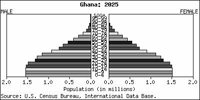
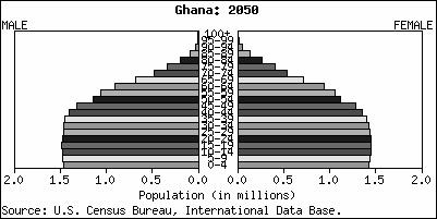
102 Figure 2.1: Population Pyramids 2000, 2025,
Poverty, Livelihoods, and Access to Basic Services in Ghana
 Poverty, Livelihoods, and Access to Basic Services in Ghana Joint presentation on Shared Growth in Ghana (Part II) by Zeljko Bogetic and Quentin Wodon Presentation based on a paper by Harold Coulombe and
Ghana Lower-middle income Sub-Saharan Africa (developing only) Source: World Development Indicators (WDI) database.
 Source: World Development Indicators (WDI) database.") Knowledge for Development Ghana in Brief October 215 Poverty and Equity Global Practice Overview Poverty Reduction in Ghana Progress and Challenges A tale of success Ghana has posted a strong growth performance
Knowledge for Development Ghana in Brief October 215 Poverty and Equity Global Practice Overview Poverty Reduction in Ghana Progress and Challenges A tale of success Ghana has posted a strong growth performance
ANALYSIS OF POVERTY TRENDS IN GHANA. Victor Oses, Research Department, Bank of Ghana
 ANALYSIS OF POVERTY TRENDS IN GHANA Victor Oses, Research Department, Bank of Ghana ABSTRACT: The definition of poverty differs across regions and localities in reference to traditions and what society
Household Income inequality in Ghana: a decomposition analysis
 Household Income inequality in Ghana: a decomposition analysis Jacob Novignon 1 Department of Economics, University of Ibadan, Ibadan-Nigeria Email: nonjake@gmail.com Mobile: +233242586462 and Genevieve
The Ghana Poverty and Inequality Report: Using the 6th Ghana Living Standards Survey 2016
 The Ghana Poverty and Inequality Report: Using the 6th Ghana Living Standards Survey 2016 By Edgar Cooke (Ashesi University College, Ghana); Sarah Hague (Chief of Policy, UNICEF Ghana); Andy McKay (Professor
GLOBALIZATION, DEVELOPMENT AND POVERTY REDUCTION: THEIR SOCIAL AND GENDER DIMENSIONS
 TALKING POINTS FOR THE EXECUTIVE SECRETARY ROUNDTABLE 1: GLOBALIZATION, DEVELOPMENT AND POVERTY REDUCTION: THEIR SOCIAL AND GENDER DIMENSIONS Distinguished delegates, Ladies and gentlemen: I am pleased
Poverty profile and social protection strategy for the mountainous regions of Western Nepal
 October 2014 Karnali Employment Programme Technical Assistance Poverty profile and social protection strategy for the mountainous regions of Western Nepal Policy Note Introduction This policy note presents
West Bank and Gaza Poverty and Shared Prosperity Diagnostic
 Public Disclosure Authorized Public Disclosure Authorized West Bank and Gaza Poverty and Shared Prosperity Diagnostic 2011-2017 Public Disclosure Authorized August 14, 2018 Public Disclosure Authorized
Poverty Profile. Executive Summary. Kingdom of Thailand
 Poverty Profile Executive Summary Kingdom of Thailand February 2001 Japan Bank for International Cooperation Chapter 1 Poverty in Thailand 1-1 Poverty Line The definition of poverty and methods for calculating
Poverty, growth and inequality
 Part 1 Poverty, growth and inequality 16 Pro-Poor Growth in the 1990s: Lessons and Insights from 14 Countries Broad based growth and low initial inequality are critical to accelerating progress toward
China s (Uneven) Progress Against Poverty. Martin Ravallion and Shaohua Chen Development Research Group, World Bank
 Progress Against Poverty. Martin Ravallion and Shaohua Chen Development Research Group, World Bank") China s (Uneven) Progress Against Poverty Martin Ravallion and Shaohua Chen Development Research Group, World Bank 1 Around 1980 China had one of the highest poverty rates in the world We estimate that
China s (Uneven) Progress Against Poverty Martin Ravallion and Shaohua Chen Development Research Group, World Bank 1 Around 1980 China had one of the highest poverty rates in the world We estimate that
Poverty Reduction and Economic Growth: The Asian Experience Peter Warr
 Poverty Reduction and Economic Growth: The Asian Experience Peter Warr Abstract. The Asian experience of poverty reduction has varied widely. Over recent decades the economies of East and Southeast Asia
HOUSEHOLD LEVEL WELFARE IMPACTS
 CHAPTER 4 HOUSEHOLD LEVEL WELFARE IMPACTS The household level analysis of Cambodia uses the national household dataset, the Cambodia Socio Economic Survey (CSES) 1 of 2004. The CSES 2004 survey covers
Rural and Urban Migrants in India:
 Rural and Urban Migrants in India: 1983-2008 Viktoria Hnatkovska and Amartya Lahiri July 2014 Abstract This paper characterizes the gross and net migration flows between rural and urban areas in India
Post-Secondary Education, Training and Labour September Profile of the New Brunswick Labour Force
 Post-Secondary Education, Training and Labour September 2018 Profile of the New Brunswick Labour Force Contents Population Trends... 2 Key Labour Force Statistics... 5 New Brunswick Overview... 5 Sub-Regional
International Remittances and Brain Drain in Ghana
 Journal of Economics and Political Economy www.kspjournals.org Volume 3 June 2016 Issue 2 International Remittances and Brain Drain in Ghana By Isaac DADSON aa & Ryuta RAY KATO ab Abstract. This paper
There is a seemingly widespread view that inequality should not be a concern
 Chapter 11 Economic Growth and Poverty Reduction: Do Poor Countries Need to Worry about Inequality? Martin Ravallion There is a seemingly widespread view that inequality should not be a concern in countries
CONFERENCE EDITION. Poverty Reduction in Ghana PROGRESS AND CHALLENGES. Vasco Molini and Pierella Paci
 CONFERENCE EDITION Poverty Reduction in Ghana PROGRESS AND CHALLENGES Vasco Molini and Pierella Paci Conference Edition Poverty Reduction in Ghana Progress and Challenges Vasco Molini Pierella Paci 215
Number of Countries with Data
 By Hafiz A. Pasha WHAT IS THE EXTENT OF SOUTH ASIA S PROGRESS ON THE MDGs? WHAT FACTORS HAVE DETERMINED THE RATE OF PROGRESS? WHAT HAS BEEN THE EXTENT OF INCLUSIVE GROWTH IN SOUTH ASIA? WHAT SHOULD BE
Poverty and Inequality
 Chapter 4 Poverty and Inequality Problems and Policies: Domestic After completing this chapter, you will be able to 1. Measure poverty across countries using different approaches and explain how poverty
Executive summary. Strong records of economic growth in the Asia-Pacific region have benefited many workers.
 Executive summary Strong records of economic growth in the Asia-Pacific region have benefited many workers. In many ways, these are exciting times for Asia and the Pacific as a region. Dynamic growth and
PENNSILVANIA STATE UNIVERSITY. How the IMF and the World Bank Dealt with the Issue of Poverty in Bangladesh from 2000 to 2010?
 Poverty in Bangladesh i PENNSILVANIA STATE UNIVERSITY How the IMF and the World Bank Dealt with the Issue of Poverty in Bangladesh from 2000 to 2010? Sarp Yanki Kalfa PLSC 440 Doctor Blackmon April 25,
POLICY BRIEF. Assessing Labor Market Conditions in Madagascar: i. World Bank INSTAT. May Introduction & Summary
 World Bank POLICY INSTAT BRIEF May 2008 Assessing Labor Market Conditions in Madagascar: 2001-2005 i Introduction & Summary In a country like Madagascar where seven out of ten individuals live below the
Inclusive growth and development founded on decent work for all
 Inclusive growth and development founded on decent work for all Statement by Mr Guy Ryder, Director-General International Labour Organization International Monetary and Financial Committee Washington D.C.,
Online Appendices for Moving to Opportunity
 Online Appendices for Moving to Opportunity Chapter 2 A. Labor mobility costs Table 1: Domestic labor mobility costs with standard errors: 10 sectors Lao PDR Indonesia Vietnam Philippines Agriculture,
UGANDA S PROGRESS TOWARDS POVERTY REDUCTION DURING THE LAST DECADE 2002/3-2012/13: IS THE GAP BETWEEN LEADING AND LAGGING AREAS WIDENING OR NARROWING?
 RESEARCH SERIES No. 118 UGANDA S PROGRESS TOWARDS POVERTY REDUCTION DURING THE LAST DECADE 2002/3-2012/13: IS THE GAP BETWEEN LEADING AND LAGGING AREAS WIDENING OR NARROWING? SARAH N. SSEWANYANA IBRAHIM
Rural and Urban Migrants in India:
 Rural and Urban Migrants in India: 1983 2008 Viktoria Hnatkovska and Amartya Lahiri This paper characterizes the gross and net migration flows between rural and urban areas in India during the period 1983
National Assessments on Gender and Science, Technology and Innovation (STI) Overall Results, Phase One September 2012
 Overall Results, Phase One September 2012") National Assessments on Gender and Science, Technology and Innovation (STI) Scorecard on Gender Equality in the Knowledge Society Overall Results, Phase One September 2012 Overall Results The European
National Assessments on Gender and Science, Technology and Innovation (STI) Scorecard on Gender Equality in the Knowledge Society Overall Results, Phase One September 2012 Overall Results The European
How s Life in the United Kingdom?
 How s Life in the United Kingdom? November 2017 On average, the United Kingdom performs well across a number of well-being indicators relative to other OECD countries. At 74% in 2016, the employment rate
HOW ECONOMIES GROW AND DEVELOP Macroeconomics In Context (Goodwin, et al.)
") Chapter 17 HOW ECONOMIES GROW AND DEVELOP Macroeconomics In Context (Goodwin, et al.) Chapter Overview This chapter presents material on economic growth, such as the theory behind it, how it is calculated,
Chapter 17 HOW ECONOMIES GROW AND DEVELOP Macroeconomics In Context (Goodwin, et al.) Chapter Overview This chapter presents material on economic growth, such as the theory behind it, how it is calculated,
How to Generate Employment and Attract Investment
 How to Generate Employment and Attract Investment Beatrice Kiraso Director UNECA Subregional Office for Southern Africa 1 1. Introduction The African Economic Outlook (AEO) is an annual publication that
Role of Cooperatives in Poverty Reduction. Shankar Sharma National Cooperatives Workshop January 5, 2017
 Role of Cooperatives in Poverty Reduction Shankar Sharma National Cooperatives Workshop January 5, 2017 Definition Nepal uses an absolute poverty line, based on the food expenditure needed to fulfil a
Spatial Inequality in Cameroon during the Period
 AERC COLLABORATIVE RESEARCH ON GROWTH AND POVERTY REDUCTION Spatial Inequality in Cameroon during the 1996-2007 Period POLICY BRIEF English Version April, 2012 Samuel Fambon Isaac Tamba FSEG University
The Trends of Income Inequality and Poverty and a Profile of
 http://www.info.tdri.or.th/library/quarterly/text/d90_3.htm Page 1 of 6 Published in TDRI Quarterly Review Vol. 5 No. 4 December 1990, pp. 14-19 Editor: Nancy Conklin The Trends of Income Inequality and
Trade, Growth and Poverty in the context of Lao PDR
 Trade, Growth and Poverty in the context of Lao PDR Dr. Yan Wang Senior Economist The World Bank Ywang2@worldbank.Org Prepared for the joint workshop on Lao PDR: Trade and The Integrated Framework Vientiane
Explanations of Slow Growth in Productivity and Real Wages
 Explanations of Slow Growth in Productivity and Real Wages America s Greatest Economic Problem? Introduction Slow growth in real wages is closely related to slow growth in productivity. Only by raising
Part 1: Focus on Income. Inequality. EMBARGOED until 5/28/14. indicator definitions and Rankings
 Part 1: Focus on Income indicator definitions and Rankings Inequality STATE OF NEW YORK CITY S HOUSING & NEIGHBORHOODS IN 2013 7 Focus on Income Inequality New York City has seen rising levels of income
How s Life in Mexico?
 How s Life in Mexico? November 2017 Relative to other OECD countries, Mexico has a mixed performance across the different well-being dimensions. At 61% in 2016, Mexico s employment rate was below the OECD
Bridging the north south divide. Getting economic growth moving in northern Ghana ODI/CEPA Workshop, Accra, 20 July 2005
 Bridging the north south divide Getting economic growth moving in northern Ghana ODI/CEPA Workshop, Accra, 20 July 2005 Objectives In view of the continued high levels of poverty in the north: To analyse
Korea s average level of current well-being: Comparative strengths and weaknesses
 How s Life in Korea? November 2017 Relative to other OECD countries, Korea s average performance across the different well-being dimensions is mixed. Although income and wealth stand below the OECD average,
How Important Are Labor Markets to the Welfare of Indonesia's Poor?
 Public Disclosure Authorized Public Disclosure Authorized Public Disclosure Authorized Public Disclosure Authorized S /4 POLICY RESEARCH WORKING PAPER 1665 How Important Are Labor Markets to the Welfare
Reducing Poverty in the Arab World Successes and Limits of the Moroccan. Lahcen Achy. Beirut, Lebanon July 29, 2010
 Reducing Poverty in the Arab World Successes and Limits of the Moroccan Experience Lahcen Achy Beirut, Lebanon July 29, 2010 Starting point Morocco recorded an impressive decline in monetary poverty over
Pro-Poor Growth and the Poorest
 Background Paper for the Chronic Poverty Report 2008-09 Pro-Poor Growth and the Poorest What is Chronic Poverty? The distinguishing feature of chronic poverty is extended duration in absolute poverty.
Labour Market Reform, Rural Migration and Income Inequality in China -- A Dynamic General Equilibrium Analysis
 Labour Market Reform, Rural Migration and Income Inequality in China -- A Dynamic General Equilibrium Analysis Yinhua Mai And Xiujian Peng Centre of Policy Studies Monash University Australia April 2011
Afrobarometer Briefing Paper No. 51. June 2008 POPULAR ATTITUDES TO DEMOCRACY IN GHANA, 2008
 Afrobarometer Briefing Paper No. 51 June 2008 POPULAR ATTITUDES TO DEMOCRACY IN GHANA, 2008 Introduction Ghana embarked on a transition to democratic rule in the early 1990s after eleven years of quasi-military
Full file at
 Chapter 2 Comparative Economic Development Key Concepts In the new edition, Chapter 2 serves to further examine the extreme contrasts not only between developed and developing countries, but also between
Test Bank for Economic Development. 12th Edition by Todaro and Smith
 Test Bank for Economic Development 12th Edition by Todaro and Smith Link download full: https://digitalcontentmarket.org/download/test-bankfor-economic-development-12th-edition-by-todaro Chapter 2 Comparative
Global Employment Trends for Women
 December 12 Global Employment Trends for Women Executive summary International Labour Organization Geneva Global Employment Trends for Women 2012 Executive summary 1 Executive summary An analysis of five
The Impact of Interprovincial Migration on Aggregate Output and Labour Productivity in Canada,
 The Impact of Interprovincial Migration on Aggregate Output and Labour Productivity in Canada, 1987-26 Andrew Sharpe, Jean-Francois Arsenault, and Daniel Ershov 1 Centre for the Study of Living Standards
Remittances and the Macroeconomic Impact of the Global Economic Crisis in the Kyrgyz Republic and Tajikistan
 Public Disclosure Authorized Public Disclosure Authorized Public Disclosure Authorized Public Disclosure Authorized China and Eurasia Forum Quarterly, Volume 8, No. 4 (2010), pp. 3-9 Central Asia-Caucasus
Human Development Indices and Indicators: 2018 Statistical Update. Eritrea
 Human Development Indices and Indicators: 2018 Statistical Update Briefing note for countries on the 2018 Statistical Update Introduction Eritrea This briefing note is organized into ten sections. The
Southern Africa Labour and Development Research Unit
 Southern Africa Labour and Development Research Unit Drivers of Inequality in South Africa by Janina Hundenborn, Murray Leibbrandt and Ingrid Woolard SALDRU Working Paper Number 194 NIDS Discussion Paper
Conference on What Africa Can Do Now To Accelerate Youth Employment. Organized by
 Conference on What Africa Can Do Now To Accelerate Youth Employment Organized by The Olusegun Obasanjo Foundation (OOF) and The African Union Commission (AUC) (Addis Ababa, 29 January 2014) Presentation
Labor Based Public Works Can it be an instrument for Safety Net Strategies?
 Labor Based Public Works Can it be an instrument for Safety Net Strategies? THE GHANA PERSPECTIVE B. M. Oppong Arusha June 14, 2010 1 INTRODUCTION Safety net Strategies have been adopted by many Countries.
Under-five chronic malnutrition rate is critical (43%) and acute malnutrition rate is high (9%) with some areas above the critical thresholds.
 and acute malnutrition rate is high (9%) with some areas above the critical thresholds.") May 2014 Fighting Hunger Worldwide Democratic Republic of Congo: is economic recovery benefiting the vulnerable? Special Focus DRC DRC Economic growth has been moderately high in DRC over the last decade,
May 2014 Fighting Hunger Worldwide Democratic Republic of Congo: is economic recovery benefiting the vulnerable? Special Focus DRC DRC Economic growth has been moderately high in DRC over the last decade,
and with support from BRIEFING NOTE 1
 and with support from BRIEFING NOTE 1 Inequality and growth: the contrasting stories of Brazil and India Concern with inequality used to be confined to the political left, but today it has spread to a
The Challenge of Inclusive Growth: Making Growth Work for the Poor
 2015/FDM2/004 Session: 1 The Challenge of Inclusive Growth: Making Growth Work for the Poor Purpose: Information Submitted by: World Bank Group Finance and Central Bank Deputies Meeting Cebu, Philippines
How s Life in Switzerland?
 How s Life in Switzerland? November 2017 On average, Switzerland performs well across the OECD s headline well-being indicators relative to other OECD countries. Average household net adjusted disposable
How Have the World s Poorest Fared since the Early 1980s?
 Public Disclosure Authorized How Have the World s Poorest Fared since the Early 1980s? Public Disclosure Authorized Public Disclosure Authorized Public Disclosure Authorized Shaohua Chen Martin Ravallion
Characteristics of Poverty in Minnesota
 Characteristics of Poverty in Minnesota by Dennis A. Ahlburg P overty and rising inequality have often been seen as the necessary price of increased economic efficiency. In this view, a certain amount
IMPACT OF GLOBALIZATION ON POVERTY: CASE STUDY OF PAKISTAN
 Romain Pison Prof. Kamal NYU 03/20/06 NYU-G-RP-A1 IMPACT OF GLOBALIZATION ON POVERTY: CASE STUDY OF PAKISTAN INTRODUCTION The purpose of this paper is to examine the effect of globalization in Pakistan
How s Life in the United States?
 How s Life in the United States? November 2017 Relative to other OECD countries, the United States performs well in terms of material living conditions: the average household net adjusted disposable income
How s Life in Estonia?
 How s Life in Estonia? November 2017 Relative to other OECD countries, Estonia s average performance across the different well-being dimensions is mixed. While it falls in the bottom tier of OECD countries
The Role of Migration and Income Diversification in Protecting Households from Food Insecurity in Southwest Ethiopia
 The Role of Migration and Income Diversification in Protecting Households from Food Insecurity in Southwest Ethiopia David P. Lindstrom Population Studies and Training Center, Brown University Craig Hadley
Unemployment and underemployment data
 Helpdesk Report Unemployment and underemployment data Laura Bolton Institute of development Studies 23 November 2016 Question Identify the number (absolute and as a proportion of the working age population)
Changes in rural poverty in Perú
 Lat Am Econ Rev (2017) 26:1 https://doi.org/10.1007/s40503-016-0038-x Changes in rural poverty in Perú 2004 2012 Samuel Morley 1 Received: 15 October 2014 / Revised: 11 November 2016 / Accepted: 4 December
Economic conditions and lived poverty in Botswana
 WWW.AFROBAROMETER.ORG Economic conditions and lived poverty in Botswana Findings from Afrobarometer Round 6 Surveys in Botswana At a Glance Economic Conditions: Trend analysis on present living conditions
HIGHLIGHTS. There is a clear trend in the OECD area towards. which is reflected in the economic and innovative performance of certain OECD countries.
 HIGHLIGHTS The ability to create, distribute and exploit knowledge is increasingly central to competitive advantage, wealth creation and better standards of living. The STI Scoreboard 2001 presents the
Is Economic Development Good for Gender Equality? Income Growth and Poverty
 Is Economic Development Good for Gender Equality? February 25 and 27, 2003 Income Growth and Poverty Evidence from many countries shows that while economic growth has not eliminated poverty, the share
Gender in the South Caucasus: A Snapshot of Key Issues and Indicators 1
 Public Disclosure Authorized Public Disclosure Authorized Gender in the South Caucasus: A Snapshot of Key Issues and Indicators 1 Armenia, Azerbaijan and Georgia have made progress in many gender-related
Republic of Ghana. Ghana Work program (FY15) Poverty and Inequality Profile. Public Disclosure Authorized. Report No: ACS13977
 Poverty and Inequality Profile. Public Disclosure Authorized. Report No: ACS13977") Report No: ACS13977 Republic of Ghana Ghana Work program (FY15) Poverty and Inequality Profile June 2015 GPVDR AFRICA Public Disclosure Authorized Public Disclosure Authorized Public Disclosure Authorized
Report No: ACS13977 Republic of Ghana Ghana Work program (FY15) Poverty and Inequality Profile June 2015 GPVDR AFRICA Public Disclosure Authorized Public Disclosure Authorized Public Disclosure Authorized
Human Development Indices and Indicators: 2018 Statistical Update. Cambodia
 Human Development Indices and Indicators: 2018 Statistical Update Briefing note for countries on the 2018 Statistical Update Introduction Cambodia This briefing note is organized into ten sections. The
GDP per capita was lowest in the Czech Republic and the Republic of Korea. For more details, see page 3.
 International Comparisons of GDP per Capita and per Hour, 1960 9 Division of International Labor Comparisons October 21, 2010 Table of Contents Introduction.2 Charts...3 Tables...9 Technical Notes.. 18
Poverty and Inequality Changes in Turkey ( )
") State Planning Organization of the Republic of Turkey and World Bank Welfare and Social Policy Analytical Work Program Working Paper Number 1: Poverty and Inequality Changes in Turkey (2003-2006) Meltem
State Planning Organization of the Republic of Turkey and World Bank Welfare and Social Policy Analytical Work Program Working Paper Number 1: Poverty and Inequality Changes in Turkey (2003-2006) Meltem
Economic and Social Council
 United Nations Economic and Social Council Distr.: General 27 December 2001 E/CN.3/2002/27 Original: English Statistical Commission Thirty-third session 5-8 March 2002 Item 7 (f) of the provisional agenda*
How s Life in Austria?
 How s Life in Austria? November 2017 Austria performs close to the OECD average in many well-being dimensions, and exceeds it in several cases. For example, in 2015, household net adjusted disposable income
Chile s average level of current well-being: Comparative strengths and weaknesses
 How s Life in Chile? November 2017 Relative to other OECD countries, Chile has a mixed performance across the different well-being dimensions. Although performing well in terms of housing affordability
New Evidence on the Urbanization of Global Poverty
 New Evidence on the Urbanization of Global Poverty MARTIN RAVALLION SHAOHUA CHEN PREM SANGRAULA THE URBANIZATION of the developing world s population has been viewed by some observers as a positive force
Fiscal Impacts of Immigration in 2013
 www.berl.co.nz Authors: Dr Ganesh Nana and Hugh Dixon All work is done, and services rendered at the request of, and for the purposes of the client only. Neither BERL nor any of its employees accepts any
Online Consultation for the Preparation of the Tajikistan Systematic Country Diagnostic. Dushanbe, Tajikistan March 2017
 Online Consultation for the Preparation of the Tajikistan Systematic Country Diagnostic Dushanbe, Tajikistan March 2017 The Systematic Country Diagnostic (SCD): Designed to be the main analytical input
evsjv `k cwimsl vb ey iv BANGLADESH BUREAU OF STATISTICS Statistics Division, Ministry of Planning
 PRELIMINARY REPORT ON HOUSEHOLD INCOME & EXPENDITURE SURVEY-2010 June, 2011 evsjv `k cwimsl vb ey iv BANGLADESH BUREAU OF STATISTICS Statistics Division, Ministry of Planning Household Income and Expenditure
Statistical Yearbook. for Asia and the Pacific
 Statistical Yearbook for Asia and the Pacific 2015 Statistical Yearbook for Asia and the Pacific 2015 Sustainable Development Goal 1 End poverty in all its forms everywhere 1.1 Poverty trends...1 1.2 Data
vi. rising InequalIty with high growth and falling Poverty
 43 vi. rising InequalIty with high growth and falling Poverty Inequality is on the rise in several countries in East Asia, most notably in China. The good news is that poverty declined rapidly at the same
Human Development Indices and Indicators: 2018 Statistical Update. Pakistan
 Human Development Indices and Indicators: 2018 Statistical Update Briefing note for countries on the 2018 Statistical Update Introduction Pakistan This briefing note is organized into ten sections. The
Quantitative Analysis of Rural Poverty in Nigeria
 NIGERIA STRATEGY SUPPORT PROGRAM Brief No. 17 Quantitative Analysis of Rural Poverty in Nigeria Bolarin Omonona In spite of Nigeria s abundant natural and human resource endowment, poverty remains pervasive,
How s Life in Slovenia?
 How s Life in Slovenia? November 2017 Slovenia s average performance across the different well-being dimensions is mixed when assessed relative to other OECD countries. The average household net adjusted
How s Life in Norway?
 How s Life in Norway? November 2017 Relative to other OECD countries, Norway performs very well across the OECD s different well-being indicators and dimensions. Job strain and long-term unemployment are
Chapter 2 Overview of Sudanese Economy and the Status of ICT in Sudan
 Chapter 2 Overview of Sudanese Economy and the Status of ICT in Sudan 2.1 Introduction This chapter provides a general overview of the socio-economic characteristics of the Sudanese economy and explains
How s Life in the Czech Republic?
 How s Life in the Czech Republic? November 2017 Relative to other OECD countries, the Czech Republic has mixed outcomes across the different well-being dimensions. Average earnings are in the bottom tier
POVERTY AND INEQUALITY IN SOUTH WEST BENGAL: AN OVERVIEW
 Jharkhand Journal of Social Development, Vol. V, No.1 & 2, 2013 ISSN 0974 651x POVERTY AND INEQUALITY IN SOUTH WEST BENGAL: AN OVERVIEW Rajarshi Majumder Associate Professor, Department of Economics, University
STRENGTHENING RURAL CANADA: Fewer & Older: Population and Demographic Crossroads in Rural Saskatchewan. An Executive Summary
 STRENGTHENING RURAL CANADA: Fewer & Older: Population and Demographic Crossroads in Rural Saskatchewan An Executive Summary This paper has been prepared for the Strengthening Rural Canada initiative by:
Italy s average level of current well-being: Comparative strengths and weaknesses
 How s Life in Italy? November 2017 Relative to other OECD countries, Italy s average performance across the different well-being dimensions is mixed. The employment rate, about 57% in 2016, was among the
How s Life in France?
 How s Life in France? November 2017 Relative to other OECD countries, France s average performance across the different well-being dimensions is mixed. While household net adjusted disposable income stands
STRENGTHENING RURAL CANADA: Fewer & Older: The Coming Demographic Crisis in Rural Ontario
 STRENGTHENING RURAL CANADA: Fewer & Older: The Coming Demographic Crisis in Rural Ontario An Executive Summary 1 This paper has been prepared for the Strengthening Rural Canada initiative by: Dr. Bakhtiar
Helen Clark: Opening Address to the International Conference on the Emergence of Africa
 Helen Clark: Opening Address to the International Conference on the Emergence of Africa 18 Mar 2015 It is a pleasure to join the President of Cote d Ivoire, H.E. Alassane Ouattara, in welcoming you to
A COMPARISON OF ARIZONA TO NATIONS OF COMPARABLE SIZE
 A COMPARISON OF ARIZONA TO NATIONS OF COMPARABLE SIZE A Report from the Office of the University Economist July 2009 Dennis Hoffman, Ph.D. Professor of Economics, University Economist, and Director, L.
How s Life in Sweden?
 How s Life in Sweden? November 2017 On average, Sweden performs very well across the different well-being dimensions relative to other OECD countries. In 2016, the employment rate was one of the highest
Analysis of Urban Poverty in China ( )
") Analysis of Urban Poverty in China (1989-2009) Development-oriented poverty reduction policies in China have long focused on addressing poverty in rural areas, as home to the majority of poor populations
Analysis of Urban Poverty in China (1989-2009) Development-oriented poverty reduction policies in China have long focused on addressing poverty in rural areas, as home to the majority of poor populations
How s Life in Finland?
 How s Life in Finland? November 2017 In general, Finland performs well across the different well-being dimensions relative to other OECD countries. Despite levels of household net adjusted disposable income
65. Broad access to productive jobs is essential for achieving the objective of inclusive PROMOTING EMPLOYMENT AND MANAGING MIGRATION
 5. PROMOTING EMPLOYMENT AND MANAGING MIGRATION 65. Broad access to productive jobs is essential for achieving the objective of inclusive growth and help Turkey converge faster to average EU and OECD income